|
|
Graphical Representation of Data: Graphical Representation of Data,” where numbers and facts become lively pictures and colorful diagrams. Instead of staring at boring lists of numbers, we use fun charts, cool graphs, and interesting visuals to understand information better. In this exciting concept of data visualization, we’ll learn about different kinds of graphs, charts, and pictures that help us see patterns and stories hidden in data. There is an entire branch in mathematics dedicated to dealing with collecting, analyzing, interpreting, and presenting numerical data in visual form in such a way that it becomes easy to understand and the data becomes easy to compare as well, the branch is known as Statistics. The branch is widely spread and has a plethora of real-life applications such as Business Analytics, demography, Astro statistics, and so on. In this article, we have provided everything about the graphical representation of data, including its types, rules, advantages, etc. Graphical Representation of Data Table of Content
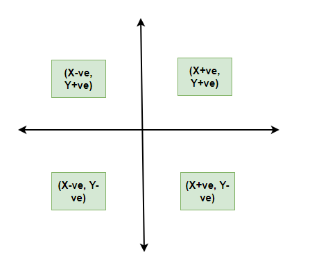
What is Graphical RepresentationGraphics Representation is a way of representing any data in picturized form. It helps a reader to understand the large set of data very easily as it gives us various data patterns in visualized form. There are two ways of representing data,
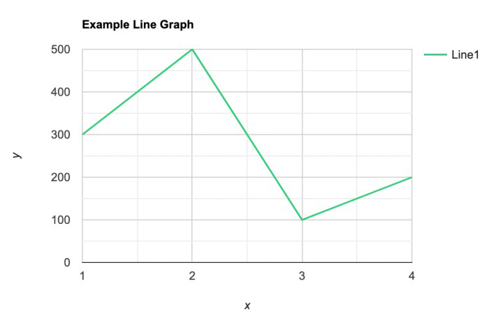
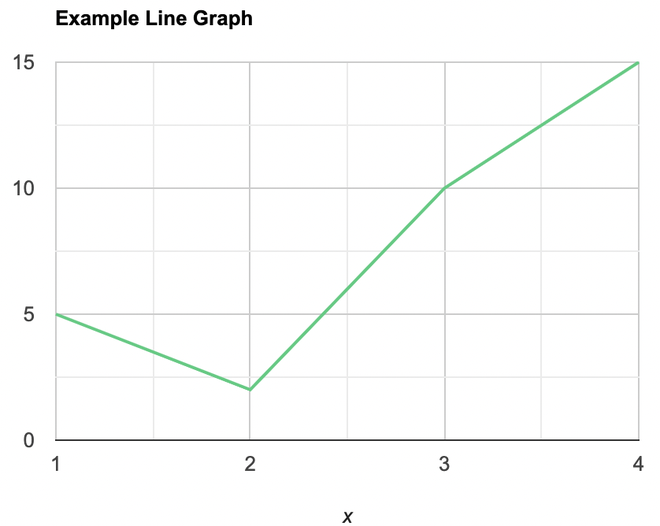
They say, “A picture is worth a thousand words”. It’s always better to represent data in a graphical format. Even in Practical Evidence and Surveys, scientists have found that the restoration and understanding of any information is better when it is available in the form of visuals as Human beings process data better in visual form than any other form. Does it increase the ability 2 times or 3 times? The answer is it increases the Power of understanding 60,000 times for a normal Human being, the fact is amusing and true at the same time. Types of Graphical RepresentationsComparison between different items is best shown with graphs, it becomes easier to compare the crux of the data about different items. Let’s look at all the different types of graphical representations briefly: Line GraphsA line graph is used to show how the value of a particular variable changes with time. We plot this graph by connecting the points at different values of the variable. It can be useful for analyzing the trends in the data and predicting further trends.
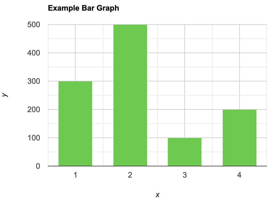
Bar GraphsA bar graph is a type of graphical representation of the data in which bars of uniform width are drawn with equal spacing between them on one axis (x-axis usually), depicting the variable. The values of the variables are represented by the height of the bars.
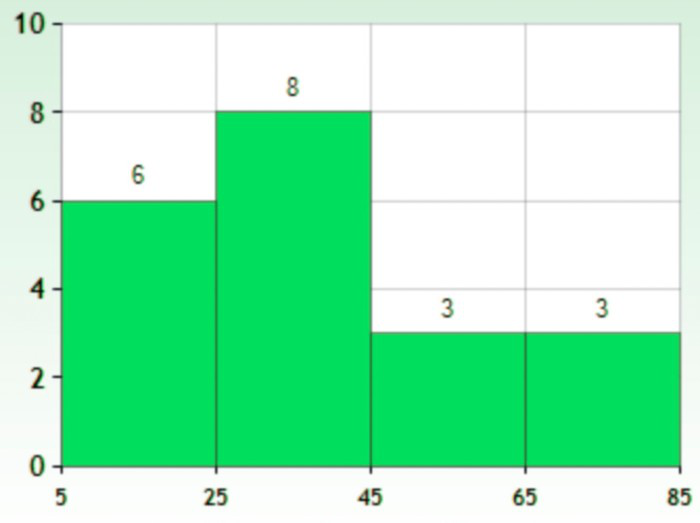
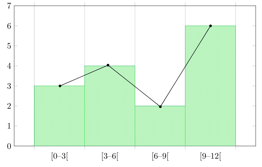
HistogramsThis is similar to bar graphs, but it is based frequency of numerical values rather than their actual values. The data is organized into intervals and the bars represent the frequency of the values in that range. That is, it counts how many values of the data lie in a particular range.
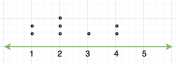
Line PlotIt is a plot that displays data as points and checkmarks above a number line, showing the frequency of the point.
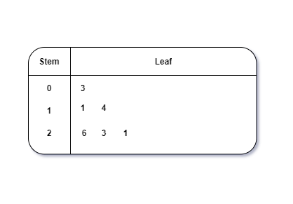
Stem and Leaf PlotThis is a type of plot in which each value is split into a “leaf”(in most cases, it is the last digit) and “stem”(the other remaining digits). For example: the number 42 is split into leaf (2) and stem (4).
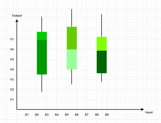
Box and Whisker PlotThese plots divide the data into four parts to show their summary. They are more concerned about the spread, average, and median of the data.
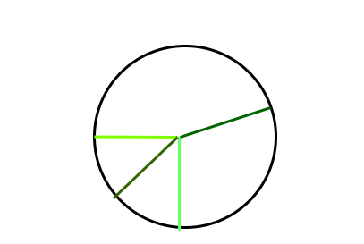
Pie ChartIt is a type of graph which represents the data in form of a circular graph. The circle is divided such that each portion represents a proportion of the whole.
Graphical Representations used in Math’sGraphs in Math are used to study the relationships between two or more variables that are changing. Statistical data can be summarized in a better way using graphs. There are basically two lines of thoughts of making graphs in maths:
Value-Based or Time Series GraphsThese graphs allow us to study the change of a variable with respect to another variable within a given interval of time. The variables can be anything. Time Series graphs study the change of variable with time. They study the trends, periodic behavior, and patterns in the series. We are more concerned with the values of the variables here rather than the frequency of those values.
Frequency BasedThese kinds of graphs are more concerned with the distribution of data. How many values lie between a particular range of the variables, and which range has the maximum frequency of the values. They are used to judge a spread and average and sometimes median of a variable under study.
Principles of Graphical Representations
Advantages and Disadvantages of Using Graphical SystemAdvantages
Disadvantages
General Rules for Graphical Representation of DataWe should keep in mind some things while plotting and designing these graphs. The goal should be a better and clear picture of the data. Following things should be kept in mind while plotting the above graphs:
Frequency PolygonA frequency polygon is a graph that is constructed by joining the midpoint of the intervals. The height of the interval or the bin represents the frequency of the values that lie in that interval.
Solved Examples on Graphical Representation of DataQuestion 1: What are different types of frequency-based plots? Answer:
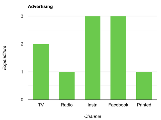
Question 2: A company with an advertising budget of Rs 10,00,00,000 has planned the following expenditure in the different advertising channels such as TV Advertisement, Radio, Facebook, Instagram, and Printed media. The table represents the money spent on different channels.
Draw a bar graph for the following data. Solution: Steps:
Question 3: Draw a line plot for the following data
Solution: Steps:
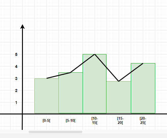
Question 4: Make a frequency plot of the following data:
Solution: Steps:
Now join the mid points of the intervals and their corresponding frequencies on the graph.
This graph shows both the histogram and frequency polygon for the given distribution. Related Article:Conclusion of Graphical RepresentationGraphical representation is a powerful tool for understanding data, but it’s essential to be aware of its limitations. While graphs and charts can make information easier to grasp, they can also be subjective, complex, and potentially misleading. By using graphical representations wisely and critically, we can extract valuable insights from data, empowering us to make informed decisions with confidence. Graphical Representation of Data – FAQsWhat are the advantages of using graphs to represent data?
What are the common types of graphs used for data representation?
How do you choose the most appropriate type of graph for your data?
How do you create effective labels and titles for graphs?
How do you interpret graphs to extract meaningful insights from data?
|
Reffered: https://www.geeksforgeeks.org
| Class 9 |
Type: | Geek |
Category: | Coding |
Sub Category: | Tutorial |
Uploaded by: | Admin |
Views: | 12 |