|
Pandas is one of the most popular Python packages used in data science. Pandas offer a powerful, and flexible data structure ( Dataframe & Series ) to manipulate, and analyze the data. Visualization is the best way to interpret the data.
Python has many popular plotting libraries that make visualization easy. Some of them are Matplotlib, Seaborn, and Python Plotly. It has great integration with Matplotlib. We can plot a Dataframe using the plot() method. But we need a Dataframe to plot. We can create a Dataframe by just passing a dictionary to the DataFrame() method of the Pandas library.
Plot a Dataframe using PandasMaking a different Plot from a Pandas DataFrame is easy. First, we create a simple Pandas DataFrame to make it easier to understand.
- Scatter Plot
- Area Plot
- Bar Plot
- Violin Plot
- Line Plot
- Box Plot
- Histogram Plot
- Pie Plot
Create a Dataframe Let’s create a simple Dataframe: In this example, code imports the Pandas and Matplotlib libraries creates a dictionary representing student data, and uses it to create a Pandas DataFrame. The `head()` function displays the first five rows of the DataFrame.
Python
# importing required library
# In case pandas is not installed on your machine
# use the command 'pip install pandas'.
import pandas as pd
import matplotlib.pyplot as plt

# A dictionary which represents data
data_dict = {'name': ['p1', 'p2', 'p3', 'p4', 'p5', 'p6'],
             'age': [20, 20, 21, 20, 21, 20],
             'math_marks': [100, 90, 91, 98, 92, 95],
             'physics_marks': [90, 100, 91, 92, 98, 95],
             'chem_marks': [93, 89, 99, 92, 94, 92]
             }

# creating a data frame object
df = pd.DataFrame(data_dict)

# show the dataframe
# bydefault head() show
# first five rows from top
df.head()
Output:
  name  age  math_marks  physics_marks  chem_marks
0   p1   20         100             90          93
1   p2   20          90            100          89
2   p3   21          91             91          99
3   p4   20          98             92          92
4   p5   21          92             98          94
Create Plots in Pandas Dataframe There are a number of plots available to interpret the data. Each graph is used for a purpose. there are various way to create plots in pandas dataframe here we are discussing some generally used method for create plots in pandas dataframe those are following.
Plot Dataframe using Pandas Scatter Plot To get the scatterplot of a dataframe all we have to do is to just call the plot() method by specifying some parameters.
kind=’scatter’,x= ‘some_column’,y=’some_colum’,color=’somecolor’ Example : In this example code creates a scatter plot using a DataFrame ‘df’ with ‘math_marks’ on the x-axis and ‘physics_marks’ on the y-axis, plotted in red. The plot is titled ‘ScatterPlot’ and displayed using Matplotlib.
Python
# scatter plot
df.plot(kind='scatter',
        x='math_marks',
        y='physics_marks',
        color='red')

# set the title
plt.title('ScatterPlot')

# show the plot
plt.show()
Output:

There are many ways to customize plots this is the basic one.
Plot a Dataframe Pandas using Area PlotAn area plot is a data visualization technique that displays quantitative data over a two-dimensional surface, depicting the magnitude of values and the cumulative total as filled-in areas, providing a visual representation of trends and patterns.
Example :In this example Python code uses the pandas, numpy, and matplotlib libraries to create a sample DataFrame with ‘X’, ‘Y1’, and ‘Y2’ columns, then generates and displays an area plot with ‘X’ on the x-axis and ‘Y1’ and ‘Y2’ on the y-axis, titled ‘Area Plot’. > import pandas as pd
import numpy as np
import matplotlib.pyplot as plt
# Creating a sample DataFrame
data = {'X': np.arange(1, 11),
'Y1': np.random.randint(1, 10, size=(10)),
'Y2': np.random.randint(1, 10, size=(10))}
df = pd.DataFrame(data)
# Plotting Area Plot
df.plot(x='X', kind='area', stacked=False)
plt.title('Area Plot')
plt.xlabel('X')
plt.ylabel('Y')
plt.show()
Output :
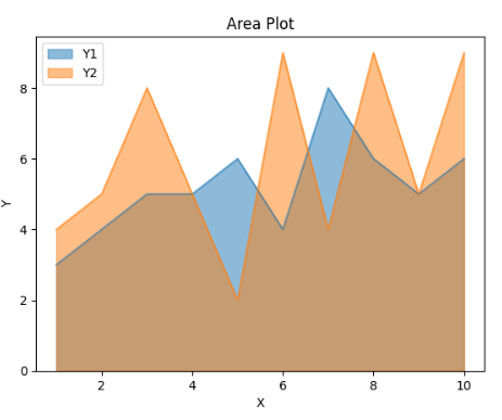 Area Plot Plot a Pandas DataFrame using Bar PlotSimilarly, we have to specify some parameters for plot() method to get the bar plot.
kind=’bar’,x= ‘some_column’,y=’some_colum’,color=’somecolor’
Example : In this example code creates a bar plot using the ‘physics_marks’ data from the DataFrame ‘df’ with names on the x-axis, green bars, and a title ‘BarPlot’. The plot is displayed using Matplotlib’s `show()` function.
Python
# bar plot
df.plot(kind='bar',
        x='name',
        y='physics_marks',
        color='green')

# set the title
plt.title('BarPlot')

# show the plot
plt.show()
Output:
 Plot a Pandas DataFrame using Violin PlotA violin plot is a data visualization that combines aspects of a box plot and a kernel density plot, providing insights into the distribution, central tendency, and probability density of a dataset.
Example : In this example the code generates and plots a violin plot using Seaborn to visualize the distribution of ‘Values’ in two categories (‘A’ and ‘B’) from a sample DataFrame.
Python
import pandas as pd
import seaborn as sns
import matplotlib.pyplot as plt

# Creating a sample DataFrame
data = {'Category': ['A'] * 100 + ['B'] * 100,
        'Values': np.concatenate([np.random.normal(0, 1, 100), np.random.normal(3, 1, 100)])}
df = pd.DataFrame(data)

# Plotting Violin Plot
plt.figure(figsize=(8, 6))
sns.violinplot(x='Category', y='Values', data=df)
plt.title('Violin Plot')
plt.xlabel('Category')
plt.ylabel('Values')
plt.show()
Output :
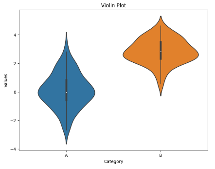 Violin Plot Create Plots in Pandas using Line PlotThe line plot of a single column is not always useful, to get more insights we have to plot multiple columns on the same graph. To do so we have to reuse the axes.
kind=’line’,x= ‘some_column’,y=’some_colum’,color=’somecolor’,ax=’someaxes’
Example : In this example the code uses Matplotlib to create a line plot with three lines representing math, physics, and chemistry marks from a DataFrame (‘df’) with student data, all displayed on the same axis (‘ax’), and the plot is titled ‘LinePlots’.
Python
# Get current axis
ax = plt.gca()

# line plot for math marks
df.plot(kind='line',
        x='name',
        y='math_marks',
        color='green', ax=ax)

# line plot for physics marks
df.plot(kind='line', x='name',
        y='physics_marks',
        color='blue', ax=ax)

# line plot for chemistry marks
df.plot(kind='line', x='name',
        y='chem_marks',
        color='black', ax=ax)

# set the title
plt.title('LinePlots')

# show the plot
plt.show()
Output:
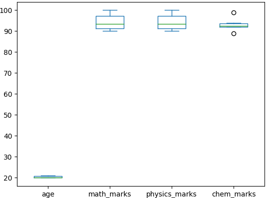
 Create plots in pandas using Box PlotBox plot is majorly used to identify outliers, we can information like median, maximum, minimum, quartiles and so on. Let’s see how to plot it.
Example : In this example These two lines of code use the Pandas library to create a box plot of a DataFrame (assumed to be named ‘df’) and then display the plot using Matplotlib.
Python
Output:
 Plotting with Pandas and Matplotlib Histogram PlotA histogram plot is a graphical representation of the distribution of a dataset, displaying the frequency of values within specified intervals (bins) along a continuous range. It provides a visual summary of the data’s underlying frequency distribution.
Example : In this example the code uses the pandas library to create a DataFrame with 100 random values from a standard normal distribution, then utilizes matplotlib to plot a histogram with 20 bins, displaying the frequency distribution of the values.
Python
import pandas as pd
import numpy as np
import matplotlib.pyplot as plt

# Creating a sample DataFrame
data = {'Values': np.random.randn(100)}
df = pd.DataFrame(data)

# Plotting Histogram
df['Values'].plot(kind='hist', bins=20, edgecolor='black')
plt.title('Histogram Plot')
plt.xlabel('Values')
plt.ylabel('Frequency')
plt.show()
Output :
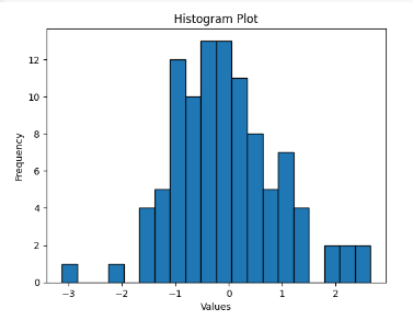 Histogram Plot
Create Plots in Pandas using Pie Plot
A pie plot is a circular statistical plot that can represent a single series of data. Each slice of the chart represents a proportion of the total percentage. Pie charts are frequently used in business presentations, such as those related to sales, operations, survey results, and resource allocation, because they offer a quick and easy summary of data.
kind=’pie’, y=’Values’, autopct=’%1.1f%%’, legend=False
Example : This example creates a pie chart using Pandas and Matplotlib to visualize the market share of different car brands. The data dictionary contains car brands and their respective market shares, which is converted into a DataFrame and plotted as a pie chart.
Python
import pandas as pd
import matplotlib.pyplot as plt

# Sample data
data = {'Brand': ['AUDI', 'BMW', 'FORD','TESLA', 'JAGUAR', 'MERCEDES'],
        'Market Share': [20, 15, 45, 30, 15, 40]}
df = pd.DataFrame(data)

# Set the index to the brand column
df.set_index('Brand', inplace=True)

# Pie chart
df.plot(kind='pie', y='Market Share', autopct='%1.1f%%', startangle=140, legend=False)
plt.title('Market Share of Smartphone Brands')
plt.show()
Output:
 Pie Plot How to plot a dataframe using Pandas? – FAQsHow to Plot a DataFrame in Pandas?To plot a DataFrame, you can use the .plot() method. This method is versatile, allowing for line plots, bar plots, histograms, and more, depending on the parameters you specify.
import pandas as pd
import matplotlib.pyplot as plt

# Sample DataFrame
df = pd.DataFrame({
    'A': [1, 2, 3, 4],
    'B': [4, 3, 2, 1]
})

# Plotting the DataFrame
df.plot()
plt.title('Line Plot of DataFrame')
plt.xlabel('Index')
plt.ylabel('Values')
plt.show()
How to Plot One Column of a DataFrame in Python?To plot a single column, select the column using standard indexing and then call the .plot() method:
# Plotting one column
df['A'].plot()
plt.title('Line Plot of Column A')
plt.xlabel('Index')
plt.ylabel('Value of A')
plt.show()
How to Plot a Row of a DataFrame in Python?To plot data from a row in a DataFrame, you need to select the row and transpose it if you want each column to be treated as a separate series:
# Plotting a row - ensure to select the row as a DataFrame to keep the structure
df.iloc[0].plot(kind='bar')  # Change 'kind' as needed
plt.title('Bar Plot of the First Row in DataFrame')
plt.xlabel('Columns')
plt.ylabel('Values')
plt.show()
Can Pandas Be Used for Plotting?Yes, pandas can definitely be used for plotting. Pandas provides a high-level interface to matplotlib, a powerful plotting library in Python. Using df.plot() you can quickly create various types of plots such as line plots, scatter plots, histograms, and more.
How to Plot a Dataset in Python?To plot a dataset in Python, especially if it’s structured as a pandas DataFrame or Series, use the pandas plotting interface or matplotlib directly. Here’s an example of plotting a dataset using both pandas and matplotlib:
# Assuming df is your dataset
# Plot using pandas
df.plot(kind='scatter', x='A', y='B')  # A scatter plot
plt.title('Scatter Plot of Columns A vs. B')
plt.show()

# Directly using matplotlib for more control
import matplotlib.pyplot as plt

plt.scatter(df['A'], df['B'])
plt.title('Scatter Plot of Columns A vs. B')
plt.xlabel('A')
plt.ylabel('B')
plt.grid(True)
plt.show()
|