|
In modern web design, responsive images are crucial to ensure that your site looks good on all devices. CSS Flexbox provides a powerful layout mode that allows you to create flexible and responsive layouts. We’ll explore how to auto-resize images within a CSS Flexbox layout while maintaining their aspect ratio.
Approach- Define a div container with a class for the images. Set the container to display: flex.
- Use flex-wrap: wrap to allow images to wrap onto new lines. Set max-width: 100% on images to ensure they do not exceed the container width.
- Set height: auto to maintain the aspect ratio of the images. Use flex: 1 1 auto to allow images to grow and shrink based on the container size.
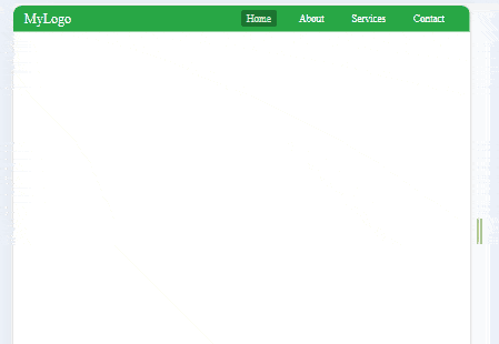
Example: Implementation to create a responsive navigation bar with Flexbox.
HTML
<!DOCTYPE html>
<html lang="en">

<head>
    <meta charset="UTF-8">
    <meta name="viewport"
          content="width=device-width,
                   initial-scale=1.0">
    <link rel="stylesheet" href="styles.css">
    <title>Auto Resize Image in Flexbox</title>

</head>

<body>
    <div class="container">
        <img src=
"https://media.geeksforgeeks.org/wp-content/uploads/20240311163321/Types-of-Wastes-(Banner).webp"
            alt="Image 1">
        <img src=
 "https://media.geeksforgeeks.org/wp-content/uploads/20240311125007/Invertebrates-(Banner).webp"
            alt="Image 2">
        <img src=
"https://media.geeksforgeeks.org/wp-content/uploads/20240311125007/Invertebrates-(Banner).webp"
            alt="Image 3">
    </div>
</body>

</html>
.container {
    display: flex;
    flex-wrap: wrap;
    justify-content: center;
    align-items: center;
    gap: 10px;
}

.container img {
    max-width: 100%;
    height: auto;
    /* Maintain aspect ratio */
    flex: 1 1 auto;
    /* Allow images to grow and shrink */
    object-fit: cover;
}

/* Optional: Add media queries for responsiveness */
@media (max-width: 600px) {
    .container img {
        flex: 1 1 100%;
        /* Full width on small screens */
    }
}
Output:
|
