|
A Responsive Navigation Bar is essential for modern web design to ensure users have a seamless experience across various devices, from desktops to mobile phones. Flexbox provides a powerful and straightforward way to create flexible and adaptable layouts.
Approach- Create a <nav> element for the navbar. Add a container for the logo and navigation links. Apply Flexbox to the .navbar container to align and distribute its child elements.
- Use display: flex on the .navbar to position child elements in a row by default. Use justify-content: space-between to space out the logo and navigation links evenly.
- Apply display: flex to the .nav-links to arrange the list items horizontally. In the media query for smaller screens, set .nav-links to display: none to hide links initially.
- Use flex-direction: column to stack links vertically when visible. Initially hide the .menu-toggle using display: none on larger screens.
- Show it using display: flex in the media query for smaller screens. Use flex-direction: column on the .menu-toggle to stack the bars vertically.
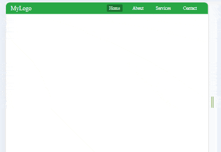
Example: Implementation to create a responsive navigation bar with Flexbox.
HTML
<!DOCTYPE html>
<html lang="en">

<head>
    <meta charset="UTF-8">
    <meta name="viewport"
          content="width=device-width,
                   initial-scale=1.0">
    <link rel="stylesheet" href="main.css">
    <title>Responsive Navbar</title>

</head>

<body>
    <nav class="navbar">
        <div class="logo">
            <a href="#">MyLogo</a>
        </div>
        <ul class="nav-links">
            <li><a href="#" class="active">Home</a></li>
            <li><a href="#">About</a></li>
            <li><a href="#">Services</a></li>
            <li><a href="#">Contact</a></li>
        </ul>
        <div class="menu-toggle">
            <span class="bar"></span>
            <span class="bar"></span>
            <span class="bar"></span>
        </div>
    </nav>

    <script>
        document.addEventListener('DOMContentLoaded', () => {
            const menuToggle = document.querySelector('.menu-toggle');
            const navLinks = document.querySelector('.nav-links');

            menuToggle.addEventListener('click', () => {
                navLinks.classList.toggle('active');
            });
        });
    </script>
</body>

</html>
/* styles.css */
* {
    margin: 0;
    padding: 0;
    box-sizing: border-box;
}

/* Basic styles for the navbar */
.navbar {
    display: flex;
    justify-content: space-between;
    align-items: center;
    padding: 10px 20px;
    background-color: #28a745;
    /* Green background */
    color: #fff;
}

/* Logo styling */
.logo a {
    color: #fff;
    text-decoration: none;
    font-size: 24px;
}

/* Navigation links styling */
.nav-links {
    display: flex;
    list-style: none;
}

.nav-links li {
    margin: 0 15px;
}

.nav-links a {
    color: #fff;
    text-decoration: none;
    font-size: 18px;
    transition: color 0.3s, text-decoration 0.3s, background-color 0.3s;
    padding: 5px 10px;
}

.nav-links a:hover,
.nav-links a.active {
    color: #e0e0e0;
    /* Lighter color for active/hover */
    background-color: #1c7430;
    /* Darker green background on hover */
    border-radius: 4px;
    /* Optional: rounded corners */
}

/* Menu toggle button for mobile view */
.menu-toggle {
    display: none;
    flex-direction: column;
    cursor: pointer;
}

.menu-toggle .bar {
    background-color: #fff;
    height: 3px;
    width: 25px;
    margin: 5px;
}

/* Responsive styling */
@media (max-width: 768px) {
    .nav-links {
        display: none;
        flex-direction: column;
        width: 100%;
        position: absolute;
        top: 60px;
        left: 0;
        background-color: #28a745;
        /* Green background for mobile view */
    }

    .nav-links.active {
        display: flex;
    }

    .nav-links li {
        margin: 10px 0;
        text-align: center;
    }

    .menu-toggle {
        display: flex;
    }
}
Output:
 Output
|