Horje
How to Change Label Font Sizes in Seaborn

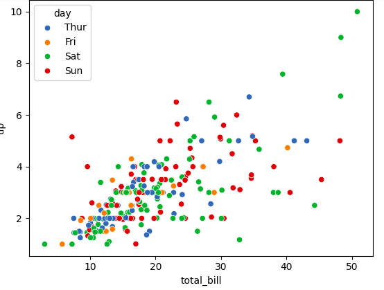
Seaborn is a powerful Python visualization library that provides a high-level interface for drawing attractive and informative statistical graphics. One of its strong points is customization, allowing you to fine-tune various aspects of your plots, including font sizes of labels, titles, and ticks. In this guide, we’ll explore how to change label font sizes in Seaborn, including examples and tips for achieving the best visual presentation for your data.

How to change label font sizes in Seaborn?

Changing font sizes in Seaborn involves configuring Matplotlib properties either globally or locally within a specific plot. Understanding these mechanisms is crucial for creating visually appealing plots that communicate your data effectively.

Basic Plot Creation in Seaborn

Before diving into font customization, let’s start by creating a basic plot using Seaborn. For illustration, we’ll use the tips dataset that comes with Seaborn.

Python
import seaborn as sns
import matplotlib.pyplot as plt

# Load example dataset
tips = sns.load_dataset("tips")

# Create a basic scatter plot
sns.scatterplot(data=tips, x="total_bill", y="tip", hue="day")
plt.show()

Output:

1


Changing Font Sizes for Axis Labels

To change the font size of axis labels, you need to access and modify the properties of the axes object returned by Matplotlib’s plotting functions.

Using set_xlabel and set_ylabel

Python
# Create a scatter plot
ax = sns.scatterplot(data=tips, x="total_bill", y="tip", hue="day")

# Customize font size for x and y axis labels
ax.set_xlabel("Total Bill ($)", fontsize=14)
ax.set_ylabel("Tip ($)", fontsize=14)

plt.show()
2


Using set Method


Python
# Create a scatter plot
ax = sns.scatterplot(data=tips, x="total_bill", y="tip", hue="day")

# Set font size for both x and y labels
ax.set(xlabel="Total Bill ($)", ylabel="Tip ($)")
ax.xaxis.label.set_size(14)
ax.yaxis.label.set_size(14)

plt.show()
3


Changing Font Sizes for Tick Labels

Tick labels, which appear on the x-axis and y-axis, can be customized using the tick_params method or by directly manipulating the xticklabels and yticklabels attributes.

Using tick_params

Python
# Create a scatter plot
ax = sns.scatterplot(data=tips, x="total_bill", y="tip", hue="day")

# Customize font size for tick labels
ax.tick_params(axis='both', labelsize=12)

plt.show()
4


Customizing Font Sizes for Titles and Legends

Plot Title

Python
# Create a scatter plot
ax = sns.scatterplot(data=tips, x="total_bill", y="tip", hue="day")

# Customize the plot title font size
ax.set_title("Total Bill vs. Tip", fontsize=16)

plt.show()
5


Legend Font Size

Python
# Create a scatter plot
ax = sns.scatterplot(data=tips, x="total_bill", y="tip", hue="day")

# Customize legend font size
legend = ax.get_legend()
legend.set_fontsize(12)

plt.show()


1


Reffered: https://www.geeksforgeeks.org


AI ML DS

Related
Modifying Colors in a Seaborn Lineplot Modifying Colors in a Seaborn Lineplot
Large scale Machine Learning Large scale Machine Learning
Detecting outliers when fitting data with nonlinear regression Detecting outliers when fitting data with nonlinear regression
Integrating Numba with Tensorflow Integrating Numba with Tensorflow
Smart Home Energy Saving Analysis in R Smart Home Energy Saving Analysis in R

Type:
Geek
Category:
Coding
Sub Category:
Tutorial
Uploaded by:
Admin
Views:
21