
|
|
In Seaborn, catplot is a function mainly for visualizing categorical data. It combines a categorical plot with a FacetGrid, allowing us to explore relationships between variables across different categories. While catplot provides informative visualizations by default, adding grid lines can further improve the readability and interpretation. In this article, we will know about how to add grid lines to a catplot in seaborn. Table of Content Adding Grid Lines to the CatplotA Grid lines can help in:
Methods to Add Grid Lines in CatPlotBelow are the methods we can use: Method 1: Using the ax.grid() MethodThis method is a direct way to add grid lines to the plot. We can customize the appearance of the grid lines using parameters like axis, color, linestyle, linewidth, etc. Steps: 1. Import necessary libraries: import seaborn as sns 2. Load the dataset: tips = sns.load_dataset("tips")3. Create the catplot: g = sns.catplot(x="day", y="total_bill", kind="bar", data=tips)4. Access the axes object and add grid lines: ax = g.ax # Access the axes object Method 2: Using the FacetGrid and map MethodsThis approach is useful when we want to add grid lines to multiple plots created by FacetGrid. The map function applies the plot function to each subplot in the grid, effectively adding grid lines to all of them. Steps: 1. Create a FacetGrid: g = sns.FacetGrid(tips, col="time")2. Map the plot function to the grid and add grid lines within the mapping function: def add_grid(x, y, **kwargs): Adding Grid Lines to a Catplot : Practical ExamplesExample 1: Visualizing Distribution with Grid LinesOutput: Visualizing Distribution with Grid Lines This example adds horizontal grid lines to a boxen plot, making it easier to compare the distribution of total bill amounts across different days. Example 2: Comparing Categories with Grid LinesOutput:  Comparing Categories with Grid Lines In this example, grid lines are added to a bar plot comparing the survival rates of different passenger classes across genders. The grid lines help in visually assessing the differences in survival rates. Customizing Grid LinesYou can further customize the appearance of the grid lines using Matplotlib’s Output: 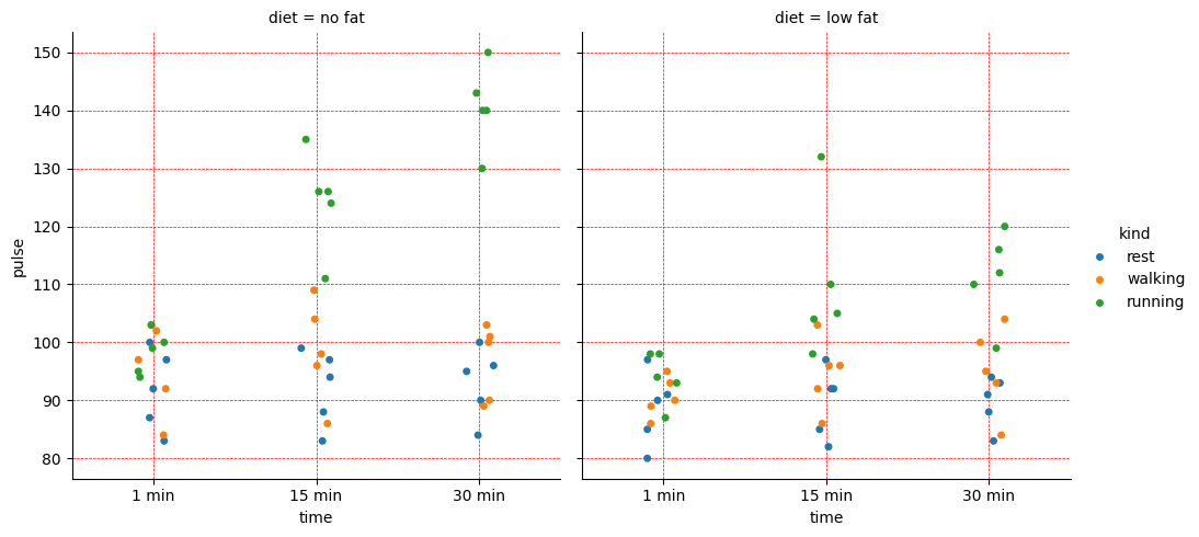 Customizing Grid Lines ConclusionIn conclusion, adding grid lines to Seaborn catplots can significantly improve the clarity and interpretability of our visualizations. By using the ax.grid() and FacetGrid & map method, we can easily customize the appearance of the grid lines to suit our specific needs. |
Reffered: https://www.geeksforgeeks.org
| AI ML DS |
Type: | Geek |
Category: | Coding |
Sub Category: | Tutorial |
Uploaded by: | Admin |
Views: | 21 |