|
Matplotlib is a powerful plotting library in Python that allows for a wide range of customization options. One common requirement is to decouple the hatch and edge color in plots. By default, the hatch color in Matplotlib is tied to the edge color, but there are ways to customize these independently. This article will delve into the technical details of how to achieve this, providing step-by-step instructions and examples.
Understanding Hatches and Edge ColorsIn Matplotlib, hatches are patterns used to fill the interior of shapes in plots, such as bars in a bar chart. The edge color is the color of the border of these shapes. By default, the hatch color is the same as the edge color, which can be limiting in terms of customization.
Why Decouple Hatch and Edge Color?Decoupling the hatch and edge color can be beneficial for several reasons:
- Enhanced Visual Distinction: Different colors for hatches and edges can make plots more visually appealing and easier to interpret.
- Publication Requirements: Some publications require specific color schemes or patterns.
- Improved Accessibility: Using distinct colors and patterns can make plots more accessible to individuals with color vision deficiencies.
Methods to Decouple Hatch and Edge ColorThere are several methods to decouple hatch and edge color in Matplotlib:
Method 1: Using rcParamsMatplotlib’s rcParams allows for global customization of plot properties. You can set the hatch color globally using rcParams.
Python
import matplotlib.pyplot as plt

# Set global hatch color
plt.rcParams['hatch.color'] = 'blue'

# Create a bar plot
fig, ax = plt.subplots()
bars = ax.bar([1, 2, 3], [3, 2, 5], color='white', edgecolor='black', hatch='/', linewidth=2)

plt.show()
Output:
 Using rcParams In this example, the hatch color is set to blue globally, while the edge color is set to black.
Method 2: Plotting TwiceAnother approach is to plot the bars twice: once for the hatch and once for the edge.
Python
import matplotlib.pyplot as plt

x = [1, 2, 3]
y = [4, 5, 6]

# Create the figure and axis
fig, ax = plt.subplots()

# Plot the hatch
bars = ax.bar(x, y, color='white', edgecolor='red', hatch='/', linewidth=2)

# Plot the edge
bars = ax.bar(x, y, color='none', edgecolor='black', linewidth=2)

plt.show()
Output:
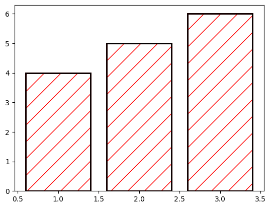 Plotting Twice This method involves plotting the bars with the desired hatch color and then overlaying them with bars that have the desired edge color.
Method 3: Customizing the Patch ObjectFor more advanced customization, you can directly modify the properties of the Patch object in Matplotlib.
Python
import matplotlib.pyplot as plt
import numpy as np

x = np.arange(4) + 1
y_red = [1, 3, 1, 4]
y_blue = [2, 2, 4, 1]

# Create the figure and axis
fig, ax = plt.subplots()

# Plot the bars with transparent face color
bars_red = ax.bar(x - 0.2, y_red, width=0.4, edgecolor='black', hatch='/', facecolor=(0, 0, 0, 0))
bars_blue = ax.bar(x + 0.2, y_blue, width=0.4, edgecolor='black', hatch='\\', facecolor=(0, 0, 0, 0))

# Customize the hatch color
for bar in bars_red:
    bar._hatch_color = (1.0, 0.0, 0.0, 1.0)  # Red hatch color

for bar in bars_blue:
    bar._hatch_color = (0.0, 0.0, 1.0, 1.0)  # Blue hatch color

plt.show()
Output:
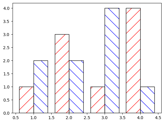 Customizing the Patch Object Considerations and LimitationsWhile decoupling hatch and edge color provides greater flexibility, there are some considerations and limitations:
- Performance: Plotting twice (Method 2) can impact performance for large datasets.
- Legend Customization: Legends may need additional customization to reflect the decoupled colors accurately.
- Version Compatibility: Some methods may depend on the version of Matplotlib being used. Always check the documentation for the version you are working with.
ConclusionDecoupling hatch and edge color in Matplotlib enhances the visual appeal and functionality of plots. By using methods such as rcParams, plotting twice, and customizing Patch objects, you can achieve a high level of customization. This article has provided a comprehensive guide on how to implement these techniques, complete with code examples. Experiment with these methods to create plots that meet your specific requirements and preferences.
|