
|
|
Flexbox in CSS is a powerful layout module that allows you to easily design complex layouts. It provides an efficient way to distribute space among items in a container, even when their sizes are unknown or dynamic. Below are the approaches to Arrange Two Items Per Row Using Flexbox: Table of Content Using flex-basisIn this approach, we are using the flex-basis property to specify the initial size of the flex items. Each item has flex: 1 0 40%, meaning it will initially take up 40% of the container’s width, allowing for two items per row when combined with the margin. Example: The below example uses flex-basis to Arrange 2 items per row using flexbox. Output: Output Using width and flex-wrapIn this approach, we are using the width property combined with flex-wrap to arrange items in two per row. Each item has a width of calc(50% – 20px), which ensures they take up approximately half of the container’s width while accounting for margins. The flex-wrap: wrap property allows items to move to the next line when the container’s width is exceeded. The box-sizing: border-box makes sure the padding and border are included in the width calculation, preventing overflow. Example: The below example uses width and flex-wrap to Arrange 2 items per row using flexbox. Output: 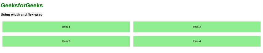 Output |
Reffered: https://www.geeksforgeeks.org
| CSS |
Type: | Geek |
Category: | Coding |
Sub Category: | Tutorial |
Uploaded by: | Admin |
Views: | 23 |