|
We use “display flex” property in our CSS code to create a flexible layout. To disable flex in CSS, We can simply set the display property of the particular element to another value like we can set “flex” to “block” or “inline-block” for our needs.
These are the following approaches:
Using “display: block” Property- First, create a basic HTML structure then inside the <body> tag, add a div element with the class “container” or you can use any other class also.
- Inside the main div create some other divs for showing properly to disable the display flex property.
- To disable the display: flex in your code use display: block.
Example: The example code below shows how to disable display flex in CSS using display: block.
HTML
<!DOCTYPE html>
<html lang="en">

<head>
    <meta charset="UTF-8">
    <meta name="viewport"
          content="width=device-width,
                   initial-scale=1.0">
    <title>Disable Flex Example</title>
    <link rel="stylesheet" href="style.css">
</head>

<body>
    <h1>Flexbox Enabled</h1>
    <p>In this section the flexbox is
      <strong>Enabled.</strong></p>
    <div class="container">
        <div class="item">Item 1</div>
        <div class="item">Item 2</div>
        <div class="item">Item 3</div>
    </div>

    <h1>Flexbox Disabled</h1>
    <p>This section has Flexbox disabled,
      for that we use <strong>display block.</strong></p>
    <div class="container disable-flex">
        <div class="item">Item A</div>
        <div class="item">Item B</div>
        <div class="item">Item C</div>
    </div>
</body>

</html>
body {
    font-family: Arial, sans-serif;
    background-color: #f4f4f4;
    margin: 0;
    padding: 0;
    display: flex;
    flex-direction: column;
    align-items: center;
}

h1 {
    color: #333;
}

p {
    color: #666;
    font-size: 16px;
    margin-bottom: 20px;
}

.container {
    display: flex;
    justify-content: center;
    align-items: center;
    background-color: #fff;
    border: 1px solid #ccc;
    padding: 20px;
    margin-bottom: 20px;
    width: 80%;
    max-width: 800px;
    box-shadow: 0 0 10px rgba(0, 0, 0, 0.1);
}

.container.disable-flex {
    display: block;
}

.item {
    background-color: #02b72d;
    padding: 20px;
    margin: 10px;
    border-radius: 5px;
    text-align: center;
    flex: 1;
    color: #fff;
}
Output:
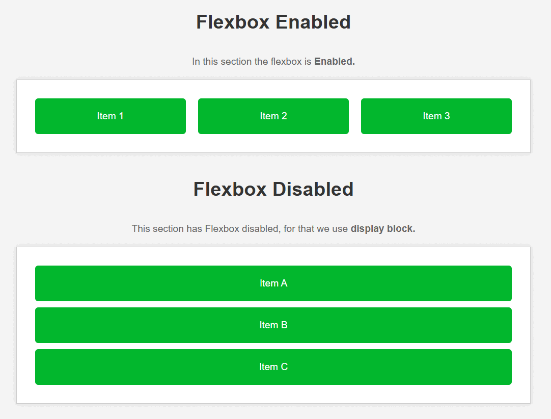 Output : Disable flex using display block Using “display: inline-block” Property- First, create a basic HTML structure then inside the <body> tag, add a div element with the class “container” or you can use any other class also.
- And inside the main div create some other divs for showing properly to disable display flex property.
- To disable the display:flex in your code use display : inline-block.
Example: The example code below shows how to disable display flex in CSS using display : inline-block.
HTML
<!DOCTYPE html>
<html lang="en">

<head>
    <meta charset="UTF-8">
    <meta name="viewport"
          content="width=device-width,
                   initial-scale=1.0">
    <title>Disable Flex Example</title>
    <link rel="stylesheet" href="style.css">
</head>

<body>
    <h1>Flexbox Enabled</h1>
    <p>In this section the flexbox is
     <strong>Enabled.</strong></p>
    <div class="container">
        <div class="item">Item 1</div>
        <div class="item">Item 2</div>
        <div class="item">Item 3</div>
    </div>

    <h1>Flexbox Disabled</h1>
    <p>This section has Flexbox disabled, for
      that we use <strong>display inline-block.</strong></p>
    <div class="container disable-flex">
        <div class="item">Item A</div>
        <div class="item">Item B</div>
        <div class="item">Item C</div>
    </div>
</body>

</html>
body {
    font-family: Arial, sans-serif;
    background-color: #f4f4f4;
    margin: 0;
    padding: 0;
    display: flex;
    flex-direction: column;
    align-items: center;
}

h1 {
    color: #333;
}

p {
    color: #666;
    font-size: 16px;
    margin-bottom: 20px;
}

.container {
    display: flex;
    justify-content: center;
    align-items: center;
    background-color: #fff;
    border: 1px solid #ccc;
    padding: 20px;
    margin-bottom: 20px;
    width: 80%;
    max-width: 800px;
    box-shadow: 0 0 10px rgba(0, 0, 0, 0.1);
}

.container.disable-flex {
    display: inline-block;
    /* It is helps to disable display: flex */
}

.item {
    background-color: #02b72d;
    padding: 20px;
    margin: 10px;
    border-radius: 5px;
    text-align: center;
    flex: 1;
    color: #fff;
}
Output:
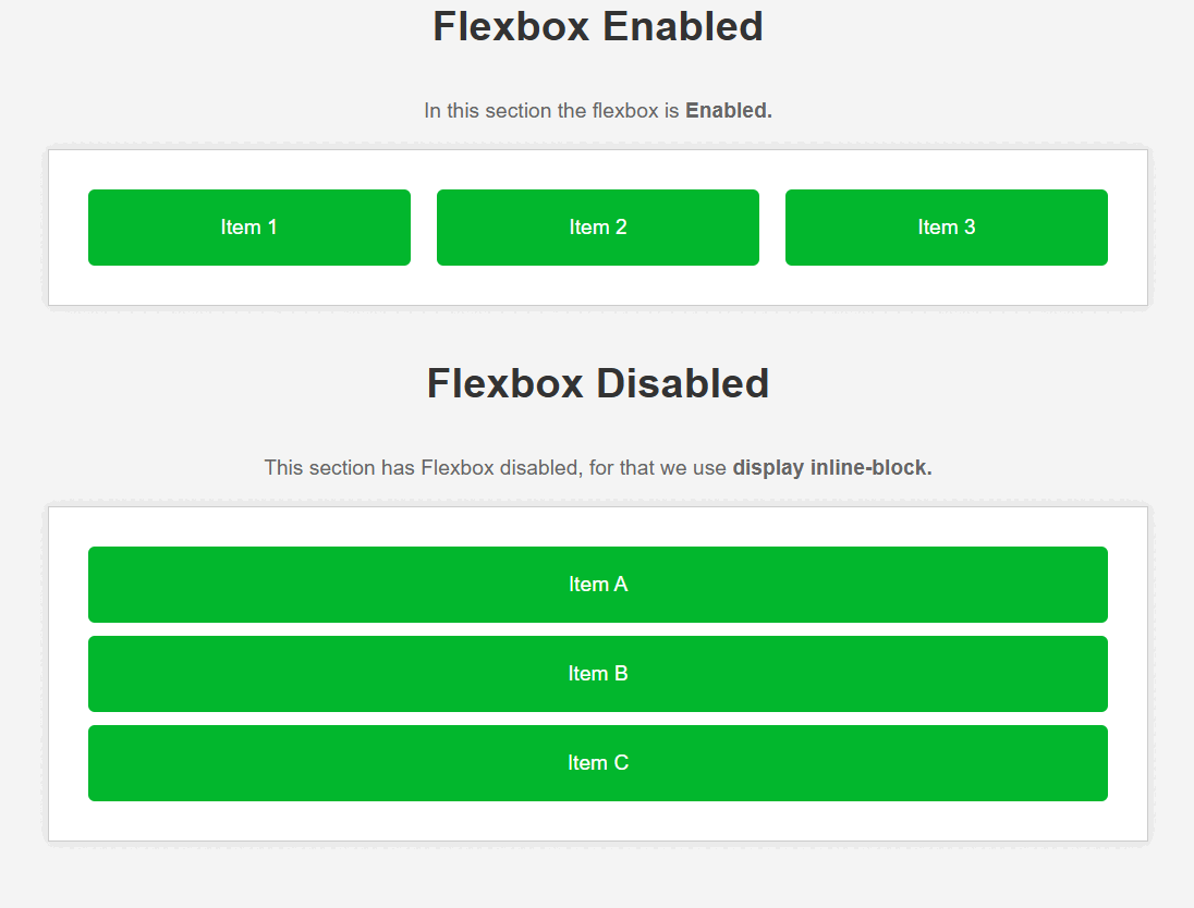 Output : Disable flex using display inline block
|