|
CSS Navigation Bar also known as Nav Bar helps users navigate through different sections of a website. It is styled using CSS to enhance its appearance and functionality, making it visually appealing and responsive. Typically located at the top or side of a webpage.
Navigation bar helps users easily access different sections or pages of the site, improving the overall user experience and site navigation efficiency.
Example: This example illustrates a fixed navigation bar at the top of the webpage with custom styling, including hover effects and an active state indicator.
HTML
<!DOCTYPE html>
<html lang="en">

<head>
    <meta charset="UTF-8">
    <meta name="viewport" content="width=device-width, initial-scale=1.0">
    <title>Responsive Navigation Bar</title>
    <link rel="stylesheet" href="styles.css">
</head>

<body>

    <header>
        <div class="container">
            <div id="logo">GFG</div>
            <nav>
                <ul class="nav-links">
                    <li><a href="#">Home</a></li>
                    <li><a href="#">About</a></li>
                    <li><a href="#">Services</a></li>
                    <li><a href="#">Contact</a></li>
                </ul>
                <div class="burger">
                    <div class="line1"></div>
                    <div class="line2"></div>
                    <div class="line3"></div>
                </div>
            </nav>
        </div>
    </header>

    <section class="content">
        <div class="container">
            <h1>Welcome to Our Website!</h1>
            <p>Get plenty of knowledge by our wonderful courses.</p>
        </div>
    </section>

    <script>
        const burger = document.querySelector('.burger');
        const nav = document.querySelector('.nav-links');

        burger.addEventListener('click', () => {
            nav.classList.toggle('active');
            burger.classList.toggle('active');
        });
    </script>
</body>

</html>
* {
    margin: 0;
    padding: 0;
    box-sizing: border-box;
}

body {
    font-family: Arial, sans-serif;
}

.container {
    max-width: 1200px;
    margin: 0 auto;
    padding: 0 20px;
    overflow: hidden;
}

header {
    background-color: #333;
    color: #fff;
    padding: 10px 0;
}

#logo {
    float: left;
    font-size: 1.5em;
}

nav {
    float: right;
}

.nav-links {
    list-style-type: none;
    margin: 0;
    padding: 0;
}

.nav-links li {
    display: inline-block;
    margin-left: 20px;
}

.nav-links li a {
    color: #fff;
    text-decoration: none;
    padding: 10px 15px;
    display: inline-block;
    transition: background-color 0.3s;
}

.nav-links li a:hover {
    background-color: #555;
}

.burger {
    display: none;
    cursor: pointer;
}

.burger div {
    width: 25px;
    height: 3px;
    background-color: #fff;
    margin: 5px;
    transition: transform 0.3s, background-color 0.3s;
}

.content {
    padding: 50px 0;
    text-align: center;
}

@media screen and (max-width: 768px) {
    .nav-links {
        display: none;
        text-align: center;
        width: 100%;
        position: absolute;
        background-color: #333;
        top: 60px;
        left: 0;
        z-index: 1;
    }

    .nav-links.active {
        display: block;
    }

    .nav-links li {
        display: block;
        margin: 10px 0;
    }

    .burger {
        display: block;
        float: right;
        margin-top: 15px;
    }

    .burger.active .line1 {
        transform: rotate(-45deg) translate(-5px, 6px);
    }

    .burger.active .line2 {
        opacity: 0;
    }

    .burger.active .line3 {
        transform: rotate(45deg) translate(-5px, -6px);
    }
}
Output
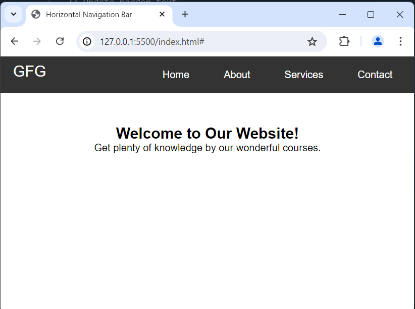
Types of Navigation BarsHorizontal Navigation bar:It lets you display links side by side horizontally. It Shows links in a row across the top of the webpage, making it easy to find different parts of the site.
Example: This demonstrates a responsive horizontal navigation bar and header layout for a website.
HTML
<!DOCTYPE html>
<html lang="en">

<head>
    <meta charset="UTF-8">
    <meta name="viewport"
          content="width=device-width, initial-scale=1.0">
    <title>Horizontal Navigation Bar</title>
    <link rel="stylesheet" href="styles.css">
</head>

<body>

    <header>
        <div class="container">
            <div id="logo">GFG</div>
            <nav>
                <ul class="nav-links">
                    <li><a href="#">Home</a></li>
                    <li><a href="#">About</a></li>
                    <li><a href="#">Services</a></li>
                    <li><a href="#">Contact</a></li>
                </ul>
            </nav>
        </div>
    </header>

    <section class="content">
        <div class="container">
            <h1>Welcome to Our Website!</h1>
            <p>
                  Get plenty of knowledge by our
                  wonderful courses.
              </p>
        </div>
    </section>

</body>

</html>
* {
    margin: 0;
    padding: 0;
    box-sizing: border-box;
}

body {
    font-family: Arial, sans-serif;
}

.container {
    max-width: 1200px;
    margin: 0 auto;
    padding: 0 20px;
    overflow: hidden;
}

header {
    background-color: #333;
    color: #fff;
    padding: 10px 0;
}

#logo {
    float: left;
    font-size: 1.5em;
}

nav {
    float: right;
}

.nav-links {
    list-style-type: none;
    margin: 0;
    padding: 0;
}

.nav-links li {
    display: inline-block;
    margin-left: 20px;
}

.nav-links li a {
    color: #fff;
    text-decoration: none;
    padding: 10px 15px;
    display: inline-block;
    transition: background-color 0.3s;
}

.nav-links li a:hover {
    background-color: #555;
}

.content {
    padding: 50px 0;
    text-align: center;
}
Output:
 Vertical Navigation Bar:Displays links stacked vertically. Lists links in a column on the side of the webpage, saving space while guiding users through the content.
Example: this illustrates a fixed vertical navigation bar on the left, a centered header with a logo, and content displayed beside the navigation bar.
HTML
<!DOCTYPE html>
<html lang="en">

<head>
    <meta charset="UTF-8">
    <meta name="viewport"
          content="width=device-width, initial-scale=1.0">
    <title>Vertical Navigation Bar</title>
    <link rel="stylesheet" href="styles.css">
</head>

<body>

    <header>
        <div class="container">
            <div id="logo">GFG</div>
        </div>
    </header>

    <nav class="vertical-nav">
        <ul class="nav-links">
            <li><a href="#">Home</a></li>
            <li><a href="#">About</a></li>
            <li><a href="#">Services</a></li>
            <li><a href="#">Contact</a></li>
        </ul>
    </nav>

    <section class="content">
        <div class="container">
            <h1>Welcome to Our Website!</h1>
            <p>Get plenty of knowledge by our wonderful courses.</p>
        </div>
    </section>

</body>

</html>
* {
    margin: 0;
    padding: 0;
    box-sizing: border-box;
}

body {
    font-family: Arial, sans-serif;
}

.container {
    max-width: 1200px;
    margin: 0 auto;
    padding: 0 20px;
    overflow: hidden;
}

header {
    background-color: #333;
    color: #fff;
    padding: 10px 0;
    text-align: center;
}

#logo {
    font-size: 1.5em;
}

.vertical-nav {
    width: 200px;
    /* Adjust width as needed */
    background-color: #333;
    position: fixed;
    top: 0;
    left: 0;
    bottom: 0;
    overflow-y: auto;
}

.nav-links {
    list-style-type: none;
    padding: 20px 0;
    margin: 0;
}

.nav-links li {
    text-align: center;
    margin-bottom: 10px;
}

.nav-links li a {
    display: block;
    color: #fff;
    text-decoration: none;
    padding: 10px;
    transition: background-color 0.3s;
}

.nav-links li a:hover {
    background-color: #555;
}

.content {
    margin-left: 220px;
    /* Adjust based on the width of vertical-nav */
    padding: 50px 20px;
}
Output:

|