|
CSS (Cascading Style Sheets) continues to evolve, offering new features and capabilities that help developers create more efficient, maintainable, and visually appealing web applications. As of 2024, several modern CSS features have gained widespread adoption and are important for front-end developers to understand and utilize effectively. In this article, we will see Modern CSS Features You Need to Know in 2024.
1. CSS Grid LayoutCSS Grid Layout is a powerful layout system that allows you to design web pages with complex grid structures. It provides a more flexible and efficient way to arrange and align elements compared to traditional methods like floats and positioning.
Key Benefits:- Responsive Design: Easily create responsive layouts that adapt to different screen sizes.
- Grid Items Placement: Control the placement of items within the grid using properties like grid-template-columns, grid-template-rows, grid-gap, and more.
- Alignment Control: Align and justify items precisely using alignment properties (justify-items, align-items, etc.).
- Nested Grids: Create nested grids for more complex layouts.
Example
HTML
<!DOCTYPE html>
<html lang="en">

<head>
    <meta charset="UTF-8">
    <meta name="viewport" content="width=device-width, initial-scale=1.0">
    <title>CSS Grid Layout Example</title>
    <style>
        .container {
            display: grid;
            grid-template-columns: 1fr 2fr 1fr;
            grid-template-rows: auto;
            gap: 10px;
            background-color: #f0f0f0;
            padding: 20px;
        }

        .item {
            background-color: #3498db;
            color: white;
            padding: 10px;
            text-align: center;
        }
    </style>
</head>

<body>
    <div class="container">
        <div class="item">Item 1</div>
        <div class="item">Item 2</div>
        <div class="item">Item 3</div>
    </div>
</body>

</html>
Output: CSS Grid Layout 2. CSS FlexboxFlexbox is a layout tool in CSS that is great for arranging and spacing items in a container. It works well even if the size of the items is unknown or changes. Flexbox is a good partner to CSS Grid because it offers a simpler, one-dimensional layout method.
Key Benefits:- Flexible Box Alignment: Align items along the main or cross axis using properties like justify-content, align-items, align-self, etc.
- Automatic Wrapping: Automatically wraps flex items to fit within the container when they exceed its width.
- Ordering: Reorder flex items visually without changing their source order.
- Space Distribution: Distribute extra space among flex items using flex-grow, flex-shrink, and flex-basis.
Example:
HTML
<!DOCTYPE html>
<html lang="en">

<head>
    <meta charset="UTF-8">
    <meta name="viewport" content="width=device-width, initial-scale=1.0">
    <title>CSS Flexbox Example</title>
    <style>
        .container {
            display: flex;
            justify-content: space-around;
            align-items: center;
            height: 200px;
            background-color: #f0f0f0;
            padding: 20px;
        }

        .item {
            background-color: #2ecc71;
            color: white;
            padding: 10px;
            text-align: center;
        }
    </style>
</head>

<body>
    <div class="container">
        <div class="item">Item 1</div>
        <div class="item">Item 2</div>
        <div class="item">Item 3</div>
    </div>
</body>

</html>
Output: CSS Flexbox 3. CSS Variables (Custom Properties)CSS Variables allow you to define reusable values (like colors, font sizes, spacing) that can be reused throughout your stylesheet. They bring modularity and maintainability to CSS, enabling more dynamic and customizable designs.
Key Benefits:- Scoped Variables: Define variables within a specific scope, such as a selector or media query.
- Dynamic Values: Update variable values dynamically using JavaScript, enabling theme switching and responsive designs.
- Fallback Values: Provide fallback values for browsers that do not support CSS Variables.
- Simplifies Maintenance: Centralize style changes by updating variable values rather than searching through CSS rules.
Example:
HTML
<!DOCTYPE html>
<html lang="en">

<head>
    <meta charset="UTF-8">
    <meta name="viewport" content="width=device-width, initial-scale=1.0">
    <title>CSS Variables Example</title>
    <style>
        :root {
            --primary-color: #3498db;
            --secondary-color: #2ecc71;
        }

        .button {
            background-color: var(--primary-color);
            color: white;
            padding: 10px 20px;
            border: none;
            cursor: pointer;
        }
    </style>
</head>

<body>
    <button class="button">Click Me</button>
</body>

</html>
Output CSS Variables 4. CSS Transitions and AnimationsCSS Transitions and Animations allow you to create smooth animations and transitions without relying on JavaScript. They enhance user experience by adding visual feedback to interactions and changes on a webpage.
Key Benefits:- Transition Effects: Smoothly animate property changes over a specified duration using transition.
- Keyframe Animations: Define complex animations with multiple keyframes using @keyframes.
- Control and Timing: Control animation timing functions (ease, ease-in, ease-out, linear) to customize animation behavior.
- Hardware Acceleration: Use GPU acceleration for smoother animations, improving performance.
Example:
HTML
<!DOCTYPE html>
<html lang="en">

<head>
    <meta charset="UTF-8">
    <meta name="viewport" content="width=device-width, initial-scale=1.0">
    <title>CSS Transitions and Animations Example</title>
    <style>
        .button {
            background-color: #3498db;
            color: white;
            padding: 10px 20px;
            border: none;
            cursor: pointer;
            transition: background-color 0.3s ease;
        }

        .button:hover {
            background-color: #f39c12;
        }

        @keyframes slide-in {
            0% {
                transform: translateX(-100%);
            }

            100% {
                transform: translateX(0);
            }
        }

        .slide-in {
            animation: slide-in 0.5s ease-out;
        }
    </style>
</head>

<body>
    <button class="button">Hover Me</button>
</body>

</html>
Output: CSS Transitions And Animations 5. CSS Flexibility with Clamp() and Min()CSS clamp() and min() functions provide more flexibility when defining CSS values, especially for responsive design. They allow you to set a value that’s calculated based on a range, ensuring the design remains flexible across different screen sizes.
Key Benefits:- Responsive Font Sizes: Set responsive font sizes that adjust based on viewport size using clamp().
- Flexible Layouts: Define flexible widths and heights that adapt to content and viewport constraints.
- Improved Readability: Ensure content remains readable by setting minimum sizes using min().
Example:
HTML
<!DOCTYPE html>
<html lang="en">

<head>
    <meta charset="UTF-8">
    <meta name="viewport" content="width=device-width, initial-scale=1.0">
    <title>CSS Flexibility with Clamp() and Min() Example</title>
    <style>
        .element {
            font-size: clamp(16px, 2vw, 20px);
            /* Responsive font size between 16px and 20px */
            padding: 20px;
            background-color: #f0f0f0;
            margin: 10px;
        }

        .container {
            width: min(100%, 600px);
            /* Container width is the minimum of 100% or 600px */
            background-color: #3498db;
            color: white;
            padding: 20px;
            margin: 10px;
        }
    </style>
</head>

<body>
    <div class="element">Responsive Font Size</div>
    <div class="container">Flexible Container Width</div>
</body>

</html>
Output: CSS Flexibility with Clamp() and Min() 6. CSS Grid Template AreasCSS Grid Template Areas allow you to define named grid areas within your layout, making it easier to create complex and visually consistent grid-based designs.
Key Benefits:- Visual Structure: Define the layout structure visually using named areas.
- Responsive Design: Easily rearrange and adapt grid areas for different screen sizes using media queries.
- Grid Area Placement: Place items within specific grid areas using grid-area.
Example:
HTML
<!DOCTYPE html>
<html lang="en">

<head>
    <meta charset="UTF-8">
    <meta name="viewport" content="width=device-width, initial-scale=1.0">
    <title>CSS Grid Template Areas Example</title>
    <style>
        .container {
            display: grid;
            grid-template-columns: 1fr 2fr;
            grid-template-rows: auto;
            grid-template-areas:
                "header header"
                "sidebar content"
                "footer footer";
            gap: 10px;
            background-color: #f0f0f0;
            padding: 20px;
        }

        .header {
            grid-area: header;
            background-color: #3498db;
            color: white;
            padding: 10px;
            text-align: center;
        }

        .sidebar {
            grid-area: sidebar;
            background-color: #2ecc71;
            color: white;
            padding: 10px;
            text-align: center;
        }

        .content {
            grid-area: content;
            background-color: #e74c3c;
            color: white;
            padding: 10px;
            text-align: center;
        }

        .footer {
            grid-area: footer;
            background-color: #9b59b6;
            color: white;
            padding: 10px;
            text-align: center;
        }
    </style>
</head>

<body>
    <div class="container">
        <div class="header">Header</div>
        <div class="sidebar">Sidebar</div>
        <div class="content">Content</div>
        <div class="footer">Footer</div>
    </div>
</body>

</html>
Output: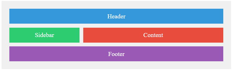 CSS Grid Template Areas CSS Scroll Snap allows you to create smooth scrolling experiences by snapping scroll positions to specific points within a scroll container. This is especially useful for galleries, carousels, and long-scrolling pages.
Key Benefits:- Smooth Scrolling: Automatically snap to defined positions during scrolling.
- Enhanced User Experience: Provide predictable navigation and visual cues for users.
- Horizontal and Vertical Snapping: Snap both horizontally (scroll-snap-type: x mandatory) and vertically (scroll-snap-type: y mandatory).
Example:
HTML
<!DOCTYPE html>
<html lang="en">

<head>
    <meta charset="UTF-8">
    <meta name="viewport" content="width=device-width, initial-scale=1.0">
    <title>CSS Scroll Snap Example</title>
    <style>
        .container {
            overflow-x: scroll;
            white-space: nowrap;
            scroll-snap-type: x mandatory;
            -webkit-overflow-scrolling: touch;
        }

        .item {
            display: inline-block;
            width: 300px;
            height: 200px;
            scroll-snap-align: start;
            background-color: #3498db;
            color: white;
            text-align: center;
            line-height: 200px;
            font-size: 24px;
            margin-right: 10px;
        }
    </style>
</head>

<body>
    <div class="container">
        <div class="item">Item 1</div>
        <div class="item">Item 2</div>
        <div class="item">Item 3</div>
        <div class="item">Item 4</div>
        <div class="item">Item 5</div>
    </div>
</body>

</html>
Output: CSS Scroll Snap
|