|
Visualizing relationships between multiple variables simultaneously can be challenging. In base R, the pairs() function is often used to create a matrix of scatterplots, showing pairwise relationships between all columns in a data frame. However, for those who prefer the flexibility and aesthetics of ggplot2, creating a similar matrix of scatterplots requires a different approach. In this article, we’ll explore how to achieve this using ggplot2 along with some additional packages.
1. Introduction to pairs()The pairs() function in base R provides a straightforward way to create a matrix of scatterplots. Here’s an example using the built-in iris dataset:
R
# Load the iris dataset
data(iris)

# Create a matrix of scatterplots using pairs()
pairs(iris[, 1:4], main = "Scatterplot Matrix of Iris Data")
Output:
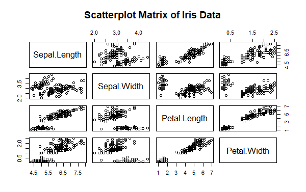 Create a Matrix of Scatterplots (pairs() Equivalent) in ggplot2 This function is useful for quickly visualizing the relationships between multiple variables. However, it lacks the customization and modern aesthetic that ggplot2 offers.
2. Creating a Scatterplot Matrix with ggplot2To create a scatterplot matrix in ggplot2, we need to use the GGally package, which extends ggplot2 with functions for creating pair plots and other complex visualizations.
Step 1: Install and Load Required PackagesFirst, install and load the necessary packages:
R
# Install required packages
install.packages("ggplot2")
install.packages("GGally")

# Load the libraries
library(ggplot2)
library(GGally)
Step 2: Create a Scatterplot MatrixUsing the ggpairs() function from the GGally package, we can easily create a scatterplot matrix. Here’s how to do it with the iris dataset:
R
# Load the iris dataset
data(iris)

# Create a scatterplot matrix using ggpairs()
ggpairs(iris[, 1:4],
        title = "Scatterplot Matrix of Iris Data",
        upper = list(continuous = "cor"),
        lower = list(continuous = "smooth"))
Output:
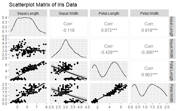 Create a Matrix of Scatterplots (pairs() Equivalent) in ggplot2 upper: Defines the plot type for the upper triangle of the matrix. Here, we use "cor" to display the correlation between variables.lower: Defines the plot type for the lower triangle of the matrix. Here, we use "smooth" to add a smoothed line to the scatterplots.
3. Customizing the Scatterplot MatrixThe ggpairs() function allows extensive customization. You can modify aesthetics, add themes, and incorporate additional information.
R
# Customizing the scatterplot matrix
ggpairs(iris[, 1:4],
        title = "Customized Scatterplot Matrix of Iris Data",
        upper = list(continuous = wrap("cor", size = 4)),
        lower = list(continuous = wrap("smooth", alpha = 0.5, size = 0.5)),
        diag = list(continuous = wrap("densityDiag", alpha = 0.5)),
        axisLabels = "show") +
  theme_minimal()
Output:
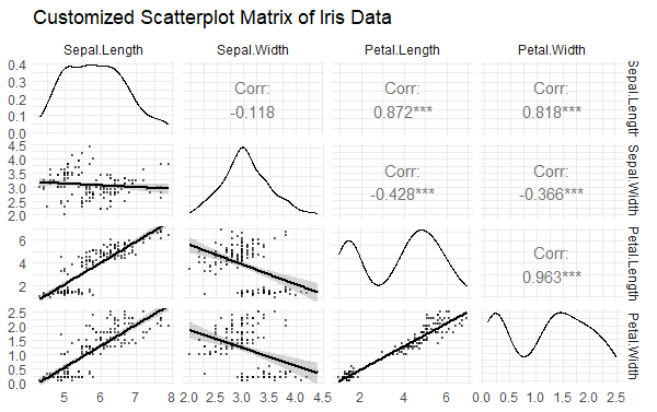 Create a Matrix of Scatterplots (pairs() Equivalent) in ggplot2 wrap(): Used to pass additional parameters to the plotting functions.diag: Customizes the diagonal plots, using densityDiag to show density plots.axisLabels: Controls whether axis labels are shown.
Adding Color by GroupYou can also color the points based on a grouping variable, such as Species in the iris dataset:
R
# Create a scatterplot matrix with color by group
ggpairs(iris,
        aes(color = Species),
        title = "Scatterplot Matrix of Iris Data by Species",
        upper = list(continuous = wrap("cor", size = 4)),
        lower = list(continuous = wrap("points", alpha = 0.7, size = 0.5)),
        diag = list(continuous = wrap("densityDiag", alpha = 0.5))) +
  theme_minimal()
Output:
 Create a Matrix of Scatterplots (pairs() Equivalent) in ggplot2 ConclusionCreating a matrix of scatterplots using ggplot2 and the GGally package allows for greater flexibility and customization compared to the base R pairs() function. By using ggpairs(), you can create aesthetically pleasing and informative scatterplot matrices that can be customized to suit your specific needs. Whether you’re exploring relationships between variables in a dataset or preparing a detailed visual analysis, the GGally package in combination with ggplot2 offers a powerful and versatile solution.
|