|
Seaborn is a powerful data visualization library in Python, built on top of Matplotlib. It provides a high-level interface for drawing attractive and informative statistical graphics. One of its functions, lmplot, is particularly useful for visualizing linear relationships between variables. However, customizing the appearance of these plots, such as changing the marker size, can sometimes be a bit tricky. This article will guide you through the process of changing the marker size in lmplot, ensuring your visualizations are both effective and aesthetically pleasing.
Understanding lmplotBefore diving into the specifics of changing marker sizes, it’s essential to understand what lmplot does.
lmplot combines regplot and FacetGrid, allowing you to plot data and regression model fits across a grid of subplots. This function is particularly useful for visualizing linear relationships and conditioning the plot on additional variables.
1. Creating ImplotTo get started with lmplot, you need some sample data. Seaborn provides built-in datasets that are useful for practice and demonstration. Let’s create a simple lmplot using the tips dataset.
Python
import seaborn as sns
import pandas as pd

df = sns.load_dataset("tips")
sns.lmplot(x="total_bill", y="tip", data=df)
Output:
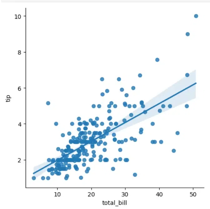 Implot Creation This code snippet creates a basic lmplot showing the relationship between the total bill and tip amounts in a restaurant dataset.
2. Why Change Marker Size?- Changing the marker size in a plot can significantly impact its readability and interpretability.
- Larger markers can make individual data points more visible, especially in dense plots.
- Conversely, smaller markers can reduce clutter when plotting a large number of points. Adjusting marker size is crucial for tailoring your visualizations to your specific dataset and audience.
Changing Marker Size in lmplot : Using scatter_kwsThe most straightforward way to change the marker size in lmplot is by using the scatter_kws parameter. This parameter allows you to pass keyword arguments directly to the underlying plt.scatter function used by lmplot.
Python
import seaborn as sns
import pandas as pd
df = sns.load_dataset("tips")
# Change marker size using scatter_kws
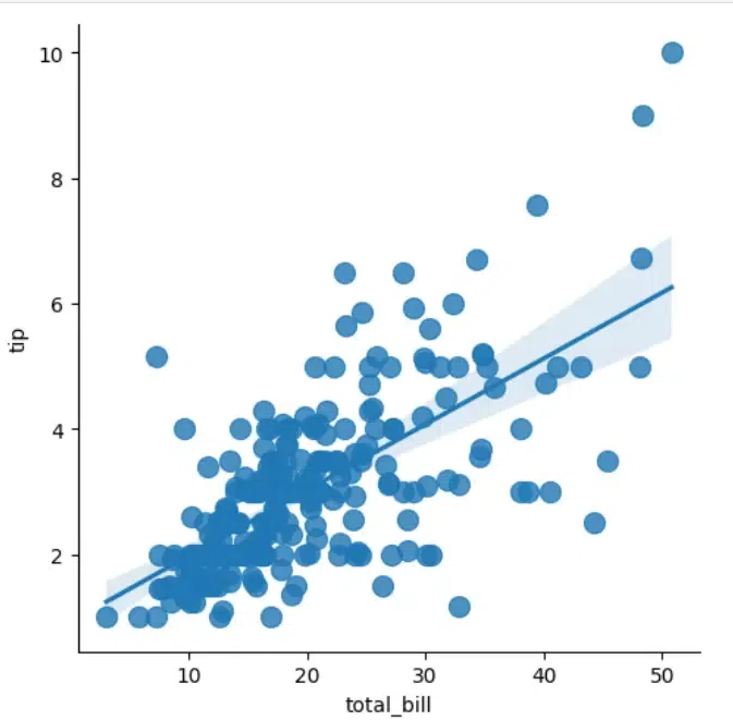
sns.lmplot(x="total_bill", y="tip", data=df, scatter_kws={"s": 100})
Output:
 Using scatter_kws In this example, the scatter_kws dictionary contains the key "s", which specifies the marker size. The value 100 can be adjusted to make the markers larger or smaller.
Customizing Marker Size Based on DataTo change the marker size in an lmplot, you can use the scatter_kws parameter. This parameter allows you to pass keyword arguments to the underlying scatter plot function, including s for marker size.
Python
# Customizing marker size
sns.lmplot(x="total_bill", y="tip", data=tips, scatter_kws={"s": 100})
plt.show()
Output:
 Custom marker size In this example, scatter_kws={“s”: 100} sets the marker size to 100. You can adjust this value to increase or decrease the marker size according to your preference.
1. Change Marker Color
Python
sns.lmplot(x="total_bill", y="tip", data=tips, scatter_kws={"s": 150, "color": "red"})
plt.show()
Output:
.webp) Color Change This code changes the marker color to red.
2. Add a Hue in Graph
Python
sns.lmplot(x="total_bill", y="tip", hue="smoker", data=tips, scatter_kws={"s": 150})
plt.show()
Output:
.webp) Adding a Hue This code adds a hue based on the smoker variable, differentiating smokers from non-smokers.
3. Adjust Regression Line
Python
sns.lmplot(x="total_bill", y="tip", data=tips, scatter_kws={"s": 150}, line_kws={"color": "blue", "lw": 2})
plt.show()
Output:
 Adjusted Regression Line This code customizes the regression line color to blue and its width to 2.
ConclusionChanging the marker size in lmplot is a simple yet powerful way to enhance your data visualizations. By using the scatter_kws parameter, you can easily adjust marker sizes to suit your needs. For more advanced customizations, combining lmplot with scatterplot allows for greater flexibility, enabling you to create more informative and visually appealing plots.
|