|
When working with time series data in Pandas, it is often necessary to highlight specific points or events in the data. One effective way to do this is by plotting vertical lines on the time series plot. In this article, we will explore how to plot a vertical line on a time series plot in Pandas, covering the necessary steps, functions, and parameters to achieve this.
Plotting Time Series Plot in PandasTime series plots display data points indexed in time order. They are particularly useful for analyzing trends, seasonal patterns, and anomalies in data over time. Vertical lines on these plots can denote significant events, such as changes in policy, milestones, or anomalies.
Creating a Time Series Plot with Pandas:
Pandas provides a powerful and easy-to-use interface for time series data manipulation and visualization. Let’s start by creating a simple time series plot.
Python
import pandas as pd
import matplotlib.pyplot as plt
import numpy as np

# Creating sample data
dates = pd.date_range(start='2023-01-01', periods=100, freq='D')
data = np.random.randn(100).cumsum()
df = pd.DataFrame(data, index=dates, columns=['Value'])
# Plotting the time series
df.plot()
plt.xlabel('Date')
plt.ylabel('Value')
plt.title('Time Series Plot')
plt.show()
Output:
 Time Series Plot with Pandas Adding Vertical Lines to the Time Series PlotThere are several ways to add vertical lines to a time series plot in Pandas. We will explore three methods: using axvline, vlines, and annotate functions from Matplotlib.
Method 1: Using axvlineThe axvline function in Matplotlib adds a vertical line across the entire plot. This method allows you to specify the x-coordinate (date) where the line should be drawn.
Python
ax = df.plot()
plt.xlabel('Date')
plt.ylabel('Value')
plt.title('Time Series Plot with Vertical Line')

# Add a vertical line at a specific date
plt.axvline(x=pd.to_datetime('2023-02-15'), color='r', linestyle='--', label='Important Date')
plt.legend()
plt.show()
Output:
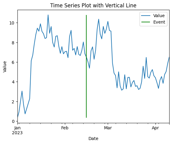
 Using axvline Method 2: Using vlinesThe vlines function allows for more customization, such as specifying the range of the vertical line.
Python
ax = df.plot()
plt.xlabel('Date')
plt.ylabel('Value')
plt.title('Time Series Plot with Vertical Line')

# Add a vertical line at a specific date with a specified range
plt.vlines(x=pd.to_datetime('2023-02-15'), ymin=df['Value'].min(), ymax=df['Value'].max(), color='g', linestyle='-', label='Event')
plt.legend()
plt.show()
Output:
 Using vlines Method 3: Using annotateThe annotate function can be used to add text annotations along with vertical lines.
Python
# Plot the time series data
ax = df.plot()
plt.xlabel('Date')
plt.ylabel('Value')
plt.title('Time Series Plot with Annotation')

# Add a vertical line and annotation
plt.axvline(x=pd.to_datetime('2023-02-15'), color='b', linestyle=':', label='Annotation Date')
plt.annotate('Event', xy=(pd.to_datetime('2023-02-15'), df['Value'].mean()), xytext=(pd.to_datetime('2023-02-15'), df['Value'].max()),
             arrowprops=dict(facecolor='black', shrink=0.05))
plt.legend()
plt.show()
Output:
 Using annotate Plotting Multiple Vertical Lines with Time Series Plot If you need to highlight multiple events, you can add multiple vertical lines by calling axvline for each event.
Python
# Specifying multiple dates for the vertical lines
event_dates = ['2023-02-01', '2023-02-15', '2023-03-01']
ax = df.plot()

# Adding multiple vertical lines
for event_date in event_dates:
    plt.axvline(x=event_date, color='green', linestyle='--', linewidth=1)

# Adding labels and title
plt.xlabel('Date')
plt.ylabel('Value')
plt.title('Time Series Plot with Multiple Vertical Lines')
plt.show()
Output:
 Multiple Vertical Lines with Time Series Plot ConclusionPlotting vertical lines on a time series plot in Pandas is a straightforward process that enhances the visualization by highlighting significant events or time points. By using Matplotlib’s axvline method, you can easily add and customize these lines to provide better insights into your data.
|