|
|
Plotly is a powerful graphing library that makes interactive, publication-quality graphs online using Python. One common task when creating time series plots is to remove empty dates from the x-axis, making the plot cleaner and more readable. In this article, we will go through the process of removing empty dates from the x-axis using Plotly. Key concepts of Plotly includes are as follows:
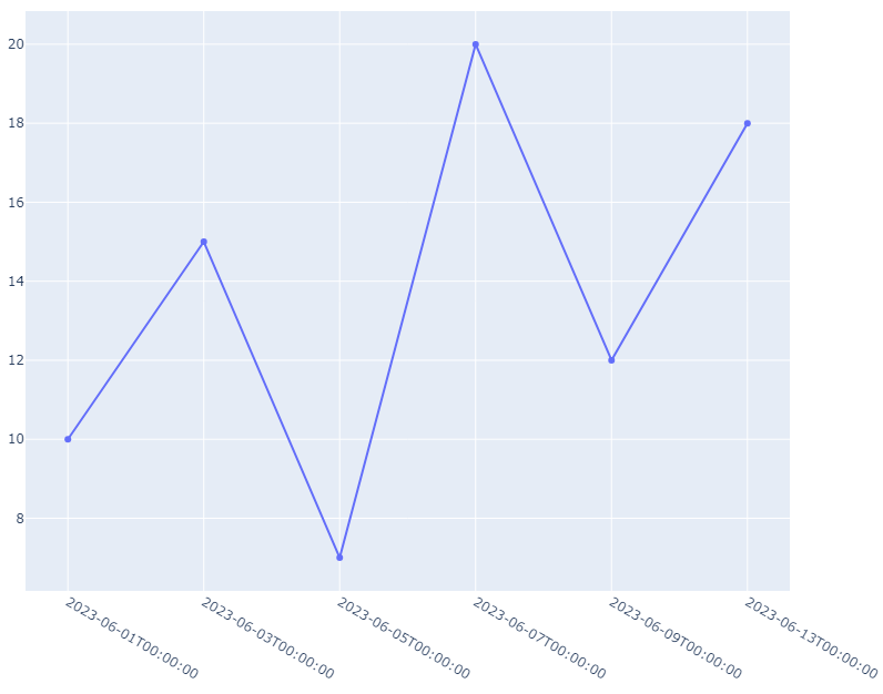
Removing Empty DatesTo remove empty dates from the x-axis, you can filter out the dates that do not have corresponding data points before plotting. This involves creating a list of dates and corresponding data points and then plotting only those dates that have data. Let us see a few different examples for a better understanding. Basic Line Plot with Empty DatesIn this example, we will create a data set with some missing dates. We will create a simple Line Plot graph by initializing the Figure() function. Then using the Scatter() function of plotly, we will create a graph where the x-axis will contain dates and the y-axis will contain the values. Then we will update the x-axis so that it does not show the space for the missing dates on the graph. For this, we will use the update_xaxes() function which will take two arguments. The type parameter will be set to ‘category’ which specifies that the x-axis should treat the dates as categorical data, which helps in treating each date as a distinct category rather than a continuous scale. The rangebreaks parameter defines a range break on the x-axis. Here, it specifies that the date Then the show() function is used to display the final graph in a new window. Output: Bacis Line Plot with Empty Dates Bar Chart with Empty DatesIn this example, we will create a data set with some missing date. We will create a simple Bar Chart graph by initializing the Figure() function. Then using the Bar() function of plotly, we will create a Bar graph where x-axis will contain dates and y-axis will contain the values. Then we will update the x-axis so that it does not show the space for the missing dates on the graph. For this, we will use the update_xaxes() function which will take two arguments. The type parameter will be set to ‘category’ which specifies that the x-axis should treat the dates as categorical data, which helps in treating each date as a distinct category rather than a continuous scale. The rangebreaks parameter defines a range break on the x-axis. Here, it specifies that the date Then the show() function is used to display the final graph in a new window. Output: .png) Bar Chart with Empty Dates ConclusionRemoving empty dates from the X axis in Plotly enhances the clarity and reliability of your visualizations, ensuring that your plots accurately represent time series data. By leveraging Plotly’s powerful features and understanding how to manipulate axes effectively, you can create informative and visually appealing plots for various applications. |
Reffered: https://www.geeksforgeeks.org
| Python |
| Related |
|---|
| |
| |
| |
| |
| |
Type: | Geek |
Category: | Coding |
Sub Category: | Tutorial |
Uploaded by: | Admin |
Views: | 19 |