|
|
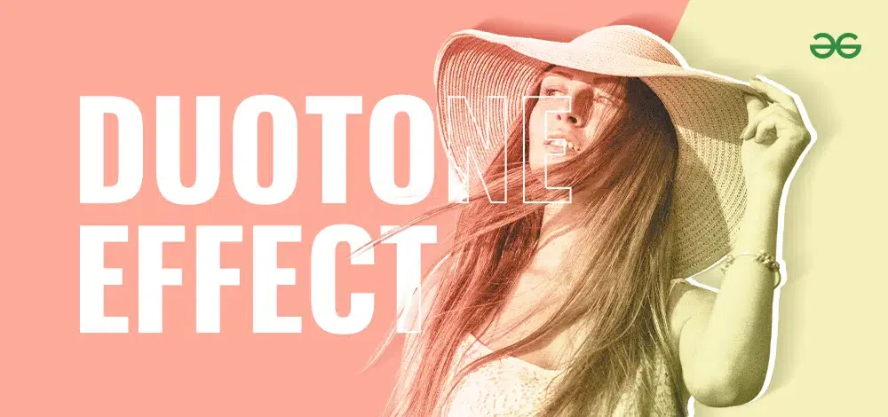
The duotone effect is a popular design trend that adds a unique and vibrant look to images by using two contrasting colors. In this article, we’ll explore how to create this eye-catching effect in your designs. Whether you’re a beginner or an experienced designer, learning the duotone effect can help you make striking visuals that stand out. We’ll guide you through the steps to achieve this effect, making your designs more engaging and modern. Duotone Effect Table of Content
What is Duotone Effect?The duotone effect involves using two contrasting colors to transform an image. Originally a cost-saving technique in printing, it has evolved with digital design into a popular artistic method. The duotone effect simplifies an image while emphasizing key elements through color contrast, making it both visually appealing and impactful. Origins of DuotoneDuotone started in the printing industry as a way to reduce costs by using two inks instead of four. It gained popularity for its ability to create striking visuals with limited resources. As digital design advanced, duotone transitioned from print to screens, maintaining its charm and gaining new dimensions in color usage and creativity. Why Duotone is So Popular TodayDuotone is very popular in design today for a few simple reasons: Modern LookDuotone makes designs look fresh and stylish. Stands OutUsing two contrasting colors makes images eye-catching and memorable. VersatileDuotone works great in many places, like websites, posters, and social media. Easy to DoTools like Photoshop and Canva make it simple to create duotone effects. Great for BrandingUsing duotone with brand colors helps make a brand’s look strong and consistent. These reasons make duotone a top choice for designers who want to create bold and attractive visuals. How to Create the Duotone EffectCreating a duotone effect might seem tricky, but it’s quite simple with the right steps. Here’s an easy guide for beginners: 1. Choosing Your ImageStart with a high-contrast black-and-white photo for the best results. High contrast makes the duotone effect more striking and clear. 2. Selecting ColorsPick two colors that complement each other and match your design’s theme. Contrasting colors like blue and orange, or red and teal, often look great. Choose colors that enhance the subject of your image and look good together. 3. Using Editing SoftwareUse tools like Adobe Photoshop, GIMP, or online platforms like Canva to create duotone images. These programs have features that make it easy to apply the duotone effect. 4. TipsExperiment with different color combinations and opacity settings to find a dynamic look. Canva’s user-friendly interface makes it easy to try out various styles before choosing the perfect combination. By following these steps, you can create stunning duotone images that enhance your designs. Adjusting Gradient in Duotone Effect1. Accessing the Gradient EditorAfter converting your image to grayscale and selecting Image > Mode > Duotone in Photoshop, you will see the Duotone Options dialog box. To adjust the gradient between the two chosen colors (Ink 1 and Ink 2), click on the gradient bar located under the color boxes for Ink 1 and Ink 2. 2. Modifying Color StopsThe Gradient Editor will open, displaying a range of color stops along the gradient bar. Color Stops: These are the markers along the gradient bar that define where specific colors begin and end. You can click on each color stop to select it, then adjust its position by dragging left or right along the gradient bar. 3. Adjusting Colors and PositionPositioning: Dragging a color stop left or right changes where its corresponding color starts and ends within the image. Color: Double-clicking on a color stop opens a color picker, allowing you to choose a new color for that stop. 4. Creating Smooth TransitionsTo create smooth transitions between colors, adjust the spacing between color stops. Dragging color stops closer together creates a more abrupt change, while spreading them apart creates a more gradual transition. 5. Using Preview OptionTo see how your adjustments affect the image in real-time, check the Preview option in the Gradient Editor. This allows you to make precise adjustments until you achieve the desired duotone effect Maintaining Contrast in Duotone Effect1. Contrast ImportanceDefinition: Contrast refers to the difference in brightness between the darkest and lightest parts of an image. Maintaining adequate contrast ensures that the duotone effect remains visually striking and the key elements in your image stand out effectively. 2. Adjusting Ink OpacityIn the Duotone Options dialog box, you can adjust the opacity of each ink (color) separately. Opacity: Increasing the opacity of Ink 1 or Ink 2 intensifies their respective colors, enhancing contrast within the duotone effect. Balance: Finding the right balance between the two inks is crucial for maintaining contrast. Adjusting opacity helps in achieving this balance, ensuring that neither color dominates too strongly. 3. Experimenting with Blending ModesFunction: Blending modes dictate how colors interact with each other and the underlying grayscale image. Use: Experimenting with different blending modes (e.g., Overlay, Soft Light) can significantly impact contrast and the overall appearance of your duotone image. 4. Previewing AdjustmentsConstantly preview your adjustments in Photoshop to evaluate how changes in gradient, color, and opacity affect contrast. This iterative process ensures that you achieve the desired visual impact for your duotone image. Tips for Creating Great Duotone Images1. Choosing the Right ColorsPick colors that match the mood you want to convey. Warm colors like reds and oranges can create energy, while cool colors like blues and greens can make things feel calm. 2. Balancing Contrast and ToneMake sure there’s enough contrast between your two colors so the image stands out. Avoid colors that are too similar, as they can make the image look flat and less interesting. 3. Enhancing Visual AppealAdd textures and overlays to make your duotone images more dynamic. Experiment with different opacity levels to create depth. Using textures can give your images a unique and tactile feel. Where to Use Duotone Images?Website DesignEnhance headers, backgrounds, and banners with bold duotone images to make your website visually appealing and guide viewer attention. Social Media GraphicsUse vibrant duotone images on Instagram, Facebook, and Twitter to make your posts more shareable and engaging. Print Media and AdvertisementsMake flyers, posters, and ads stand out with striking duotone designs, grabbing attention in crowded spaces. Benefits of Using Duotone Images
Examples of Duotone Design in Action
Creative Inspiration for DuotoneTo get inspired, look at design portfolios and websites like Behance and Dribbble. These platforms showcase innovative uses of the duotone effect and provide a wealth of ideas for your own projects. Seeing how other designers apply duotone can spark new ideas and help you push the boundaries of your creativity. ConclusionThe duotone effect is a powerful tool in the graphic designer’s arsenal, offering a blend of simplicity and sophistication. As trends come and go, duotone stands out for its ability to transform ordinary images into extraordinary visual statements. Whether you’re a seasoned designer or just starting out, experimenting with duotone can bring a fresh and dynamic look to your projects. Graphic Design Trend: Duotone – FAQsWhat is duotone graphic design?
Why is duotone popular in branding?
Can I create duotone designs without Photoshop?
What types of images work best for duotone?
How can I avoid overusing duotone in my designs?
|
Reffered: https://www.geeksforgeeks.org
| Design |
| Related |
|---|
| |
| |
| |
| |
| |
Type: | Geek |
Category: | Coding |
Sub Category: | Tutorial |
Uploaded by: | Admin |
Views: | 16 |