|
|
Adding horizontal lines to a bar chart in ggplot2 is a useful way to highlight specific values such as averages, thresholds, or any other reference lines. This article provides a comprehensive guide on how to add horizontal lines above bar charts in R using ggplot2, along with detailed examples and explanations. ggplot2 Basicsggplot2 is a powerful R package for creating a wide variety of static and interactive graphs. The package is based on the “grammar of graphics,” which provides a structured approach to describing and building plots. The basic building blocks of ggplot2 include:
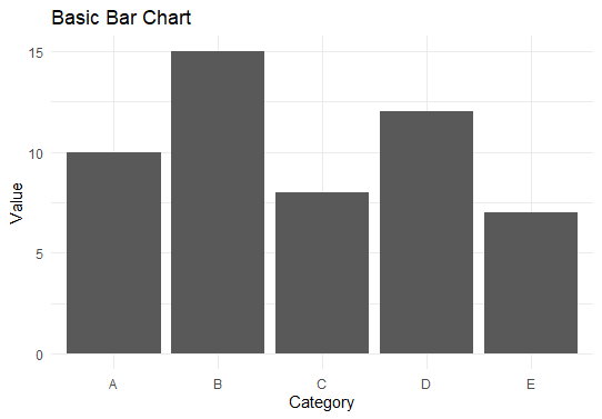
Now we will discuss step by step How to add a horizontal line above a bar chart using ggplot in R Programming Language. Step 1: Install and Load Necessary PackagesFirst, ensure you have ggplot2 installed and then load it: Step 2: Create Sample DataLet’s create a sample dataset for our bar chart: Output: category value Step 3: Basic Bar ChartWe will start by creating a basic bar chart using ggplot2: Output: How to add a horizontal line above a bar chart using ggplot Step 4: Adding a Horizontal LineTo add a horizontal line to the bar chart, use the geom_hline() function. Let’s add a horizontal line at y = 10: Output:  Add a horizontal line above a bar chart using ggplot Step 5: Adding Multiple Horizontal LinesYou can also add multiple horizontal lines to indicate different reference points. For example, let’s add lines at y = 10 and y = 12: Output: 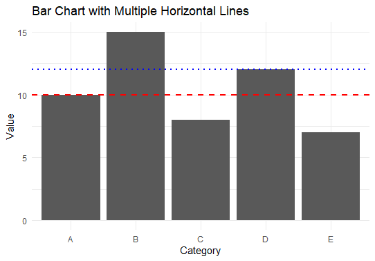 Add a horizontal line above a bar chart using ggplot Step 6: Dynamic Horizontal Line Based on DataYou can add a horizontal line based on a computed value, such as the mean of the value column: Output: 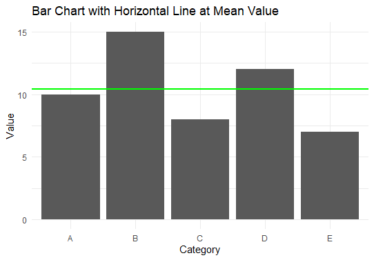 Add a horizontal line above a bar chart using ggplot This chart includes a solid green line at the mean value of the value column. This line provides a reference for the average value across all categories. ConclusionAdding horizontal lines to a bar chart in ggplot2 is a simple yet powerful way to enhance your visualizations by highlighting specific values or thresholds. By using geom_hline(), you can easily add single or multiple horizontal lines, and even dynamic lines based on computed values. This technique is invaluable for making your plots more informative and easier to interpret. |
Reffered: https://www.geeksforgeeks.org
| R Language |
Type: | Geek |
Category: | Coding |
Sub Category: | Tutorial |
Uploaded by: | Admin |
Views: | 15 |