|
Building a Tooltip Component with React Hooks is straightforward and effective. Tooltips are a common UI element used to provide additional information when a user hovers over or focuses on an element. In this article, we’ll build a Tooltip component using React Hooks.
PrerequisitesApproach- Implement tooltip functionality to display informational text on hover.
- Allow customization of tooltip content, position, and styling.
- Use React for rendering and state management with Hooks.
- Ensure tooltip accessibility for all users.
- Optimize the component for performance and smooth user experience.
Steps to Setup the ApplicationStep 1: Create a reactJS application by using this command
npx create-react-app myapp Step 2: Navigate to project directory
cd myapp Project Structure: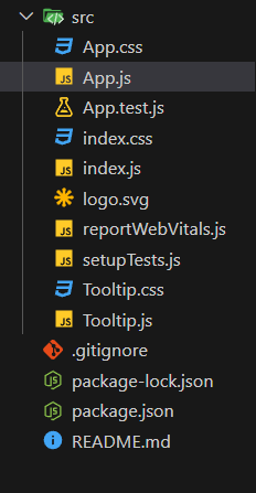 Updated dependencies The updated dependencies in package.json file will look like:
"dependencies": {
    "@testing-library/jest-dom": "^5.17.0",
    "@testing-library/react": "^13.4.0",
    "@testing-library/user-event": "^13.5.0",
    "react": "^18.3.1",
    "react-dom": "^18.3.1",
    "react-scripts": "5.0.1",
    "web-vitals": "^2.1.4"
  }
Example: Implementation to design a tooltip component.
CSS
/* Tooltip.css */
.tooltip-container {
    display: inline-block;
    position: relative;
  }

  .tooltip-box {
    position: absolute;
    padding: 8px;
    background-color: #333;
    color: #fff;
    border-radius: 4px;
    white-space: nowrap;
    z-index: 10;
  }

  .tooltip-top {
    bottom: 100%;
    left: 50%;
    transform: translateX(-50%);
    margin-bottom: 8px;
  }

  .tooltip-right {
    top: 50%;
    left: 100%;
    transform: translateY(-50%);
    margin-left: 8px;
  }

  .tooltip-bottom {
    top: 100%;
    left: 50%;
    transform: translateX(-50%);
    margin-top: 8px;
  }

  .tooltip-left {
    top: 50%;
    right: 100%;
    transform: translateY(-50%);
    margin-right: 8px;
  }
/* App.css */
 .App {
  text-align: center;
  padding: 50px;
  background-color: black; /* Set background color to black */
  color: white; /* Ensure text is visible on a black background */
}

.main-heading {
  font-size: 2.5em;
  margin-bottom: 10px;
  color: green; /* Set color to green */
}

.sub-heading {
  font-size: 1.5em;
  margin-bottom: 40px;
}

.tooltip-demo {
  display: flex;
  justify-content: space-around;
  flex-wrap: wrap;
  gap: 10px; /* Reduced gap to bring buttons closer */
}

.tooltip-demo button {
  padding: 10px 20px; /* Increase button size */
  font-size: 1.2em; /* Increase button text size */
  cursor: pointer;
  background-color: #444; /* Button background color */
  color: white; /* Button text color */
  border: none;
  border-radius: 5px;
  transition: background-color 0.3s;
}

.tooltip-demo button:hover {
  background-color: #555; /* Darker background on hover */
}
/* App.js */

import React from 'react';
import Tooltip from './Tooltip';
import './App.css';

const App = () => {
  return (
    <div className="App">
      <h1 className="main-heading">
        GeeksforGeeks
      </h1>
      <h2 className="sub-heading">
        Tooltip with React Hooks</h2>
      <div className="tooltip-demo">
        <Tooltip direction="top" content="Tooltip on Top">
          <button>Hover me (Top)</button>
        </Tooltip>
        <Tooltip direction="right" content="Tooltip on Right">
          <button>Hover me (Right)</button>
        </Tooltip>
        <Tooltip direction="bottom" content="Tooltip on Bottom">
          <button>Hover me (Bottom)</button>
        </Tooltip>
        <Tooltip direction="left" content="Tooltip on Left">
          <button>Hover me (Left)</button>
        </Tooltip>
      </div>
    </div>
  );
};

export default App;
/* Index.js */
import React from 'react';
import ReactDOM from 'react-dom/client';
import './index.css';
import App from './App';
import reportWebVitals from './reportWebVitals';

const root = ReactDOM.createRoot(document.getElementById('root'));
root.render(
  <React.StrictMode>
    <App />
  </React.StrictMode>
);

reportWebVitals();
/* Tooltip.js */
import React, { useState } from 'react';
import './Tooltip.css';

const Tooltip = ({ direction, content, children }) => {
  const [visible, setVisible] = useState(false);

  const showTooltip = () => setVisible(true);
  const hideTooltip = () => setVisible(false);

  return (
    <div className="tooltip-container"
                    onMouseEnter={showTooltip}
                    onMouseLeave={hideTooltip}>
      {visible && <div className={`tooltip-box tooltip-${direction}`}>
          {content}
      </div>}
      {children}
    </div>
  );
};

export default Tooltip;
Step to Run Application: Run the application using the following command from the root directory of the project
npm start Output: Your project will be shown in the URL http://localhost:3000/
.gif) Final Output
|