
|
|
Data visualization is a crucial aspect of data analysis, enabling data scientists and analysts to interpret complex data sets and derive meaningful insights. Among the myriad of Python libraries available for data visualization, Leather stands out for its simplicity and efficiency. This article delves into the features, capabilities, and usage of the Leather library, providing a comprehensive guide for those looking to create quick and effective visualizations. Table of Content Introduction to LeatherLeather is a Python charting library designed for users who need to create charts quickly and are less concerned with achieving perfect aesthetics. It is particularly useful for generating basic, yet informative, visualizations without the overhead of more complex libraries. Leather is known for its rough and ready approach, making it an ideal choice for rapid prototyping and exploratory data analysis. Key Features of Leather: Leather offers several features that make it a valuable tool for data visualization:
Installing LeatherTo get started with Leather, you need to install it via pip. Open your terminal or command prompt and run the following command: pip install leatherCreating Basic Charts with LeatherLeather supports several types of charts, including bar charts, line charts, scatter plots, and more. Below are examples of how to create some of these charts using Leather. 1. Bar ChartA bar chart represents the frequency of a category. Generally, there are two types of bar charts: the horizontal bar chart, also known as ‘Bars’ in this library, and the vertical bar chart, known as ‘Columns’. Now let’s first build a horizontal bar chart.
Output: Now, let’s build the vertical bar chart. The only change is to use the add_columns() function instead of the add_bars() function to add data to the graph. Here’s how to do it: Output: 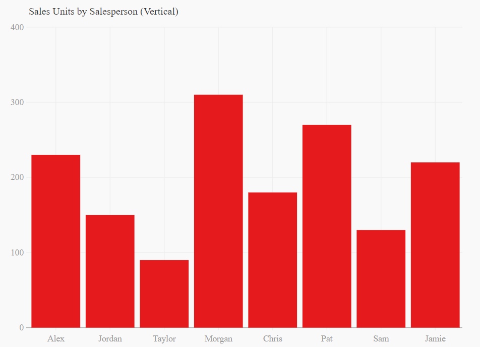 2. Scatter PlotA scatter plot is a type of visualization that displays points or data with respect to an x and y axis. Each point represents the values of two variables. This plot is used to understand the correlations between two variables and to identify patterns such as clusters, trends, or outliers.
Finally, to save and display the graph, we will use the to_svg() and display(SVG()) functions, just like before. Output:  3. Line PlotA line plot is a variation of the scatter plot where each data point is connected by a straight line. It is used to analyze trends and changes in a dataset over time. This type of plot is commonly employed in finance and stock analysis.
Output:  Mixed Plot With LeatherWe can also mix or integrate two different plots into a single plot. To do this we first will store our dummy data into two variables, then call plot functions like add_line() and add_dots() simultaneously. Output:  Mixed Plot With Leather As you can see in the above plot, since we used two different datasets, we are getting legend values as ‘Unnamed series’ because we didn’t specify labels for them. When combining different plots, it’s important to clearly label each plot to indicate what each specific series represents. And we can achieve this, along with many other customizations, by using styling. Let’s get into it. Customizing Charts With LeatherWhile Leather is designed for simplicity, it also offers some customization options to enhance the appearance of your charts. 1. Legends/LabelsTo add labels or legends to our mixed plot, we need to use the name parameter for each plot. Here’s how to do it for the above plot: Output:  2. Changing Plot ColorsYou might have wondered why every plot we’ve built so far is red. This is because red is the default colour for all plots in Leather. We need to use the fill_color parameter to change the colour when adding data to the plot. This feature is handy as it allows us to visualize data in the colour of our choice. For this example, let’s take the first plot we built, which was a horizontal bar plot, and change the colour from red to black by adding this parameter. Here’s how to do it: Output:  Changing Plot Colors 3. Creating dashed lines plotAs we can see in the line plot, it looks quite boring. Let’s make the lines dashed to improve its appearance. To do this, we will use the stroke_dasharray parameter inside the add_line() function. Let’s edit our previous line plot and add this parameter. Output:  Dashed lines plot Advanced Usage With Leather’s LibraryFor more advanced usage, Leather can be integrated with other data manipulation libraries such as Pandas. This allows for seamless data processing and visualization. Integrating with PandasHere’s an example of how to use Leather with Pandas to visualize a DataFrame: Output:  Integrating with Pandas ConclusionLeather is a powerful yet simple Python library for data visualization. Its ease of use, speed, and minimal dependencies make it an ideal choice for users who need to create charts quickly without worrying about perfect aesthetics. Whether you are a data scientist, analyst, or developer, Leather can help you visualize your data effectively and efficiently. By integrating Leather with other data manipulation libraries like Pandas, you can streamline your data analysis workflow and create informative visualizations with minimal effort. |
Reffered: https://www.geeksforgeeks.org
| AI ML DS |
Type: | Geek |
Category: | Coding |
Sub Category: | Tutorial |
Uploaded by: | Admin |
Views: | 17 |