|
Waterfall charts are a powerful visualization tool used to understand the cumulative effect of sequentially introduced positive or negative values. They are particularly useful in financial analysis, where they help illustrate how an initial value is affected by a series of intermediate positive or negative values, leading to a final value.
 Waterfall Chart This article will delve into the technical aspects of creating waterfall charts in Python, using various libraries and techniques.
Introduction to Waterfall ChartsWaterfall charts, also known as bridge charts, are a type of data visualization that helps in understanding the incremental changes in the value of a variable. They are commonly used in financial analysis to show how a starting value (such as net income) is affected by a series of positive and negative changes (such as revenue, expenses, taxes) to reach an ending value.
Components of a Waterfall ChartA waterfall chart is basically a graph that represents the cumulative effect of positive or negative values that are sequentially introduced on an initial starting value. Every data point in the series is denoted or represented by a vertical bar. These bars are colour-coded in different colours, usually green, blue, and red. These colours on the bars indicate whether they represent increases or decreases. In this section, you will explore about different components involved in a waterfall chart.
- Colour Coding: Typically, Negative values are represented by Red colour, and Positive values are represented by the Green color.
- Initial Value: It is the starting point of the waterfall chart.
- Intermediate Values: These can be either negative or positive, that are representing decreases or increases respectfully.
- Final Value: It is the ending point after accounting for all intermediate points.
Libraries for Creating Waterfall Charts in PythonSeveral Python libraries can be used to create waterfall charts, each offering different features and levels of customization. The most commonly used libraries include:
- Matplotlib: A comprehensive library for creating static, animated, and interactive visualizations in Python.
- Plotly: An interactive graphing library that makes it easy to create complex visualizations.
Creating Waterfall Charts with Matplotlib in PythonIn this section, you will go through the implementation of waterfall charts using python libraries like Matplotlib and Pandas in a step-by-step manner. Below is the complete python code which by running in the code editor will plot the waterfall charts.
Step 1: Install the Required Libraries
Firstly, Install the required libraries using pip for creating waterfall charts in python. Use “pip” if your operating system is Windows, and use “pip3” if your operating system is Mac/Linux.
pip/pip3 install matplotlib pip/pip3 install pandas Step 2: Import Libraries
Now Create a Python file in your system and start writing code. Start by importing the above required libraries Matplotlib and Pandas.
Python
# Importing python libraries
import matplotlib.pyplot as plt
import pandas as pd
Step 3: Create Sample Data
After importing necessary libraries, create a sample dataframe to visualize with the data and hence creating the waterfall charts.
Python
# sample data
sample_data = {
    'Category': ['Start', 'Sales', 'Returns', 'Marketing', 'R&D', 'End'],
    'Amount': [1000, 300, -50, -200, -100, 950]
}
df = pd.DataFrame(data)
Step 4: Calculate Intermediate Values
In this step, start by calculating the running total at each step as show below in the code:
Python
# Calculating the running totals
df['Running_Total'] = df['Amount'].cumsum()
df['Shifted_Total'] = df['Running_Total'].shift(1).fillna(0)
df['Position'] = df.apply(lambda row: row['Shifted_Total'] if row['Amount'] >= 0 else row['Running_Total'], axis=1)
Step 5: Plot the Waterfall Chart
In this final step, you should plot the waterfall chart using the python library Matplotlib and write code for Bars, lines to connects the bars, and adding the total labels and finally plotting the waterfallchart as shown below in the code:
Python
# plotting the waterfall chart
fig, ax = plt.subplots(figsize=(10, 6))

# code for Bars
ax.bar(df['Category'], df['Amount'], bottom=df['Position'], color=['#4CAF50' if x >= 0 else '#F44336' for x in df['Amount']])

# code for lines to connect the bars
for i in range(1, len(df)):
    ax.plot([i-1, i], [df['Running_Total'][i-1], df['Running_Total'][i]], color='black')

# Adding the total labels
for i, (total, amount) in enumerate(zip(df['Running_Total'], df['Amount'])):
    ax.text(i, total + (amount / 2), f'{total:.0f}', ha='center', va='bottom' if amount > 0 else 'top')

ax.set_title('Waterfall Chart')
ax.set_ylabel('Amount')
plt.show()
Output:
 Waterfall Chart Creating Waterfall Charts with PlotlyPlotly is another powerful library for creating interactive visualizations. It provides a more user-friendly interface for creating waterfall charts.
Step 1: Install Plotly
pip install plotly Step 2: Import Necessary Libraries and Prepare data
Python
import plotly.graph_objects as go
x = ["Sales", "Consulting", "Net Revenue", "Purchases", "Other Expenses", "Profit Before Tax"]
y = [60, 80, 0, -40, -20, 0]
Step 3: Create the Waterfall Chart
The key to creating a waterfall chart is to use a stacked bar chart where the bottom bar is invisible, making the top bar appear to float.
Python
fig = go.Figure(go.Waterfall(
    name="20",
    orientation="v",
    measure=["relative", "relative", "total", "relative", "relative", "total"],
    x=x,
    y=y,
    textposition="outside",
    text=["+60", "+80", "", "-40", "-20", "Total"],
    connector={"line":{"color":"rgb(63, 63, 63)"}}
))

fig.update_layout(title="Profit and Loss Statement 2018", showlegend=True)
fig.show()
Output:
.webp) Waterfall Chart using Plotly Customizing the Waterfall Chart Using PythonCustomizing the waterfall chart is basically modifying the charts to your specific needs and making it more visually appealing and informative. There are lot of customization options for us like:
- Colors: We can modify the color scheme of the waterfall chart based on personal preference or corporate branding.
- Labels: We can add more labels that are informative, which in turn provides additional context.
- Annotations: This helps us to highlight specific data points or any significant changes.
- Themes: We can use and apply different themes of the python library Matplotlib to change the overall look and feel of the water fall chart.
Python
import matplotlib.pyplot as plt
import pandas as pd

# below is the Sample data
sample_data = {
    'Category': ['Start', 'Sales', 'Returns', 'Marketing', 'R&D', 'End'],
    'Amount': [1000, 300, -50, -200, -100, 950]
}
df = pd.DataFrame(sample_data)

# Calculating the running totals
df['Running_Total'] = df['Amount'].cumsum()
df['Shifted_Total'] = df['Running_Total'].shift(1).fillna(0)
df['Position'] = df.apply(lambda row: row['Shifted_Total'] if row['Amount'] >= 0 else row['Running_Total'], axis=1)

# Plotting the customized waterfall chart
fig, ax = plt.subplots(figsize=(12, 8))

# Customizing colors as we like
colors = ['#5DA5DA', '#FAA43A', '#60BD68', '#F17CB0', '#B2912F', '#B276B2']

# code for Bars
ax.bar(df['Category'], df['Amount'], bottom=df['Position'], color=colors)

# code for lines to connect the bars
for i in range(1, len(df)):
    ax.plot([i-1, i], [df['Running_Total'][i-1], df['Running_Total'][i]], color='gray', linestyle='dashed')

# Adding the total labels
for i, (total, amount) in enumerate(zip(df['Running_Total'], df['Amount'])):
    ax.text(i, total + (amount / 2), f'{total:.0f}', ha='center', va='bottom' if amount > 0 else 'top', fontsize=10, weight='bold')

ax.set_title('Customized Waterfall Chart', fontsize=16)
ax.set_ylabel('Amount', fontsize=14)
ax.set_xlabel('Category', fontsize=14)
plt.show()
Output:
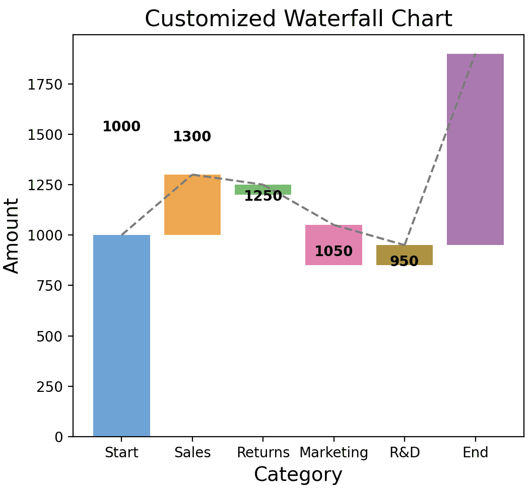 Customized Waterfall Chart Analyzing Waterfall ChartsWaterfall charts are not just for visualization; they are also powerful analytical tools. They can help you understand the transition in the quantitative value of an entity subjected to increments or decrements.
Key Analytical Features:
- Segmented Representation: Each segment of the waterfall chart represents a distinct component contributing to the overall change. This segmentation allows analysts to clearly see the magnitude and direction of each factor’s impact.
- Cumulative Effect: The cumulative effect of successive changes is visualized through the chart’s layout, providing a holistic view of how initial conditions evolve into the final outcome.
- Decision Support: By presenting data in a structured and sequential manner, waterfall charts support decision-making processes by revealing the sequence and magnitude of influences that shape outcomes.
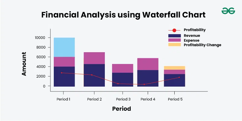
Use-Cases and Examples of Waterfall ChartFinancial Analysis: In financial contexts, waterfall charts are extensively used to dissect and illustrate changes in revenue, expenses, or profit margins across various periods or categories. Here’s how they facilitate in-depth analysis:
- Revenue Breakdown: For businesses, a waterfall chart can meticulously delineate how total revenue evolves from one period to another, accounting for factors such as sales growth, price changes, and currency fluctuations. Each segment of the waterfall represents a specific contributing factor, such as new product sales, price increases, or changes in customer base.
- Expense Allocation: Similarly, waterfall charts are adept at breaking down expenses into their constituent parts. This helps in understanding how costs have changed over time or in different departments. For instance, in a cost analysis, segments of the waterfall might represent fixed costs, variable costs, and one-time expenditures, providing clarity on where resources are allocated.
- Profitability Analysis: Analyzing profitability involves examining how various revenue and expense factors impact the bottom line. Waterfall charts can effectively visualize how changes in revenue and expenses contribute to shifts in profitability. This insight is invaluable for identifying areas of improvement or investment.
- Budget Variance: Waterfall charts are instrumental in comparing actual financial performance against budgeted targets. By segmenting deviations into categories such as revenue shortfalls or unexpected expenses, organizations can pinpoint where they have exceeded or fallen short of expectations, enabling timely corrective actions.
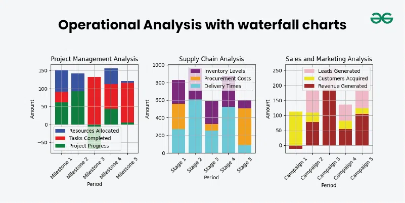
 Financial Analysis Operational Analysis: Beyond finance, waterfall charts find applications in operational analysis across different industries:
- Project Management: In project management, waterfall charts can illustrate the allocation of resources or the progress of tasks over time. They show how milestones are achieved or delayed, offering project managers insights into where adjustments are needed to keep projects on track.
- Supply Chain Analysis: Waterfall charts aid in visualizing changes in supply chain metrics such as inventory levels, procurement costs, and delivery times. Each segment of the waterfall represents a stage in the supply chain process, highlighting areas of efficiency or bottlenecks that need addressing.
- Sales and Marketing: For sales and marketing teams, waterfall charts can track the effectiveness of marketing campaigns or sales initiatives. They demonstrate how leads are converted into customers or how promotional efforts impact revenue generation, guiding strategies for future campaigns.
 Operational Analysis ConclusionWaterfall charts are a versatile and powerful tool for visualizing the cumulative effect of sequentially introduced positive or negative values. Python offers several libraries to create these charts, each with its own strengths and customization options. Whether you choose Matplotlib for its versatility, Plotly for its interactivity, or WaterfallCharts for its simplicity, you can create informative and visually appealing waterfall charts to aid in your data analysis.
|