|
|
Data visualization is a powerful tool for exploring and understanding data. It allows us to visually represent data in a meaningful way, making it easier to identify patterns, trends, and relationships. Seaborn is a Python data visualization library based on Matplotlib that provides a high-level interface for drawing attractive and informative statistical graphics. In this article, we will explore the basics of data visualization using Seaborn and discuss some of the common types of plots it offers. Table of Content
What is Data Visualization Using Seaborn?Seaborn is a Python visualization library based on matplotlib that provides a high-level interface for drawing attractive statistical graphics. It is built on top of matplotlib and seamlessly integrates with pandas data structures, making it an ideal choice for visualizing data from data frames and arrays. Types Of Seaborn PlotsBelow, are the plots those we discuss in this article.
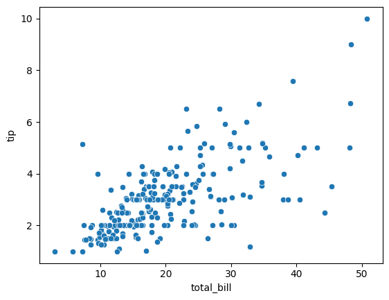
Relational Plots in SeabornScatter Plot , Line Plot and Relational Plot are contained in the category of Relational Plots in Seaborn. 1. Scatter PlotA scatter plot is a type of graph that uses Cartesian coordinates to display values for two variables for a set of data. Points on the plot indicate the values of the variables, allowing for visualization of any correlation or pattern. We create a scatter plot using the “total_bill” column for the x-axis and the “tip” column for the y-axis from the “tips” dataset using the Output: 2. Line plotA line plot is a type of graph that displays data points connected by straight lines, showing trends over a continuous interval or time period. It is useful for visualizing changes and trends in data over time. We can create a line plot using the “size” column (number of people at the table) for the x-axis and the “tip” column for the y-axis from the “tips” dataset using Output:  3. Relational Plot (relplot):A relational plot (relplot) is a versatile function in seaborn for creating scatter and line plots, with additional capabilities for faceting data into multiple subplots. It simplifies the creation of complex visualizations by handling various plot types and layouts automatically. A relational plot using Seaborn to visualize some data. This code creates a relational plot that uses total_bill and tip from the tips dataset, with points colored by the smoker variable.
 Categorical Plots in SeabornBar Plot ,Count Plot, Box Plot , Violin Plot , Strip Plot , Swarm Plot are some of the categorical plots in Seaborn. 1. Bar Plot (barplot):A bar plot (barplot) displays categorical data with rectangular bars, where the length of each bar represents the value of the corresponding category. It is useful for comparing quantities across different categories. This code creates a bar plot using the tips dataset, showing the average total_bill for each day.
 2. Count Plot (countplot):A count plot (countplot) is a bar plot that shows the frequency of occurrences for each category in a categorical variable. It visualizes the count of each unique value in the data. This code generates a count plot showing the number of occurrences for each day in the tips dataset.
 3. Box Plot (boxplot):A box plot (boxplot) displays the distribution of a dataset through its quartiles, highlighting the median, interquartile range, and potential outliers. It provides a visual summary of the data’s central tendency, dispersion, and skewness. This code creates a box plot using the tips dataset, displaying the distribution of total_bill for each day.
 4. Violin Plot (violinplot):A violin plot (violinplot) combines a box plot with a kernel density plot, showing the distribution, probability density, and central tendencies of the data. It provides a detailed view of the data’s distribution, highlighting variations and multimodalities. This code creates a violin plot showing the distribution of total_bill for each day in the tips dataset.
 5. Strip Plot (stripplot):A strip plot (stripplot) displays individual data points for one or more categorical variables, often overlaid on a box or violin plot. It shows the distribution and concentration of data points, highlighting any potential outliers. This code generates a strip plot, showing all total_bill values for each day in the tips dataset as individual points. Output:  6. Swarm PlotA swarm plot displays individual data points for one or more categorical variables, similar to a strip plot, but adjusts points to avoid overlap. It provides a clear view of the distribution and density of the data. This code creates a swarm plot, showing the distribution of total_bill for each day with non-overlapping points. Output  Distribution Plots in Seaborn1. Histogram (histplot):A histogram (histplot) displays the distribution of a continuous variable by dividing data into bins and plotting the frequency of data points in each bin. It provides insights into the data’s central tendency, dispersion, and shape. This code generates a histogram showing the distribution of total_bill in the tips dataset. Output  2. Kernel Density Estimate Plot (kdeplot):A kernel density estimate plot (kdeplot) visualizes the probability density function of a continuous variable by smoothing the histogram with a kernel function. It provides a smooth representation of the data’s distribution, allowing for better understanding of its shape and characteristics. This code creates a Kernel Density Estimate (KDE) plot, which is a smoothed version of the histogram, showing the distribution of total_bill. Output  3. Distribution Plot (displot):A distribution plot (displot) is a versatile seaborn function that allows for visualization of univariate distributions. It can combine histograms, kernel density estimates, and rug plots to provide insights into the distribution of a single variable. This code generates a distribution plot using the KDE method to show the distribution of total_bill in the tips dataset. Output  4. Empirical Cumulative Distribution Function Plot (ecdfplot):An empirical cumulative distribution function plot (ecdfplot) displays the cumulative distribution of a continuous variable based on the observed data points. It shows how the data is spread across different percentiles and can be useful for comparing distributions or assessing goodness-of-fit. This code creates an Empirical Cumulative Distribution Function (ECDF) plot, showing the proportion of data points less than or equal to each total_bill value. Output  5. Rug Plot (rugplot):A rug plot (rugplot) is a simple plot that displays individual data points along a single axis, usually the x-axis, as small lines or ticks. It provides a visual representation of the data distribution and density, often used in combination with other types of plots like histograms or KDE plots. This code generates a rug plot, showing individual total_bill values as small vertical lines along the x-axis. Output  Matrix Plots in Seaborn1. Heatmap (heatmap):A heatmap (heatmap) is a graphical representation of data where values in a matrix are represented as colors. It’s often used to visualize the magnitude of values in a matrix, allowing patterns and correlations to be easily identified. This code creates a heatmap using the flights dataset, showing the number of passengers each month over the years. Output  2. Cluster Map (clustermap):A cluster map (clustermap) is a heatmap that organizes rows and columns of a dataset based on their similarity, often using hierarchical clustering. It’s useful for identifying patterns and relationships in complex datasets by grouping similar rows and columns together. This code generates a cluster map, which clusters both rows and columns based on similarity, using the flights dataset. Output  Pair Grid (PairGrid) in Seaborn1. Pair Plot (pairplot):A pair plot (pairplot) creates a grid of scatterplots and histograms for each pair of variables in a dataset, allowing for visual exploration of relationships and distributions between variables. It’s particularly useful for identifying patterns and correlations in multivariate data. This code creates a pair plot, showing pairwise relationships between all numerical variables in the tips dataset. Output: 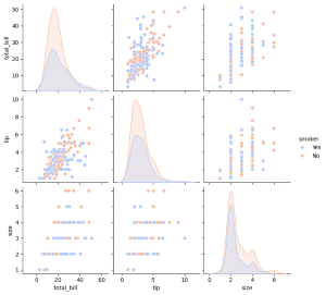 Data visualization is a crucial aspect of data analysis, providing insights and understanding that raw data alone cannot offer. Seaborn, with its high-level interface and seamless integration with pandas, makes creating complex and informative visualizations straightforward. By exploring various types of plots, such as relational, categorical, distribution, matrix, and pair grid plots, users can effectively communicate their data’s story. Relational plots like scatter and line plots help in identifying relationships between variables. Categorical plots, including bar plots, count plots, and box plots, are essential for visualizing data distributions across different categories. Distribution plots such as histograms and KDE plots provide a deeper understanding of data spread and density. Matrix plots, including heatmaps and cluster maps, are invaluable for visualizing data in matrix form, revealing patterns and correlations. Finally, pair grids facilitate the exploration of relationships between multiple variables simultaneously. Incorporating Seaborn into your data analysis toolkit allows for the creation of clear, attractive, and informative visualizations, making it easier to interpret complex datasets and make data-driven decisions. |
Reffered: https://www.geeksforgeeks.org
| AI ML DS |
Type: | Geek |
Category: | Coding |
Sub Category: | Tutorial |
Uploaded by: | Admin |
Views: | 21 |