|
|
Visualizing weather data is essential for understanding trends, patterns, and anomalies in meteorological information. R, with its robust packages for data manipulation and visualization, offers powerful tools to create insightful weather data visualizations. This article will guide you through the process of visualizing weather data in R, covering data acquisition, preprocessing, and creating various types of visualizations. Objectives and GoalsThe primary objective of this article is to explore weather data visualization techniques and develop a forecasting model using R Programming Language. By exploring a dataset containing historical weather information, we try to demonstrate the power of data visualization in understanding trends and patterns, as well as the effectiveness of forecasting models in predicting future weather conditions. Dataset Link: Weather History The weather dataset has various columns such as:
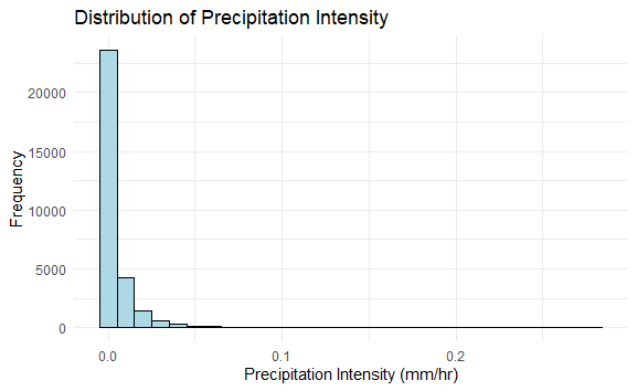
We’re using the weather dataset for our analysis and predictions. By this, we can make sure that our results are reliable and stay the same without adding any extra data from outside sources. Step 1: Load Required Libraries and DatasetLoads the necessary libraries ggplot2 and forecast into the R environment. These libraries contain functions and tools that we’ll use for data visualization and forecasting, respectively. Here, we read the weather dataset from the specified file path using the read.csv() function. Step 2: Display the Structure of the DatasetIt displays the structure of the weather_data dataset, showing information about its variables, data types, and other properties. It helps us to understand the structure of the dataset we’re working with. Output: 'data.frame': 96453 obs. of 12 variables: Step 3: Visualization of Weather DataNow we will plot the visualization of our Weather Data to get some valid pieces of information. Histogram of Precipitation IntensityA histogram of precipitation intensity reveals the distribution of precipitation events, highlighting the most common precipitation intensities and indicating the range of values. Output: Weather Data Visualization Scatter Plot of Wind Speed vs. TemperatureA scatter plot shows the relationship between wind speed and high temperature. This can help identify any correlations between wind conditions and temperature changes. Output: 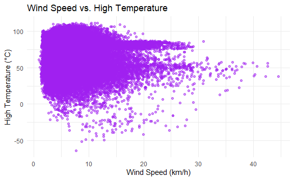 Weather Data Visualization Bar Plot of Precipitation TypesA bar plot displays the frequency of different types of precipitation (e.g., rain, snow), providing an overview of the distribution of precipitation types within the dataset. Output: 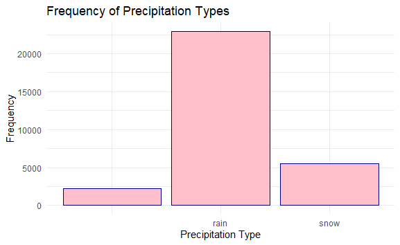 Weather Data Visualization Histogram with Density PlotWe can plot the distribution of temperatures across the dataset, with the histogram showing the frequency of different temperature ranges. Output: 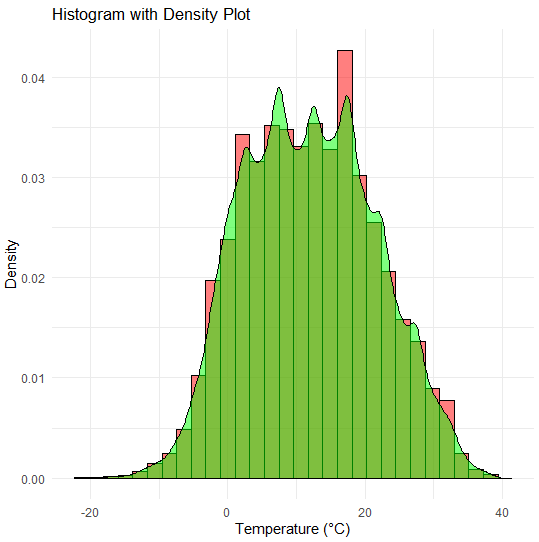 Weather Data Visualization The spread of the histogram and density plot illustrates the variability or range of temperatures present in the dataset. A wider spread indicates a greater variability in temperature readings, while a narrower spread suggests more consistency in temperature values. ConclusionVisualizing weather data in R allows you to uncover trends, patterns, and anomalies in meteorological data. By leveraging packages like ggplot2, Plotly, and dygraphs, you can create both static and interactive visualizations that provide valuable insights. Whether you’re analyzing temperature trends, humidity levels, or wind speeds, R offers the tools you need to effectively visualize and interpret weather data. |
Reffered: https://www.geeksforgeeks.org
| AI ML DS |
Type: | Geek |
Category: | Coding |
Sub Category: | Tutorial |
Uploaded by: | Admin |
Views: | 18 |