|
Cards are a fundamental UI component in web development, used to display large amounts of information in a concise format. They serve as containers for various types of content, such as text, images, and links. Using cards on a website can easily attract user attention and help users understand the content of the website. We will see how to create a card with CSS
 Preview image card Approach- First, create a basic HTML structure then inside the <body> tag, add a div element with the class “card”.
- Then add an img element using the <img> tag and give it a class name like “card-img”. In this card, you can add some more content like card description, lists a button, etc.
- Style the card using CSS. Here you can style the card class with background color, border radius, box shadow, width, and transition effects for hover interactions.
- For responsiveness, you can use the CSS media query which helps to adjust the card’s width and content padding for smaller screens.
- In the JavaScript part create a function toggleModal(modalId) to show and hide the modal, It should get the model element by ID and check if the modal is currently displayed if displayed, hide it and change the button text to “Read More…” or if hidden, show it and change the button text to “Show Less…”.
- And also create a function closeModal(modalId) to close the modal when the close button is clicked.
Example: The example code below shows how to create a card with CSS.
HTML
<!DOCTYPE html>
<html lang="en">
<head>
<meta charset="UTF-8">
<meta name="viewport"
content="width=device-width, initial-scale=1.0">
<title>Interactive Cards</title>
<link rel="stylesheet" href="styles.css">
</head>
<body>
<h2 class="main-heading">
How to create a "card" with CSS
</h2>
<!-- Card Container -->
<div class="card-container">
<!-- First Card -->
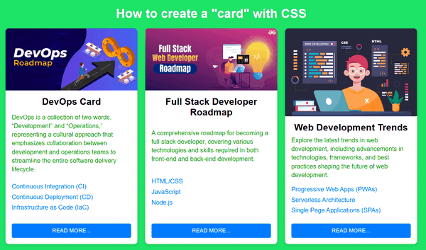
<div class="card">
<img src=
"https://media.geeksforgeeks.org/wp-content/uploads/20230416201559/DevOps-Roadmap.webp"
alt="Card image" class="card-img">
<div class="card-content">
<h2 class="card-title">
DevOps Card
</h2>
<p class="card-description">
DevOps is a collection of two words,
“Development” and “Operations,”
representing a cultural approach that
emphasizes collaboration between
development and operations teams to
streamline the entire software
delivery lifecycle.
</p>
<ul class="card-list">
<li>Continuous Integration (CI)</li>
<li>Continuous Deployment (CD)</li>
<li>Infrastructure as Code (IaC)</li>
</ul>
<button class="card-button"
onclick="toggleModal(1)">
Read More...
</button>
</div>
</div>
<!-- Second Card -->
<div class="card">
<img src=
"https://media.geeksforgeeks.org/wp-content/uploads/20231207165628/Full-Stack-Developer-Roadmap.webp"
alt="Card image" class="card-img">
<div class="card-content">
<h2 class="card-title">
Full Stack Developer Roadmap
</h2>
<p class="card-description">
A comprehensive roadmap for becoming a
full stack developer, covering various
technologies and skills required in
both front-end and back-end development.
</p>
<ul class="card-list">
<li>HTML/CSS</li>
<li>JavaScript</li>
<li>Node.js</li>
</ul>
<button class="card-button"
onclick="toggleModal(2)">
Read More...
</button>
</div>
</div>
<!-- Third Card -->
<div class="card">
<img src=
"https://media.geeksforgeeks.org/wp-content/uploads/20240308154942/web-(1).jpg"
alt="Card image"
class="card-img">
<div class="card-content">
<h2 class="card-title">
Web Development Trends
</h2>
<p class="card-description">
Explore the latest trends in web development,
including advancements in technologies,
frameworks, and best practices shaping
the future of web development.
</p>
<ul class="card-list">
<li>Progressive Web Apps (PWAs)</li>
<li>Serverless Architecture</li>
<li>Single Page Applications (SPAs)</li>
</ul>
<button class="card-button" onclick="toggleModal(3)">
Read More...
</button>
</div>
</div>
</div>
<!-- Modals -->
<div id="modal-1" class="modal">
<div class="modal-content">
<span class="close"
onclick="closeModal(1)">
×
</span>
<h2 class="extra-heading">
DevOps Card
</h2>
<p class="extra-paragraph">
Detailed information about DevOps,
including tools, best practices,
and how it benefits the software
development lifecycle...
</p>
</div>
</div>
<div id="modal-2" class="modal">
<div class="modal-content">
<span class="close"
onclick="closeModal(2)">
×
</span>
<h2 class="extra-heading">
Full Stack Developer Roadmap
</h2>
<p class="extra-paragraph">
In-depth guide and resources for becoming
a proficient full stack developer, covering
both front-end and back-end technologies...
</p>
</div>
</div>
<div id="modal-3" class="modal">
<div class="modal-content">
<span class="close"
onclick="closeModal(3)">
×
</span>
<h2 class="extra-heading">
Web Development Trends
</h2>
<p class="extra-paragraph">
Latest trends in web development,
such as advancements in Progressive
Web Apps (PWAs), serverless
architecture, and more...
</p>
</div>
</div>
<script src="script.js"></script>
</body>
</html>
/* General styles */
body {
    font-family: Arial, sans-serif;
    background: #1de366;
    display: flex;
    flex-direction: column;
    align-items: center;
    margin: 0;
    padding: 20px;
    box-sizing: border-box;
}

.main-heading {
    font-size: 2em;
    margin-bottom: 20px;
    color: #fff;
    text-align: center;
}

/* Card Container */
.card-container {
    display: flex;
    flex-wrap: wrap;
    justify-content: center;
    gap: 20px;
}

/* Card styles */
.card {
    background-color: #fff;
    border-radius: 8px;
    box-shadow: 0 4px 8px rgba(0, 0, 0, 0.1);
    width: 340px;
    overflow: hidden;
    text-align: center;
    transition: transform 0.2s;
    cursor: pointer;
    display: flex;
    flex-direction: column;
}

.card:hover {
    transform: scale(1.05);
}

.card-img {
    width: 100%;
    height: auto;
}

.card-content {
    flex: 1;
    padding: 16px;
    display: flex;
    flex-direction: column;
    justify-content: space-between;
}

.card-title {
    font-size: 1.5em;
    margin: 0 0 8px 0;
}

.card-description {
    font-size: 1em;
    color: #13a513;
    margin: 0 0 16px 0;
    text-align: left;
    line-height: 1.4;
}

.card-description:hover {
    color: #1de366;
}

.card-list {
    text-align: left;
    padding: 0;
    margin: 0 0 16px 0;
    list-style-type: disc;
    list-style-position: inside;
}

.card-list li {
    margin-bottom: 8px;
    list-style: none;
    color: #007bff;
}

.card-button {
    background-color: #007bff;
    color: #fff;
    border: none;
    border-radius: 4px;
    padding: 10px 20px;
    cursor: pointer;
    text-transform: uppercase;
    font-size: 0.9em;
}

.card-button:hover {
    background-color: #0056b3;
}

/* Modal styles */
.modal {
    display: none;
    position: fixed;
    z-index: 1;
    left: 0;
    top: 0;
    width: 100%;
    height: 100%;
    overflow: auto;
    background-color: rgb(0, 0, 0);
    background-color: rgba(0, 0, 0, 0.4);
    padding-top: 60px;
}

.modal-content {
    background-color: #fefefe;
    margin: 5% auto;
    padding: 20px;
    border: 1px solid #888;
    width: 80%;
    max-width: 500px;
    border-radius: 8px;
}

.close {
    color: #aaa;
    float: right;
    font-size: 28px;
    font-weight: bold;
}

.close:hover,
.close:focus {
    color: black;
    text-decoration: none;
    cursor: pointer;
}

.extra-heading {
    font-size: 1.5em;
    margin-bottom: 15px;
    color: #1a93f5;
    margin-left: 4rem;
}

.extra-paragraph {
    color: green;
    font-size: 1em;
    margin-bottom: 15px;
}

/* Responsive styles */
@media (max-width: 600px) {
    .card {
        width: calc(50% - 20px);
    }
}
function toggleModal(modalId) {
    const modal = document.getElementById(`modal-${modalId}`);
    const button = document.querySelector(`.card-container
                                           .card:nth-child(${modalId})
                                           .card-button`);

    if (modal.style.display === "block") {
        modal.style.display = "none";
        button.textContent = "Read More...";
    } else {
        modal.style.display = "block";
        button.textContent = "Show Less...";
    }
}

function closeModal(modalId) {
    const modal = document.getElementById(`modal-${modalId}`);
    modal.style.display = "none";
    const button = document.querySelector(`.card-container
                .card:nth-child(${modalId}) .card-button`);
    button.textContent = "Read More...";
}
Output:
|
-(3).png)