|
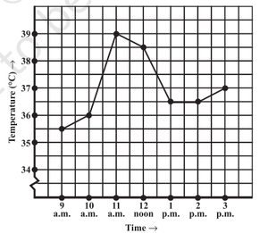
Question 1: The following graph shows the temperature of a patient in a hospital, recorded every hour.
(i) What was the patient’s temperature at 1 p.m.? Solution:
(ii) When was the patient’s temperature 38.5° C? Solution:
(iii) The patient’s temperature was the same two times during the period given. What were these two times? Solution:
(iv) What was the temperature at 1.30 p.m.? How did you arrive at your answer? Solution:
(v) During which periods did the patients’ temperature showed an upward trend? Solution:
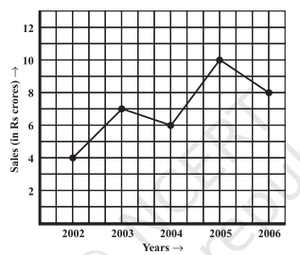
Question 2: The following line graph shows the yearly sales figures for a manufacturing company.
(a) What were the sales in (i) 2002 (ii) 2006? Solution:
(b) What were the sales in (i) 2003 (ii) 2005? Solution:
(c) Compute the difference between sales in 2002 and 2006. Solution:
(d) In which year was there the greatest difference between the sales as compared to its previous year? Solution:
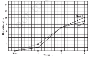
Question 3: For an experiment in Botany, two different plants, plant A and plant B were grown under similar laboratory conditions. Their heights were measured at the end of each week for 3 weeks. The results are shown in the following graph.
(a) How high was Plant A after (i) 2 weeks (ii) 3 weeks? Solution:
(b) How high was Plant B after (i) 2 weeks (ii) 3 weeks? Solution:
(c) How much did Plant A grow during the 3rd week? Solution:
(d) How much did Plant B grow from the end of the 2nd week to the end of the 3rd week? Solution:
(e) During which week did Plant A grow most? Solution:
(f) During which week did Plant B grow least? Solution:
(g) Were the two plants of the same height during any week shown here? Specify. Solution:
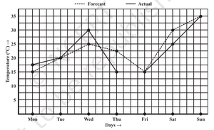
Question 4: The following graph shows the temperature forecast and the actual temperature for each day of a week.
(a) On which days was the forecast temperature the same as the actual temperature? Solution:
(b) What was the maximum forecast temperature during the week? Solution:
(c) What was the minimum actual temperature during the week? Solution:
(d) On which day did the actual temperature differ the most from the forecast temperature? Solution:
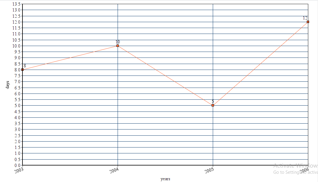
Question 5: Use the tables below to draw linear graphs.(a) The number of days a hillside city received snow in different years.
Solution:
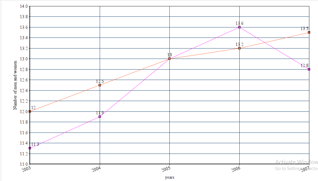
(b) Population (in thousands) of men and women in a village in different years.
Solution:
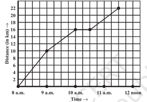
Question 6: A courier-person cycles from a town to a neighboring suburban area to deliver a parcel to a merchant. His distance from the town at different times is shown by the following graph.
(a) What is the scale taken for the time axis? Solution:
(b) How much time did the person take for the travel? Solution:
(c) How far is the place of the merchant from the town? Solution:
(d) Did the person stop on his way? Explain. Solution:
(e) During which period did he ride fastest? Solution:
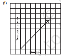
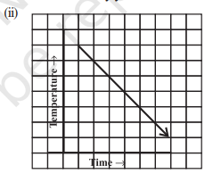
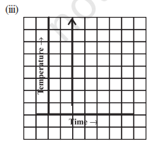
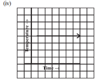
Question 7: Can there be a time-temperature graph as follows? Justify your answer.(i)
Solution:
(ii)
Solution:
(iii)
Solution:
(iv)
Solution:
|
Reffered: https://www.geeksforgeeks.org
| Class 8 |
Type: | Geek |
Category: | Coding |
Sub Category: | Tutorial |
Uploaded by: | Admin |
Views: | 12 |