|
Building web interfaces that are both visually appealing and accessible across various browsers and devices can be challenging. One key aspect of creating robust web designs is feature detection.
CSS provides a powerful tool for feature detection through the @supports rule.
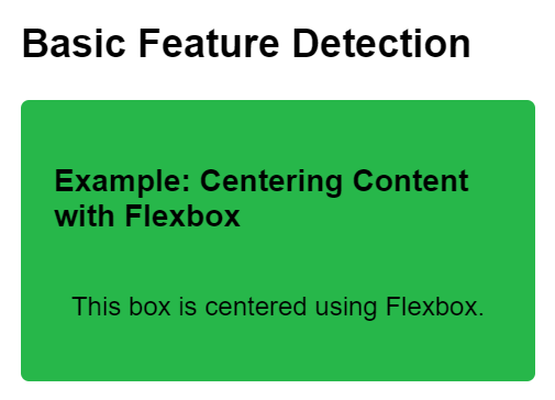
Basic Feature DetectionBasic feature detection involves using the @supports rule to check whether a specific CSS property or value is supported by the browser. This approach is ideal for applying styles that rely on fundamental CSS features.
Syntax:@supports (property: value) {
/* CSS rules to apply when the property:value pair is supported */
}Example: Centering Content with Flexbox
HTML
<!DOCTYPE html>
<html lang="en">

<head>
    <meta charset="UTF-8">
    <meta name="viewport"
          content="width=device-width, initial-scale=1.0">
    <title>Feature Detection with @supports</title>
    <style>
        @supports (display: flex) {
            .flex-container {
                display: flex;
                justify-content: center;
            }
        }

        body {
            font-family: Arial, sans-serif;
            margin: 0;
            padding: 20px;
        }

        h2 {
            margin-top: 0;
        }

        .box {
            background-color: #27b74a;
            padding: 20px;
            margin-bottom: 20px;
            border-radius: 5px;
        }
    </style>
</head>

<body>
    <h2>Basic Feature Detection</h2>
    <div class="box">
        <h3>Example: Centering Content with Flexbox</h3>
        <div class="flex-container">
            <p>This box is centered using Flexbox.</p>
        </div>
    </div>
</body>

</html>
Output:
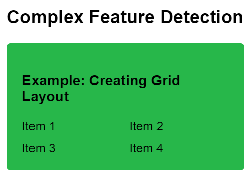
Complex Feature DetectionComplex feature detection allows for more sophisticated checks by using logical operators (and, or, not) within the @supports query. This approach is useful for scenarios where feature support is more nuanced or involves multiple properties.
Syntax:@supports (property1: value1) and (property2: value2) {
/* CSS rules to apply when property1:value1 and property2:value2 are supported */
}Example: Creating Grid Layout
HTML
<!DOCTYPE html>
<html lang="en">

<head>
    <meta charset="UTF-8">
    <meta name="viewport"
          content="width=device-width, initial-scale=1.0">
    <title>Feature Detection with @supports</title>
    <style>
        @supports (display: grid) and (grid-template-columns: 1fr 1fr) {
            .grid-container {
                display: grid;
                grid-template-columns: 1fr 1fr;
                gap: 10px;
            }
        }

        body {
            font-family: Arial, sans-serif;
            margin: 0;
            padding: 20px;
        }

        h2 {
            margin-top: 0;
        }

        .box {
            background-color: #27b74a;
            padding: 20px;
            margin-bottom: 20px;
            border-radius: 5px;
        }
    </style>
</head>

<body>
    <h2>Complex Feature Detection</h2>
    <div class="box">
        <h3>Example: Creating Grid Layout</h3>
        <div class="grid-container">
            <div class="grid-item">Item 1</div>
            <div class="grid-item">Item 2</div>
            <div class="grid-item">Item 3</div>
            <div class="grid-item">Item 4</div>
        </div>
    </div>
</body>

</html>
Output:
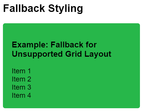
Fallback StylingFallback styling ensures graceful degradation by providing alternative styles using the @supports rule when certain features aren’t supported by the browser.
Syntax@supports not (property: value) {
/* Fallback CSS rules to apply when the property:value pair is not supported */
}Example: Fallback for Unsupported Grid Layout
HTML
<!DOCTYPE html>
<html lang="en">

<head>
    <meta charset="UTF-8">
    <meta name="viewport"
          content="width=device-width, initial-scale=1.0">
    <title>Feature Detection with @supports</title>
    <style>
        @supports not (display: grid) {
            .fallback-container {
                float: left;
                width: 50%;
            }

            .fallback-item {
                width: calc(50% - 5px);
                margin-right: 10px;
            }

            .fallback-item:nth-child(2n) {
                margin-right: 0;
            }
        }

        body {
            font-family: Arial, sans-serif;
            margin: 0;
            padding: 20px;
        }

        h2 {
            margin-top: 0;
        }

        .box {
            background-color: #27b74a;
            padding: 20px;
            margin-bottom: 20px;
            border-radius: 5px;
        }
    </style>
</head>

<body>
    <h2>Fallback Styling</h2>
    <div class="box">
        <h3>Example: Fallback for Unsupported Grid Layout</h3>
        <div class="fallback-container">
            <div class="fallback-item">Item 1</div>
            <div class="fallback-item">Item 2</div>
            <div class="fallback-item">Item 3</div>
            <div class="fallback-item">Item 4</div>
        </div>
    </div>
</body>

</html>
Output:
|
 How To Create a Responsive Table in CSS ?
 Difference Between px % & em Units in CSS
 Getting Started with Tailwind CSS
 How to use Radial Gradient in Tailwind CSS ?
 What is a CSS Reset ?