|
A tooltip in HTML is a small pop-up box or text that appears when a user hovers over an element such as a button, link, or image. Tooltips are often used to provide additional information about the element or give the user context. We can create a tooltip using several methods, including the title attribute, CSS hover effects, and CSS pseudo-elements.
We can create a tooltip using the below methods:
Creating a Tooltip Using the title attributeIn this approach, we use the title attribute in HTML to provide additional information about an element. This information is typically displayed as a tooltip when the user hovers over the element with their mouse
Syntax:<element title="tooltip text">
Example 1: In this example we styles headers, and adds tooltips to buttons. It includes titles for the page and buttons, with the text “GeeksForGeeks” in green and tooltips for user guidance.
HTML
<!DOCTYPE html>
<html lang="en">

<head>
    <meta charset="UTF-8">
    <meta name="viewport"
          content="width=device-width,
                   initial-scale=1.0">
    <title>
        Centered Content
    </title>
</head>

<body>
    <div style="text-align: center;">
        <h1 style="color: green;">
            GeeksForGeeks
        </h1>
        <h2>
            Adding tooltip to buttons
        </h2>
        <button title="Tooltip for submit button">
            Submit
        </button>
        <button title="Tooltip for Reset button">
            Reset
        </button>
        <button title="Tooltip for Cancel button">
            Cancel
        </button>
    </div>
</body>

</html>
Output: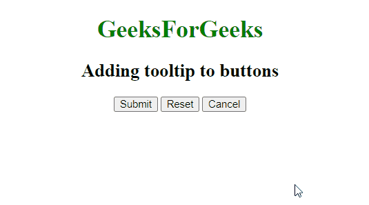
Creating a Tooltip Using CSS hover effectThis approach utilizes CSS hover effect properties to create a tooltip. We create a hidden element that becomes visible when the user hovers over an element. The visibility and opacity properties are used to show and hide the tooltip.
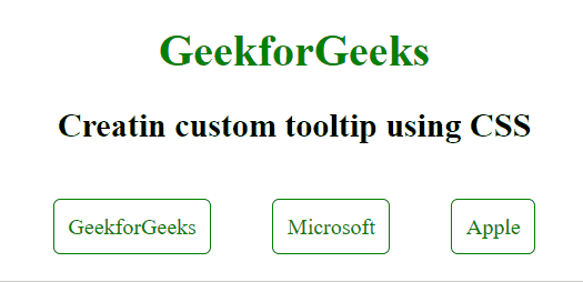
Example: The below code practically implements CSS hover effect to create a custom tooltip for an element.
HTML
<!DOCTYPE html>
<html>

<head>
    <title>
        Link Tooltip Example
    </title>
    <style>
        .tooltip {
            position: relative;
            display: inline-block;
            text-align: center;
            margin: 20px;
            padding: 10px;
            border: 1px solid green;
            border-radius: 5px;
        }

        .tooltip a {
            color: green;
            text-decoration: none;
        }

        .tooltip .tooltiptext {
            visibility: hidden;
            width: 120px;
            background-color: #555;
            color: #fff;
            text-align: center;
            border-radius: 6px;
            padding: 5px;
            position: absolute;
            z-index: 1;
            bottom: 125%;
            left: 50%;
            transform: translateX(-50%);
            opacity: 0;
            transition: opacity 0.3s;
        }

        .tooltip:hover {
            background-color: green;
        }

        .tooltip:hover a {
            color: #fff;
        }

        .tooltip:hover .tooltiptext {
            visibility: visible;
            opacity: 1;
        }
    </style>
</head>

<body style="text-align: center;">
    <h1 style="color: green; text-align: center;">
        GeekforGeeks
    </h1>

    <h2>
        Creating custom tooltip using CSS
    </h2>

    <div class="cont" style="text-align: center;">
        <div class="tooltip">
            <a href="#" class="link">
                GeekforGeeks
            </a>
            <span class="tooltiptext">
                Visit GeekforGeeks
            </span>
        </div>

        <div class="tooltip">
            <a href="#" class="link">
                Microsoft
            </a>
            <span class="tooltiptext">
                Visit Microsoft
            </span>
        </div>

        <div class="tooltip">
            <a href="#" class="link">
                Apple
            </a>
            <span class="tooltiptext">
                Visit Apple
            </span>
        </div>
    </div>

</body>

</html>
Output:
Creating a Tooltip Using pseudo-elementsCSS pseudo-elements are used to add extra content either before or after the specified element. They are known as pseudo-elements because they add content without adding an element to the HTML DOM.
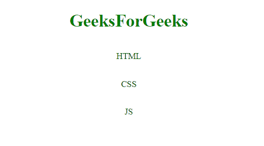
Example: The below code implements the CSS pseudo elements to create a tooltip.
HTML
<!DOCTYPE html>
<html>

<head>
    <title>
        Abbreviation Tooltip Example
    </title>
    <style>
        .tooltip {
            position: relative;
            display: inline-block;
            color: green;
        }

        .container {
            text-align: center;
        }

        .tooltip::after {
            content: attr(data-tooltip);
            visibility: hidden;
            width: 150px;
            background-color: black;
            color: white;
            text-align: center;
            border-radius: 6px;
            padding: 5px 0;
            position: absolute;
            z-index: 1;
            top: 100%;
            left: 50%;
            transform: translateX(-50%);
            opacity: 0;
            transition: opacity 0.3s;
        }

        .tooltip:hover::after {
            visibility: visible;
            opacity: 1;
        }
    </style>
</head>

<body>
    <div class="container">
        <h1 style="color: green">
            GeeksForGeeks
        </h1>
        <h2>
            Adding tooltip using pseudo selectors
        </h2>
        <p class="tooltip"
            data-tooltip="HyperText Markup Language">
            HTML
        </p><br/>
        <p class="tooltip"
            data-tooltip="Cascading Style Sheets">
            CSS
        </p><br/>
        <p class="tooltip" data-tooltip="JavaScript">
            JS
        </p>
    </div>
</body>

</html>
Output:
Tooltips enhance user experience by providing additional information. They can be created using the `title` attribute for simplicity, CSS hover effects for customization, or CSS pseudo-elements for advanced styling. Each method offers unique benefits, enabling effective context delivery in web applications.
|