
|
|
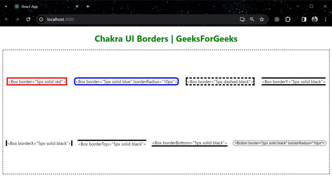
Chakra UI is a popular React component library that simplifies the process of building user interfaces with a set of customizable and accessible components. Among those feature it also provide support for styling and layout including the management of borders. It provides various properties to customize borders. In this article, we will learn about Implementation of borders in Chakra UI. Prerequisites:Approach:We have created a UI Flex Box and inside that box we are using the Box and one button to demonstrate different styles of borders. To use a Box and Button component, we have to import it from “@chakra-ui/react” module. Chakra UI provides various props to modify the borders and border radius. This are the some of the key props to modify the borders: border, borderWidth, borderStyle, borderColor, borderTop, borderRight, borderBottom, borderLeft, borderX, borderY and borderRadius. Steps to Create React Application and Installing Module:Step 1: Create a React application using the following command: npx create-react-app gfg
Step 2: After creating your project folder(i.e. gfg), move to it by using the following command: cd gfg
Step 3: After creating the React application, Install the required package using the following command: npm i @chakra-ui/react @emotion/react @emotion/styled framer-motion
Project Structure:
The updated dependencies in package.json file: "dependencies": { Example: The below example is demonstrating the use of Borders in Chakra UI Javascript
To run the application use the following command: npm run start
Output: Now go to http://localhost:3000 in your browser:
|
Reffered: https://www.geeksforgeeks.org
| Geeks Premier League |
Type: | Geek |
Category: | Coding |
Sub Category: | Tutorial |
Uploaded by: | Admin |
Views: | 14 |