Horje
Chakra UI Border Radius

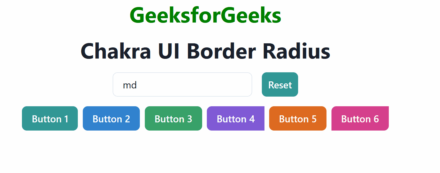
Chakra UI is the famous React UI library that is used to create and build user interfaces. Using this library, we can manage the border radii of various UI elements. Each element of the UI can be customized with different Border radius values provided through border-radius props. In this article, we will see the practical implementation of Chakra UI Border Radius in terms of examples.

Prerequisites:

Approach:

We have created 6 different buttons that demonstrate different border radius settings which are based on the user input. We can dynamically change the border-radius by entering the values in the input field. There is a “Reset” button that sets the border radius back to the default value which is “md“.

Steps to Create React Application And Installing Module:

Step 1: Create a React application using the following command:

npx create-react-app chakra

Step 2: After creating your project folder(i.e. chakra), move to it by using the following command:

cd chakra

Step 3: After creating the React application, Install the required package using the following command:

npm i @chakra-ui/react @emotion/react@^11 @emotion/styled@^11 framer-motion@^6

Project Structure:

The updated dependencies are in the package.json file.

"dependencies": {
"@chakra-ui/react": "^2.8.2",
"@emotion/react": "^11.11.3",
"@emotion/styled": "^11.11.0",
"@testing-library/jest-dom": "^5.17.0",
"@testing-library/react": "^13.4.0",
"@testing-library/user-event": "^13.5.0",
"framer-motion": "^6.5.1",
"react": "^18.2.0",
"react-dom": "^18.2.0",
"react-scripts": "5.0.1",
"web-vitals": "^2.1.4"
}

Example: Below is the practical implementation of the Chakra UI Border Radius.

Javascript

// App.js
import React, { useState } from 'react';
import {
    ChakraProvider,
    Box,
    Button,
    extendTheme,
    VStack,
    HStack,
    Input,
    Heading,
} from '@chakra-ui/react';
const theme = extendTheme({
    radii: {
        md: '8px',
    },
});
function App() {
    const [bRadius, set_b_Radius] = useState('md');
    const radiusCngFn = (event) => {
        set_b_Radius(event.target.value);
    };
    return (
        <ChakraProvider theme={theme}>
            <Box p={4}>
                <VStack spacing={4} align="center">
                    <Heading as="h2" color="green">
                        GeeksforGeeks
                    </Heading>
                    <Heading as="h3">Chakra UI Border Radius</Heading>
                    <HStack spacing={4} align="center">
                        <Input
                            type="text"
                            placeholder="Enter border radius(e.g., md, lg, 10px)"
                            value={bRadius}
                            onChange={radiusCngFn}
                        />
                        <Button
                            onClick={() => set_b_Radius('md')}
                            colorScheme="teal"
                        >
                            Reset
                        </Button>
                    </HStack>
                    <HStack>
                        <Button borderRightRadius="0"
                                colorScheme="teal"
                                borderRadius={bRadius}>
                            Button 1
                        </Button>
                        <Button borderLeftRadius="0"
                                colorScheme="blue"
                                borderRadius={bRadius}>
                            Button 2
                        </Button>
                        <Button borderTopRadius={bRadius} colorScheme="green">
                            Button 3
                        </Button>
                        <Button
                            borderTopLeftRadius={bRadius}
                            borderTopRightRadius="0"
                            borderBottomRightRadius="0"
                            borderBottomLeftRadius={bRadius}
                            colorScheme="purple"
                        >
                            Button 4
                        </Button>
                        <Button borderTopRadius={bRadius}
                                borderBottomRadius={bRadius}
                                colorScheme="orange">
                            Button 5
                        </Button>
                        <Button
                            borderTopRightRadius="0"
                            borderBottomRightRadius={bRadius}
                            borderBottomLeftRadius="0"
                            colorScheme="pink"
                        >
                            Button 6
                        </Button>
                    </HStack>
                </VStack>
            </Box>
        </ChakraProvider>
    );
}
export default App;

Step to run the application: Run the application using the following command:

npm run start 

Output: Now go to http://localhost:3000 in your browser:

Output


Reffered: https://www.geeksforgeeks.org


Geeks Premier League

Related
Chakra UI Shadow Chakra UI Shadow
Chakra UI Color and background color Chakra UI Color and background color
Chakra UI Form Range Slider Chakra UI Form Range Slider
What Is The Primary Purpose Of The Azure Data Explorer? What Is The Primary Purpose Of The Azure Data Explorer?
Kubernetes Controller VS Kubernetes Operator Kubernetes Controller VS Kubernetes Operator

Type:
Geek
Category:
Coding
Sub Category:
Tutorial
Uploaded by:
Admin
Views:
16