Horje
Chakra UI Shadow

Chakra UI consists of a Shadow component, which can be used to customize the elements and apply shadow effects to it. This shadow can be in various forms like dark, inner, outline, size-based, text-based, and more. This enhances the overall appearance of the elements in the application and makes the application more user-interactive. The textShadow prop is mainly used to apply the Shadow effect to the elements.

Prerequisites:

Approach:

We have created different Boxes and applied various Shadow effects to the boxes. This includes various sized effects, inner, outline-based Shadow and we have taken a Text-based shadow on which the Green color is been applied as the Shadow color. Using the prop textShadow, we can manage the thickness and color of the Shadow. For each of the boxes, the different colors and shadow-specific effects have been applied.

Steps to Create React Application And Installing Module:

Step 1: Create a React application using the following command:

npx create-react-app chakra

Step 2: After creating your project folder(i.e. chakra), move to it by using the following command:

cd chakra

Step 3: After creating the React application, Install the required package using the following command:

npm i @chakra-ui/react @emotion/react@^11 @emotion/styled@^11 framer-motion@^6
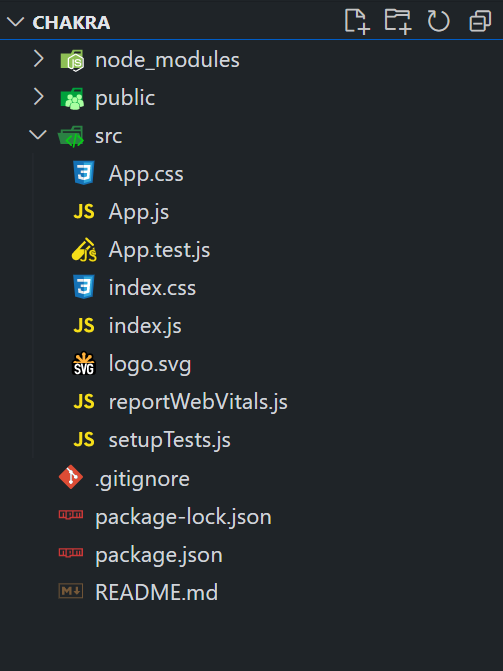
Project Structure:

The updated dependencies are in the package.json file.

"dependencies": {
"@chakra-ui/react": "^2.8.2",
"@emotion/react": "^11.11.3",
"@emotion/styled": "^11.11.0",
"@testing-library/jest-dom": "^5.17.0",
"@testing-library/react": "^13.4.0",
"@testing-library/user-event": "^13.5.0",
"framer-motion": "^6.5.1",
"react": "^18.2.0",
"react-dom": "^18.2.0",
"react-scripts": "5.0.1",
"web-vitals": "^2.1.4"
}

Example: Below is the practical implementation of the Chakra UI Shadow.

Javascript

import React from 'react';
import {
    ChakraProvider,
    Box,
    Text,
    SimpleGrid,
    extendTheme,
} from '@chakra-ui/react';
const theme = extendTheme({
    shadows: {
        xs: '0 0 5px rgba(255, 0, 0, 0.5)',
        sm: '0 1px 2px rgba(0, 255, 0, 0.5)',
        base: '0 1px 3px rgba(0, 0, 255, 0.5)',
        md: '0 4px 6px rgba(255, 0, 255, 0.5)',
        lg: '0 10px 15px rgba(255, 255, 0, 0.5)',
        xl: '0 20px 25px rgba(0, 255, 255, 0.5)',
        '2xl': '0 25px 50px rgba(255, 255, 255, 0.5)',
        'dark-lg': '0 20px 25px rgba(0, 0, 0, 0.5)',
        outline: '0 0 0 3px rgba(66, 153, 225, 0.6)',
        inner: 'inset 0 2px 4px 0 rgba(255, 255, 255, 0.5)',
    },
});
 
function App() {
    return (
        <ChakraProvider theme={theme}>
            <Box p="4">
                <Text fontSize="2xl" fontWeight="bold"
                      mb="4" color="green.500">
                    GeeksforGeeks Shadows Example
                </Text>
                <Text fontSize="xl" fontWeight="bold"
                      mb="4" color="black.500">
                    Chakra UI Shadow
                </Text>
                <Text
                    textShadow="2px 2px green"
                    m="4"
                    fontSize="xl"
                    fontWeight="bold"
                    color="black.800"
                >
                    GFG Text [Green Shadow]
                </Text>
                <SimpleGrid
                    columns={{ sm: 2, md: 3 }}
                    spacing="4"
                    p="6"
                    textAlign="center"
                    rounded="lg"
                    color="gray.700"
                >
                    {['xs', 'sm', 'base', 'md', 'lg',
                    'xl', '2xl', 'dark-lg', 'outline', 'inner'].map(
                        (shadowSize) => (
                            <Box
                                key={shadowSize}
                                boxShadow={shadowSize}
                                p="4"
                                rounded="md"
                                bg="gray.100"
                            >
                                {shadowSize}
                            </Box>
                        )
                    )}
                </SimpleGrid>
            </Box>
        </ChakraProvider>
    );
}
export default App;

Step to run the application: Run the application using the following command:

npm run start 

Output: Now go to http://localhost:3000 in your browser:

Screenshot-2024-01-25-at-15-06-31-React-App


Reffered: https://www.geeksforgeeks.org


Geeks Premier League

Related
Chakra UI Color and background color Chakra UI Color and background color
Chakra UI Form Range Slider Chakra UI Form Range Slider
What Is The Primary Purpose Of The Azure Data Explorer? What Is The Primary Purpose Of The Azure Data Explorer?
Kubernetes Controller VS Kubernetes Operator Kubernetes Controller VS Kubernetes Operator
How To Use Azure Cognitive Services For Image Recognition ? How To Use Azure Cognitive Services For Image Recognition ?

Type:
Geek
Category:
Coding
Sub Category:
Tutorial
Uploaded by:
Admin
Views:
16