|
The original viewport units, such as vw (viewport width) and vh (viewport height), have been widely used to create responsive layouts that adapt to different screen sizes. Using the vh unit on mobile is buggy because the viewport size won’t include the browser’s address bar UI. However, the newly introduced units, namely vmin, vmax, vi and vb bring additional possibilities and flexibility to web designers.
vi = 1% of the size of the viewport’s inline axis.vb = 1% of the size of the viewport’s block axis.vmin = the smaller of vw or vh.vmax = the larger of vw or vh.
Syntax
width: 50vi;
height: 40vb;
width: 80vmin;
height: 60vmax;
Example 1: In this example, we will create a page with 80% width using width in vi units i.e., 80 vi.
HTML
<!DOCTYPE html>
<html>
<head>
<title>Viewport Units</title>
<style>
.container {
width: 80vi;
/* Set the width relative to the
viewport including the scrollbar */
margin: 0 auto;
/* Center the container horizontally */
padding: 20px;
background-color: #f0f0f0;
}
h1 {
font-size: 5vi;
/* Set the font size relative to the
viewport including the scrollbar */
}
p {
font-size: 3vi;
}
</style>
</head>
<body>
<div class="container">
<h1>GeeksforGeeks</h1>
<p>Viewport Index</p>
</div>
</body>
</html>
|
Output:
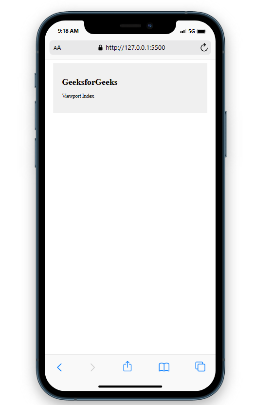 Viewport Inline axis Example 2: In this example,we will have a box of 40% block width and height inside a container with 100% heigth and width.
HTML
<!DOCTYPE html>
<html>
<head>
<title>Viewport Units</title>
<style>
.container {
width: 100vb;
height: 100vb;
background-color: lightblue;
display: flex;
justify-content: center;
align-items: center;
}
.box {
width: 40vb;
height: 40vb;
background-color: coral;
color: white;
font-size: 2rem;
text-align: center;
padding: 1rem;
}
</style>
</head>
<body>
<div class="container">
<div class="box">Hello, World!</div>
</div>
</body>
</html>
|
Output:
 Viewport block axis Example 3: In this article, we will create a section of 50% height and width with font size 8 vmin.
HTML
<!DOCTYPE html>
<html>
<head>
<title>Viewport Units</title>
<style>
body {
margin: 0;
padding: 0;
}
.section {
width: 50vmin;
height: 50vmin;
background-color: #f2f2f2;
margin: 0 auto;
display: flex;
align-items: center;
justify-content: center;
font-size: 8vmin;
color: #333;
}
</style>
</head>
<body>
<div class="section">GeeksforGeeks</div>
</body>
</html>
|
Output:
.png) Viewport min Example 4: In this example, we will create a box of 50% heigth and width inside a container with 100% width and height.
HTML
<!DOCTYPE html>
<html>
<head>
<title>Viewport Units</title>
<style>
.container {
width: 100vw;
height: 100vh;
display: flex;
justify-content: center;
align-items: center;
}
.box {
width: 50vmax;
height: 50vmax;
color: aliceblue;
background-color: #167d29;
}
</style>
</head>
<body>
<div class="container">
<div class="box">GeeksforGeeks</div>
</div>
</body>
</html>
|
Output:
.png) Viewport max Supported Browser:
- Google Chrome
- Microsoft Edge
- Firefox
- Opera
- Safari
|
.png)