|
Angular PrimeNG is an open-source framework with a rich set of native Angular UI components that are used for great styling and this framework is used to make responsive websites with very much ease. In this article, we will know how to use Dialog Initial Focus in Angular PrimeNG. We will also learn about the properties along with their syntaxes that will be used in the code.
Dialog component is used to make a component containing some content to display in an overlay window. When the dialogue is shown, an element with autofocus receives focus.
Angular PrimeNG Dialog Initial Focus Properties:
- header: It is the title text of the dialog. It is of string data type, the default value is null.
- position: It is used to set the position of the dialog. It is of string data type, the default value is center.
- visible: It specifies the visibility of the dialog. It is of the boolean data type, the default value is false.
- styleClass: It is used to set the style class of the component. It is of string data type, the default value is null.
- autofocus: It is used to apply focus on the element when the dialog is popped up.
Syntax:
<p-dialog
       position="..."
       header="...."
       [(visible)]="...">
      <button
              type="button"
              pButton
              autofocus>
      </button>
</p-dialog>

<p-button
       (click)="..."
       label="....">
</p-button>
Creating Angular application & module installation:
Step 1: Create an Angular application using the following command.
ng new appname
Step 2: After creating your project folder i.e. appname, move to it using the following command.
cd appname
Step 3: Install PrimeNG in your given directory.
npm install primeng --save
npm install primeicons --save
Project Structure: It will look like the following:
- Run the below command to see the output:
ng serve --open
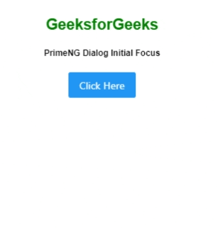
Example 1: Below is the code example that illustrates the use of Angular PrimeNG Dialog Initial Focus using the autofocus property.
app.component.html
<div style="text-align: center">
<h2 style="color: green">GeeksforGeeks</h2>
<h5>PrimeNG Dialog Initial Focus</h5>
<p-dialog position="center"
header="GeeksforGeeks"
[(visible)]="geeks">
<button type="button"
pButton autofocus label="Autofocus">
</button>
</p-dialog>
<p-button (click)="gfg()"
label="Click Here">
</p-button>
</div>
|
app.component.ts
import { Component } from "@angular/core";
import { PrimeNGConfig } from "primeng/api";
@Component({
selector: "app-root",
templateUrl: "./app.component.html",
})
export class AppComponent {
constructor(private primengConfig: PrimeNGConfig) {}
ngOnInit() {
this.primengConfig.ripple = true;
}
geeks: boolean;
gfg() {
this.geeks = true;
}
}
|
app.module.ts
import { NgModule } from "@angular/core";
import { BrowserModule } from "@angular/platform-browser";
import { BrowserAnimationsModule }
from "@angular/platform-browser/animations";
import { AppComponent } from "./app.component";
import { DialogModule } from "primeng/dialog";
import { ButtonModule } from "primeng/button";
@NgModule({
imports: [BrowserModule,
BrowserAnimationsModule,
DialogModule,
ButtonModule],
declarations: [AppComponent],
bootstrap: [AppComponent],
})
export class AppModule {}
|
Output:
Example 2: Below is another code example that illustrates the use of Angular PrimeNG Dialog Initial Focus without using the autofocus property.
app.component.html
<div style="text-align: center">
<h2 style="color: green">GeeksforGeeks</h2>
<h5>PrimeNG Dialog Initial Focus</h5>
<p-dialog position="center"
header="GeeksforGeeks"
[(visible)]="geeks">
<button type="button"
pButton label="Without autofocus">
</button>
</p-dialog>
<p-button (click)="gfg()"
label="Click Here">
</p-button>
</div>
|
app.component.ts
import { Component } from "@angular/core";
import { PrimeNGConfig } from "primeng/api";
@Component({
selector: "app-root",
templateUrl: "./app.component.html",
})
export class AppComponent {
constructor(private primengConfig: PrimeNGConfig) {}
ngOnInit() {
this.primengConfig.ripple = true;
}
geeks: boolean;
gfg() {
this.geeks = true;
}
}
|
app.module.ts
import { NgModule } from "@angular/core";
import { BrowserModule } from "@angular/platform-browser";
import { BrowserAnimationsModule }
from "@angular/platform-browser/animations";
import { AppComponent } from "./app.component";
import { DialogModule } from "primeng/dialog";
import { ButtonModule } from "primeng/button";
@NgModule({
imports: [BrowserModule,
BrowserAnimationsModule,
DialogModule,
ButtonModule],
declarations: [AppComponent],
bootstrap: [AppComponent],
})
export class AppModule {}
|
Output:
Reference: https://primefaces.org/primeng/dialog
|