
|
Creating a line chart in Excel is a fundamental skill for visualizing trends and data patterns over time. Whether you’re tracking sales growth, monitoring temperature changes, or analyzing performance metrics, a line chart can provide clear and insightful visualizations. Also, learning how to how to make a line graph in excel with multiple lines can enhance your Excel skills. In this article, we’ll explore how to create a line chart in Excel, guiding you step-by-step to make a line graph in Excel that effectively communicates your data. By mastering the line chart in Excel, you’ll be able to transform raw data into compelling visual stories. Let’s start exploring the process and learn how to craft a perfect chart line in Excel for your data analysis needs How to Create a Line Chart in Excel Table of Content What is a Line Chart in ExcelA line chart also known as a line graph, is a visual representation that shows a series of data points connected by a straight line. In a line chart, the independent values such as time intervals or categories, are plotted on the horizontal x-axis, while the dependent values, like prices or sales, are plotted on the vertical y-axis. Values that are represented below the x-axis are the negative values. Line graphs are widely used in various fields to track trends and patterns in data over time. How to Create a Line Chart in ExcelStep 1: Prepare Your DataIn this step, we will be inserting random sales data for three different courses for the last five years in our Excel sheet. Below is the screenshot of the random sales data that we are going to use for our line chart.  Prepare Your Data Step 2: Insert Line ChartOnce we created our dataset, we will insert a line chart for our data values. For this, we need to drag & select data and then go to the Insert tab and then the chart section and insert the line chart.  Insert Line Chart Once we select our desired line chart (Here, Line with Markers). Excel will automatically plot a graph for our dataset. Below is the screenshot attached for it.  Graph Plotted In the above graph, we can easily visualize the different courses that are sold. In the next step, we will try to format our graph. Step 3: Formatting GraphWe will try to format our graph according to our needs in this step.
 Change the Graph Title
 Enter Edit Course How to Create a Line Chart with Multiple SeriesTo create a multiple-line graph, follow the same steps as for making a single-line graph. Your table should have a minimum of three columns: one for the time intervals on the left, and numeric values on the right. Each data series will be plotted separately. Follow the below steps the create the multiple-line graph: Step 1: Select the source data.Step 2: Go to the insert tab.Step 3: Click on the Insert Line or Area Chart icon Click on “Line Chart” Icon Step 4: Choose 2-D Line or any other graph type that suits your needs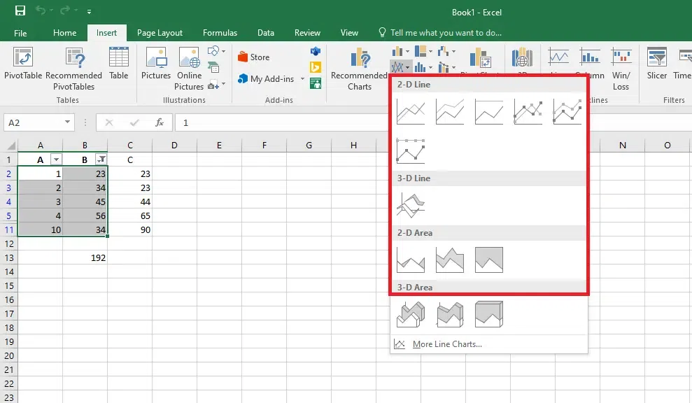 Choose a Line Chart Excel Line Chart TypesThe following varieties of line graphs are available in Microsoft Excel: Excel can create either a single-line graph or a multiple-line graph, depending on how many columns are in your data collection. Use this chart type when: The order of category is important and when there are many data points available. 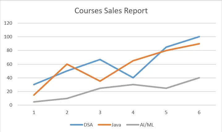 Use Charts 1. Stacked LineIt aims to demonstrate how different elements of a whole alter over time. The top line in this graph represents the sum of all the lines below it because the lines in this graph are cumulative, which means that each new data series is added to the first.  Stacked Line 2. 100% Stacked LineIt resembles a stacked line graph, but the y-axis displays percentages rather than absolute numbers. The top line, which spans the top of the chart directly, indicates a sum of 100% at all times. This kind is usually used to illustrate the gradual contribution of a part to the whole.  100% Stacked Line 3. Line with MarkersThe line graph with markers at each data point in the marked form. Stacked Line and 100% Stacked Line graphs are also available in marked forms. Use this chart type when there are few data points.  Line with Markers 4. 100% Stacked Line with MarkersUse this chart type to show the percentage contribution to a whole over time or categories. Show the change to the percentage that each value contributes over time.  Stacked Line with Markers 5. 3-D LineAn alternative to the traditional line graph in three dimensions.  3-D Line How to Customize and Improve an Excel Line ChartExcel’s built-in line chart already has a nice appearance, but there is always room for improvement. It makes sense to start with the standard modifications in order to give your graph a distinctive and polished appearance. 1. Adding or Removing the Chart ElementsWe can also add or remove the chart elements. For this, we need to select our chart and then click the plus(+) icon. This will open various chart elements, which we can add or remove by checking or unchecking the checkbox option.  Adding or Removing the Chart Elements 2. Adding Axis Titles and LegendIn this step, we will add the axis title and the legend for our line chart. For this, we need to perform the same previous step and add the chart titles and the legend. For axis titles, we will use No. Of Sales for Y-axis and Year for X-axis, and we will position the legend at the top.  Adding Axis Titles and Legend 3. Changing the Style of the GraphIn this step, we will try to change the style of the graph. For this, we need to select our graph and click on the chart style option. It will show various inbuilt styles for the graph. We can use whatever style we want.  Changing the Style of the Graph Hopefully, this extensive overview of Excel’s Line Chart has given you a general idea of what line charts in Excel are, and how to create one, along with how to Customize and Improve an Excel Line Graph.
ConclusionIn conclusion, exploring the art of creating a line chart in Excel empowers you to transform raw data into meaningful visual insights. By following the steps outlined in this guide on how to create a line chart in Excel, you can easily make a line graph in Excel that highlights trends and patterns. Whether you’re presenting sales figures, tracking project progress, or analyzing historical data, a line chart in Excel provides a clear and effective way to communicate your findings. Embrace the power of chart line in Excel to enhance your data presentations and make informed decisions with confidence. How to Create a Line Chart in Excel – FAQsHow do I create a Line chart in Excel?
How to make line graph in excel with 2 variables?
How to create line graph in excel with x and y axis?
How to make line graph in excel with 3 variables?
How do I make a line up chart in Excel?
|
Reffered: https://www.geeksforgeeks.org
| Excel |
| Related |
|---|
| |
| |
| |
| |
| |
Type: | Geek |
Category: | Coding |
Sub Category: | Tutorial |
Uploaded by: | Admin |
Views: | 12 |