|
In CSS, overlay/hover effects can be achieved by using Flexbox containers to center content and applying styles to reveal overlays on hover. By positioning elements absolutely within a Flexbox container, overlays can cover the entire content area.
These are the following approaches:
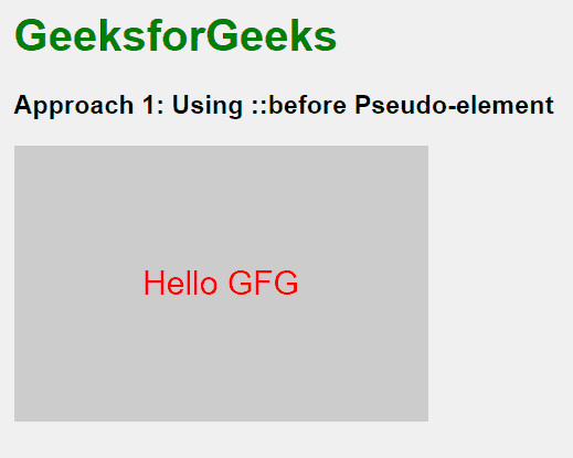
Using ::before Pseudo-elementIn this approach, we are using the ::before pseudo-element to create an overlay effect on hover. The ::before element is styled with a semi-transparent background and set to cover the entire container. Initially, the overlay is invisible (opacity: 0), but when the container is hovered over, the overlay becomes visible (opacity: 1) through a smooth transition, creating a hover effect. The main text is positioned above the overlay using z-index and position: relative to ensure it remains visible.
Example: The below example uses ::before Pseudo-element to overlay/hover div in flexbox container div.
HTML
<!DOCTYPE html>

<head>
    <title>Example 1</title>
    <style>
        body {
            font-family: Arial, sans-serif;
            display: flex;
            justify-content: center;
            align-items: center;
            height: 100vh;
            background-color: #f0f0f0;
            margin: 0;
        }

        h1 {
            color: green;
        }

        h3 {
            margin-top: 20px;
        }

        .container {
            display: flex;
            justify-content: center;
            align-items: center;
            width: 300px;
            height: 200px;
            background-color: #ccc;
            position: relative;
            overflow: hidden;
        }

        .container::before {
            content: '';
            position: absolute;
            top: 0;
            left: 0;
            width: 100%;
            height: 100%;
            background: rgba(0, 0, 0, 0.6);
            opacity: 0;
            transition: opacity 0.3s;
        }

        .container:hover::before {
            opacity: 1;
        }

        .text {
            color: rgb(255, 0, 0);
            z-index: 1;
            position: relative;
            font-size: 24px;
        }
    </style>
</head>

<body>
    <div>
        <h1>GeeksforGeeks</h1>
        <h3>Approach 1: Using ::before
          Pseudo-element</h3>
        <div class="container">
            <div class="text">Hello GFG</div>
        </div>
    </div>
</body>

</html>
Output:
 Output Using an Overlay DivIn this approach, we are using an overlay div to create a hover effect within a gallery layout. Each gallery item contains an image and an overlay div that covers the entire item. Initially, the overlay is transparent (opacity: 0), but when the item is hovered over, the overlay becomes visible (opacity: 1). This overlay is styled with a semi-transparent background and centered text.
Example: The below example uses Overlay Div to overlay/hover div in flexbox container div.
HTML
<!DOCTYPE html>

<head>
    <title>Example 2</title>
    <style>
        body {
            font-family: Arial, sans-serif;
            display: flex;
            flex-direction: column;
            justify-content: center;
            align-items: center;
            height: 100vh;
            background-color: #f0f0f0;
            margin: 0;
        }

        h1 {
            color: green;
            margin-bottom: 20px;
        }

        h3 {
            margin-bottom: 20px;
        }

        .gallery {
            display: flex;
            flex-wrap: wrap;
            gap: 20px;
        }

        .gallery-item {
            position: relative;
            width: 200px;
            height: 150px;
            background-color: #eee;
            overflow: hidden;
            border-radius: 10px;
        }

        .gallery-item img {
            width: 100%;
            height: 100%;
            object-fit: cover;
            border-radius: 10px;
        }

        .overlay {
            position: absolute;
            top: 0;
            left: 0;
            width: 100%;
            height: 100%;
            background: rgba(0, 0, 0, 0.6);
            opacity: 0;
            transition: opacity 0.3s;
            border-radius: 10px;
            display: flex;
            justify-content: center;
            align-items: center;
            color: white;
            font-size: 18px;
        }

        .gallery-item:hover .overlay {
            opacity: 1;
        }
    </style>
</head>

<body>
    <h1>GeeksforGeeks</h1>
    <h3>Approach 2: Using an Overlay Div</h3>
    <div class="gallery">
        <div class="gallery-item">
            <img src=
"https://media.geeksforgeeks.org/wp-content/uploads/20240305215328/gfglogo.png" alt="img1">
            <div class="overlay">Text 1</div>
        </div>
        <div class="gallery-item">
            <img src=
"https://media.geeksforgeeks.org/wp-content/uploads/20240305215328/gfglogo.png" alt="img2">
            <div class="overlay">Text 2</div>
        </div>
        <div class="gallery-item">
            <img src=
"https://media.geeksforgeeks.org/wp-content/uploads/20240305215328/gfglogo.png" alt="img3">
            <div class="overlay">Text 3</div>
        </div>
    </div>
</body>

</html>
Output:
 Output
|