|
Multiple variables for hue parameters in Seaborn are important for creating visually rich and informative plots. By assigning multiple variables to the hue parameter, you can represent additional dimensions of data within a single plot, enhancing the depth of analysis and making it easier to interpret complex relationships.
In this article, we will explore three different/approaches to specify multiple variables for the hue parameters in seaborn.
Specifying Multiple Variables for Hue Parameters in SeabornMethod 1: Using a Color Palette and Mapping Multiple VariablesIn this approach, we are using a color palette (sns.color_palette) to map multiple variables to the hue parameter in Seaborn. By defining a custom palette based on the unique categories in the dataset (‘day’ in this case), we can assign distinct colors to each category and create a scatter plot with different hues representing different days.
Syntax:
palette = sns.color_palette(‘palette_name’, n_colors=num_colors)
sns.scatterplot(data=dataframe, x=’x_column’, y=’y_column’, hue=’hue_column’, palette=palette)
- sns.color_palette(‘palette_name’, n_colors=num_colors): Creates a color palette with a specified name and number of colors.
- sns.scatterplot(data=dataframe, x=’x_column’, y=’y_column’, hue=’hue_column’, palette=palette): Creates a scatter plot where the hue is mapped to a categorical column in the DataFrame, using the specified palette.
Example:
Python
import matplotlib.pyplot as plt
import seaborn as sns

tips = sns.load_dataset('tips')

# Define a color palette for each variable
palette = sns.color_palette('husl', n_colors=len(tips['day'].unique()))

# Create a plot with multiple variables mapped to hue
sns.scatterplot(data=tips, x='total_bill', y='tip', hue='day', palette=palette)

plt.show()
Output:
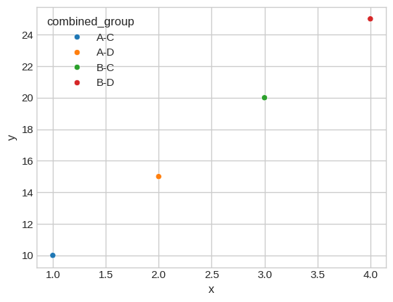
 Method 2: Combining Variables and Creating a New Categorical VariableIn this approach, we create a new categorical variable by combining existing variables (‘group1’ and ‘group2’) using string concatenation. This new variable (‘combined_group’) serves as the hue parameter in Seaborn, allowing us to visualize the relationship between multiple variables on a scatter plot with distinct hues for each combination of ‘group1’ and ‘group2’.
Syntax:
df[‘combined_column’] = df[‘column1’] + ‘-‘ + df[‘column2’]
sns.scatterplot(data=df, x=’x_column’, y=’y_column’, hue=’combined_column’)
- df[‘combined_column’] = df[‘column1’] + ‘-‘ + df[‘column2’]: Creates a new categorical column by combining existing columns using string concatenation.
- sns.scatterplot(data=df, x=’x_column’, y=’y_column’, hue=’combined_column’): Creates a scatter plot where the hue is mapped to the newly created combined column.
Example:
Python
import matplotlib.pyplot as plt
import seaborn as sns
import pandas as pd

# Create a DataFrame with multiple variables
data = {'x': [1, 2, 3, 4], 'y': [10, 15, 20, 25], 'group1': ['A', 'A', 'B', 'B'], 'group2': ['C', 'D', 'C', 'D']}
df = pd.DataFrame(data)

# Create a new categorical variable combining group1 and group2
df['combined_group'] = df['group1'] + '-' + df['group2']

# Create a plot with the combined variable mapped to hue
sns.scatterplot(data=df, x='x', y='y', hue='combined_group')

plt.show()
Output:
 Method 3: Using FacetGrid to Plot Multiple VariablesIn this approach, we are using Seaborn’s FacetGrid to create a grid of scatter plots, each representing a different category (‘species’ in this case). By setting the hue parameter to ‘species’, we can plot multiple variables (‘sepal_length’ vs. ‘sepal_width’) on each facet of the grid, effectively visualizing the relationship between multiple variables across different categories.
Syntax:
g = sns.FacetGrid(data=dataframe, col=’col_name’, hue=’hue_column’, col_wrap=num_cols)
g.map_dataframe(sns.scatterplot, x=’x_column’, y=’y_column’)
g.add_legend()
- sns.FacetGrid(data=dataframe, col=’col_name’, hue=’hue_column’, col_wrap=num_cols): Creates a FacetGrid object with specified data, column for facets, hue column, and wrapping columns.
- g.map_dataframe(sns.scatterplot, x=’x_column’, y=’y_column’): Maps a scatter plot function to each facet of the grid, specifying the x and y columns.
- g.add_legend(): Adds a legend to the grid to label the hue categories.
Example:
Python
import matplotlib.pyplot as plt
import seaborn as sns

iris = sns.load_dataset('iris')

# Create a FacetGrid plot with multiple variables
g = sns.FacetGrid(iris, col='species', hue='species', col_wrap=2)
g.map_dataframe(sns.scatterplot, x='sepal_length', y='sepal_width')
g.add_legend()

plt.show()
Output:
 ConclusionIn conclusion, these methods showcase the flexibility of Seaborn in handling multiple variables for the hue parameter. Whether through custom color palettes for distinct visual cues, combining variables for nuanced categorical representation, or using FacetGrid for organized facetted plots, Seaborn empowers users to create insightful visualizations with complex data relationships.
|