|
|
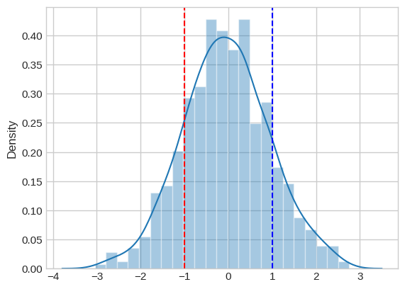
Vertical lines in distribution plots help emphasize specific values or thresholds within the data distribution, aiding in visualizing critical points or comparisons. In this article, we will explore three different/approaches to add vertical lines to a distribution plot in Python. Understanding Distribution Plots and Vertical LinesDistribution plots, such as kernel density estimates (KDE) or histograms, are graphical representations of the probability distribution of a dataset. They help visualize how data points are distributed across different values. Vertical lines are often added to distribution plots to highlight specific points or values of interest. These lines can be used to mark thresholds, mean values, or any other relevant points on the distribution. Example: In a KDE plot created using Seaborn’s kdeplot, vertical lines can be added using Matplotlib’s plt.axvline function. This function takes parameters such as the x-coordinate of the line (x), the color (color), and the linestyle (linestyle). By specifying these parameters, you can add vertical lines to a distribution plot to emphasize certain aspects of the data distribution. Techniques to Add Vertical LinesBelow are the possible approaches/methods to add vertical lines to a distribution plot. Method 1: Using Seaborn’s distplot with matplotlib.pyplot.axvlineIn this approach, we are using Seaborn’s distplot to create a distribution plot of random data. Then, we add vertical lines at specified points using Matplotlib’s plt.axvline method. Example: Output: Method 2: Using Seaborn’s displot with plt.axvline and the data parameterIn this approach, we create a DataFrame with sample data and use Seaborn’s displot to plot a kernel density estimate (KDE) of the data. Vertical lines are added at specific values using Matplotlib’s plt.axvline method, with the data parameter specifying the column from the DataFrame. Example: Output: 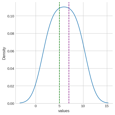 Method 3: Using Seaborn’s kdeplot with plt.axvlineIn this approach, we use Seaborn’s kdeplot to plot a KDE of a sample dataset (‘total_bill’ from Seaborn’s ‘tips’ dataset). Vertical lines are added at chosen points using Matplotlib’s plt.axvline method to highlight specific values on the distribution plot. Example: Output:  ConclusionIn conclusion, adding vertical lines to distribution plots is a powerful technique for highlighting key data points or comparisons. Through the explored methods using Seaborn and Matplotlib, users can effectively annotate and highlight critical aspects of the data distribution, enhancing the interpretability and insightfulness of their visualizations. |
Reffered: https://www.geeksforgeeks.org
| AI ML DS |
| Related |
|---|
| |
| |
| |
| |
| |
Type: | Geek |
Category: | Coding |
Sub Category: | Tutorial |
Uploaded by: | Admin |
Views: | 12 |