Horje
How to Add Visual Effects to Images using CSS?

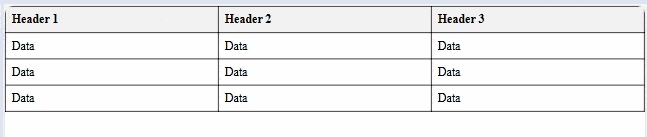
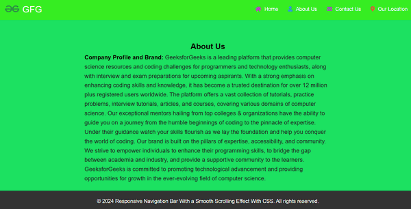
CSS is most useful for adding visual effects to images, enhancing the overall user experience. By using CSS properties like filter, transform, and transition, you can create dynamic and engaging effects that respond to user interactions. In this article, we will explore examples showcasing the visual effects of images using CSS.

These are the following methods:

Applying CSS Filter Effects

We have applied the filter property in CSS to create visual effects on the image, such as grayscale, blur, and brightness, which activate on hover.

Example: The below example uses CSS Filter Effects to add visual effects to images using CSS.

HTML
<!DOCTYPE html>
<html lang="en">

<head>
    <style>
        body {
            font-family: Arial, sans-serif;
            text-align: center;
            margin: 20px;
        }

        h1 {
            color: green;
        }

        .image-container img {
            width: 300px;
            transition: 0.5s;
        }

        .image-container img:hover {
            filter: grayscale(100%) blur(2px) brightness(1.2);
        }
    </style>
</head>

<body>
    <h1>GeeksforGeeks</h1>
    <h3>Applying CSS Filter Effects</h3>
    <div class="image-container">
        <img src=
"https://media.geeksforgeeks.org/wp-content/uploads/20240305215328/gfglogo.png"
            alt="GeeksforGeeks Logo">
    </div>
</body>

</html>

Output:

Applying CSS Transform and Transition Effects

We have applied the transform property in CSS to scale and rotate the image on hover, combined with the transition property to ensure smooth animations.

Example: The below example uses CSS Transform and Transition effects to add visual effects to images using CSS.

HTML
<!DOCTYPE html>
<html lang="en">

<head>
    <style>
        body {
            font-family: Arial, sans-serif;
            text-align: center;
            margin: 20px;
        }

        h1 {
            color: green;
        }

        .image-container img {
            width: 300px;
            transition: transform 0.5s;
        }

        .image-container img:hover {
            transform: scale(1.2) rotate(10deg);
        }
    </style>
</head>

<body>
    <h1>GeeksforGeeks</h1>
    <h3>Applying CSS Transform and Transition Effects</h3>
    <div class="image-container">
        <img src="
https://media.geeksforgeeks.org/wp-content/uploads/20240305215328/gfglogo.png"
            alt="GeeksforGeeks Logo">
    </div>
</body>

</html>

Output:


Reffered: https://www.geeksforgeeks.org


CSS

Related
How to Create a Full-Width Table using CSS? How to Create a Full-Width Table using CSS?
How to Create an Autocomplete using CSS? How to Create an Autocomplete using CSS?
How to create a Card with CSS How to create a Card with CSS
How To Create a More Button in a Navigation Bar using CSS? How To Create a More Button in a Navigation Bar using CSS?
How to Create a Smooth Scrolling Effect with CSS? How to Create a Smooth Scrolling Effect with CSS?

Type:
Geek
Category:
Coding
Sub Category:
Tutorial
Uploaded by:
Admin
Views:
17