|
|
Histogram: A histogram is a graphical representation used in statistics to show the distribution of numerical data. It looks somewhat like a bar chart, but with key differences that make it suitable for showing how data is distributed across continuous intervals or specific categories that are considered “bins”. A histogram is similar to a bar graph. The basic difference between the two is that bar charts correlate a value with a single category or discrete variable, whereas histograms visualize frequencies for continuous variables. In this article, we have provided every detail about Histograms, their definition, types, examples, how the histogram looks, etc. Histogram Table of Content
What is Histogram?Histogram is a graphical representation that condenses data series into easy-to-understand numerical data by grouping them into logical ranges of varying heights, often known as bins. Essentially, it summarises discrete or continuous data. Histogram is a tool for visualising the distribution of data across a continuous interval or period. In a histogram data is grouped into continuous number ranges and each range corresponds to a vertical bar.
It allows us to assess where the values are concentrated, what the extremes are, and whether there are any gaps or anomalous values. A Histogram is similar to a vertical bar graph, however, the distinction is that the Histogram has no space between the bars, but a bar graph has. Histogram Meaning
Parts of a HistogramA histogram is a graph that represents the distribution of data. Here are the essential components, presented in simple terms: Title: This is similar to the name of the histogram. It explains what the histogram is about and what data it displays. X-axis: Visualize the X-axis as a horizontal line at the bottom of the histogram. It displays the many categories or groups that the data is sorted into. For example, if you’re measuring people’s heights, the X-axis may indicate several height ranges such as “5-6 feet” or “6-7 feet.” Y-axis: The Y-axis appears as a vertical line on the side of the histogram. It displays the number of times something occurs in each category or group shown on the X-axis. So, if you’re measuring heights, the Y-axis may display how many individuals are in each height range. Bars: Bars are like the histogram’s building blocks. They are the vertical rectangles you see on the chart. Each bar on the X-axis represents a category or group, and its height indicates how many times something occurs inside that category. So, higher bars indicate more occurrences, whereas shorter bars indicate fewer occurrences. The bar’s width remains constant, but it indicates the range covered by each category on the X-axis. If all of the bars have the same width, it indicates that the categories are all the same size. Types of HistogramThe following are some typical forms of histograms and their characteristics: Uniform HistogramA uniform distribution means that the data is uniformly distributed among the classes, with each having a same number of elements. It may display many peaks, suggesting varying degrees of incidence. 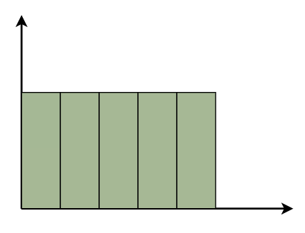 Uniform Histogram Bimodal HistogramA histogram is called bimodal if it has two distinct peaks. This implies that the data consists of observations from two distinct groups or categories, with notable variations between them. 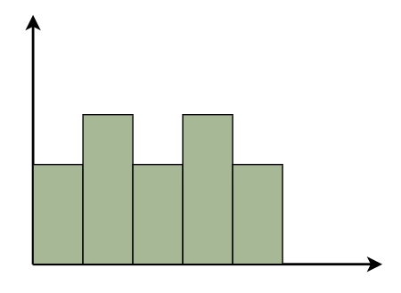 Bimodal Histogram Symmetric HistogramSymmetric Histogram is also known as a bell-shaped histogram, it has perfect symmetry when divided vertically down the centre, with both sides matching each other in size and shape. The balance reflects a steady distribution pattern. 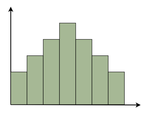 Symmetric Histogram Right-Skewed HistogramA right-skewed histogram shows bars leaning towards the right side. This signifies that the majority of the data points are on the left side, with a few outliers reaching to the right. Consider a histogram showing the distribution of family earnings. A right-skewed histogram occurs when the majority of families are in lower income groups, but a small number of highly rich households skew the average income. 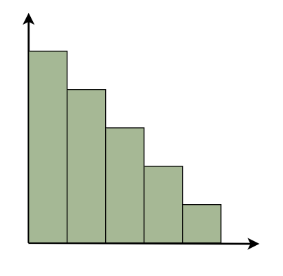 Right-Skewed Histogram Left-Skewed HistogramA left-skewed histogram shows bars that lean towards the left side. This means that the majority of the data points are on the right side, with a few exceptionally low values extending to the left. Consider a histogram reflecting the distribution of test scores in a classroom. A left-skewed histogram occurs when the majority of students receive excellent grades but a few do badly, resulting in an average that is dragged to the left. 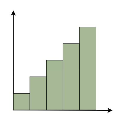 Left-Skewed Histogram Frequency HistogramA frequency histogram visually displays how often specific values appear in data. Each bar represents a range of values, with its height indicating the frequency of occurrences. For instance, if we’re tracking study hours, the histogram shows how many students fall into each study time range, offering insights into study habits across the student population. Relative Frequency HistogramRelative Frequency Histogram displays proportions instead of exact counts for each interval. For example, in a class of 20 students, it might show that 25% scored between 70 and 80%. Relative frequency histograms offer insights into the occurrence of distinct values and distribution patterns within a dataset. Cumulative Frequency HistogramA cumulative frequency histogram is a graph that depicts the total number of values up to a specific point. Instead of displaying the frequency of each individual number, it shows the cumulative frequency, which increases as you walk down the graph. For example, if you’re graphing test scores, the height of each bar shows the total number of points received to that moment. So, if the first bar displays a frequency of 10 for scores 0-10 and the second bar shows a frequency of 20 for scores 0-20, it indicates that 20 students scored 20 or below. Cumulative Relative Frequency HistogramA Cumulative Relative Frequency Histogram is a histogram that depicts the percentage of data points in a dataset that fall below a specific number. Each bar indicates the sum of relative frequencies up to a certain point. For example, if we have test results ranging from 0 to 100, the histogram will show the percentage of students that scored below each level. If 30% of students scored less than 70, the bar for 70 would be 30% higher. Histogram Examples1. Normal Distribution Histogram
2. Skewed Distribution Histogram
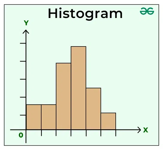
Histogram GraphA histogram is like a bar graph that shows data in columns along the x-axis. Each column represents a range of outcomes, and the height of the column on the y-axis shows how many times that outcome occurred in the data. It’s a simple and effective way to see how data is spread out or distributed. A histogram chart is added below,
How to Draw Histogram?Histogram is the basic toll of representing data and we can easily draw histogram by following the steps added below: Step 1: Collect the data you wish to display in the histogram. This might range from test results to population distribution. For example: Assume you get the following test scores: 14, 20, 12, 26, 8, 7, 2, 28, 30, 16, 18, 23. First arrange it in ascending order. Exam results: 2, 7, 8, 12, 14, 16, 18, 19, 23, 26, 28 and 30. Step 2: Determine the number of intervals, or “bins,” you wish to split your data into. This is determined by the scope and distribution of your data, as well as the amount of information you choose to display. Assume we wish to divide the scores into 5 bins. Step 3: Determine the limits of each bin. These bounds should encompass the complete range of your data and be regularly spaced. 0-5 – 10 – 15 – 20 – 25 – 30. Step 4: Count the number of data points that belong in each bin.
Step 5: On a graph, show the bin borders on the x-axis and the frequency of data points in each bin on the y-axis.
In this histogram, the x-axis depicts the bins, while the y-axis indicates the frequency of data points falling within each bin. The bars represent the sample data’s distribution across the given bins. How to Interpret a Histogram?A histogram is a type of bar graph that displays the distribution of data. Assume you have a collection of numbers, such as test results or people’s heights. A histogram divides these numbers into ranges known as “bins,” and then illustrates how many data points fall into each bin by creating bars. The higher the bar, the more data points are contained inside that range. So, when you look at a histogram, you can immediately observe where the majority of the data is, whether it is grouped in one location or spread out, and whether there are any strange patterns, such as gaps or outliers. When to Use Histogram?Histogram graphs are utilized under various scenarios and some of them are,
Advantages of HistogramHistograms provide various advantages for data analysis and visualization:
Disadvantages of HistogramHistograms has advantages as well as disadvantages for data analysis and visualization:
Applications of Histogram
Difference between Bar Graph And HistogramA histogram is one of the most frequent graphs used to represent frequency distribution. The histogram appears more like a bar graph, but there is a distinction between the two. The differences between the bar graph and the histogram are as follows:
People Also View:Histogram Solved ExamplesExample 1: Present the following information as a histogram:
Solution: We take the Marks on the graph’s horizontal axis and, based on the first column of the data, set the scale to 1 unit = 10. We pick number of students on the vertical axis of the graph and use the second column of the table to determine the scale: 1 unit = 10. Now we’ll create the relevant histogram.
Example 2: Present the following information as a histogram:
Solution: We take the Marks on the graph’s horizontal axis and, based on the first column of the data, set the scale to 1 unit = 10. We pick number of students on the vertical axis of the graph and use the second column of the table to determine the scale: 1 unit = 5. Now we’ll create the relevant histogram.
Practice Problems of Histogram1) Present the following information as a histogram:
2) Present the following information as a histogram:
Histogram – FAQsWhat is histogram and how is it different from a bar graph?
What are key elements of a histogram?
What are many forms of histograms and what do they represent?
When should you use a histogram?
What are advantage of utilizing histograms?
What is a right-skewed histogram, and when does it appear?
What is a left-skewed histogram, and when does it appear?
What is difference between a bar graph and a histogram?
|
||||||||||||||||||||||||||||||||||||||||||||||||||||||||||||||||||||||||||||||||||||||||||||||||||||||


Reffered: https://www.geeksforgeeks.org
| Mathematics |
Type: | Geek |
Category: | Coding |
Sub Category: | Tutorial |
Uploaded by: | Admin |
Views: | 13 |