
|
|
Foundation CSS Media Queries provides a set of predefined media queries that cover a wide range of device sizes. These media queries are categorized into different breakpoints, which are defined by the screen widths at which the layout should adapt. By utilizing these breakpoints, developers can create responsive designs that adjust fluidly across various screen sizes. Foundation CSS Media Query Components:
To leverage Foundation CSS media queries, developers can either use the pre-defined breakpoints or customize them according to their requirements. By enclosing the specific CSS styles within the corresponding media query block, the styles will be applied selectively based on the device’s screen size. SyntaxTo apply a different background color for small screens, we can use the following Foundation CSS media query syntax: @media only screen and (max-width: 640px) {
body {
background-color: #f2f2f2;
}
}
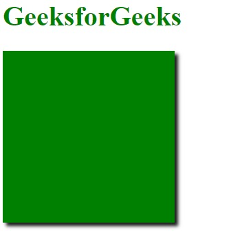
In this code snippet, the background-color style will only be applied to the body element when the screen width is smaller than or equal to 640 pixels, targeting small screens. Example: This example illustrates the basic usage of the Foundation CSS Media Queries. HTML
Output:
Reference: https://get.foundation/sites/docs/media-queries.html |
Reffered: https://www.geeksforgeeks.org
| CSS |
Type: | Geek |
Category: | Coding |
Sub Category: | Tutorial |
Uploaded by: | Admin |
Views: | 15 |